Bailout Archive:
Obama’s Bank Reform Plan
In: Bailout Finance Politics Source: FT Stock Market US Economy
9 Feb 2010The FT has an audio annotated slideshow explaining the proposal.
(note, to get around FT’s registration try this link)
Inflated Worth
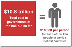
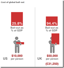
2 Feb 2010World Bailouts and Stimulus
In: Bailout Finance Global Economy Maps Source: Ritholtz US Economy
27 Jan 2010Powerful summary from the Harvard Business Review (hardcopy apparently) via The Big Picture.
Wall Street Compensation 2006-09
In: Bailout Finance Interactive Source: WSJ Stock Market US Economy
17 Jan 2010A very nice treemap presentation — you can drill down by year and company level. Clicking on a company box will bring up their own comments on compensation policies. Well done WSJ!
Credit
14 Dec 2009Wall Street Stock Options
8 Nov 2009Recovery Mapping
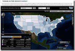
5 Nov 2009Recovery.org has an interactive map that lets you track where the spending is going (down to the street level).
The Fed’s Changing Assets
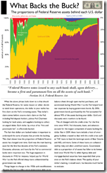
3 Nov 2009How the composition of the Fed’s balance sheet has changed over time. I would like to have seen the past two years blown up in detail. (via Ritzholtz).
2008 Executive Compensation
In: Bailout Finance Interactive Source: USA Today US Economy
23 Oct 2009BBC G20
In: Bailout Emerging Markets Finance Global Economy Interactive Maps Politics US Economy
19 Oct 2009A bit dated as these were prepared in the lead up to the Pittsburgh summit a few weeks ago. Worth passing on nonetheless.
A checklist of the G20’s April London Summit pledges and whether they’ve been fulfilled. Included some nice graphics on IMF and tax reforms.
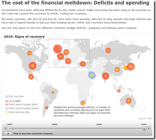
G20 Stimulus and Fiscal Deficit map. Use the slider to look at the changes 2007-2010. Mouse over a country to view popup data details.
Stimulate Those Jobs
In: Bailout Employment Innovative Interactive Maps Source: USA Today US Economy
16 Oct 2009A funky little interactive map from USA Today. Click on a state on the map and the appropriate little dot on the sorted chart on the right will highlight to show you it’s ranking. When you change the indicator using the drop down box at the top (jobs created/total funds awarded/total funds received/unemployment rate) the dots in the chart all bounce around and resort themselves.
Follow the Money
5 Oct 2009G20 Financial Support
5 Oct 2009It’s unclear what the vintage of the data is, but the below map shows G20 crisis spending. Thanks to Silona for the heads up.
What is Chart Porn?
An addictive collection of beautiful charts, graphs, maps, and interactive data visualization toys -- on topics from around the world.
Categories
- Bailout (118)
- Chartporn Related (3)
- Commentary (21)
- Culture (669)
- Emerging Markets (66)
- Employment (245)
- Environment/weather (133)
- Finance (298)
- Food (92)
- Global Economy (373)
- Graphic Design (bad) (26)
- Graphic Design (general) (183)
- Graphic Tools (23)
- History (158)
- Housing (162)
- Humor (204)
- Innovative (183)
- Interactive (545)
- Internet/tech (97)
- Maps (578)
- News Media (34)
- Politics (329)
- Reference (97)
- Science (331)
- Source: Economist (101)
- Source: FT (92)
- Source: NYT (147)
- Source: Ritholtz (76)
- Source: USA Today (27)
- Source: Washington Post (90)
- Source: WSJ (135)
- Sports (58)
- Stock Market (74)
- Uncategorized (2)
- Updated regularly (76)
- US Economy (553)
- Video (22)
- Aram Korevaar: This chart is now being used as a projection in which countries such as China see themselves as in a [...]
- David: Welcome back Chart Porn! [...]
- J S: Thanks for the great story. Miss reading this blog. Hope to see you more active again. [...]
- jake: I lived in a DC row house for 6 years, and I'm writing this comment from my tiny 1 bedroom apartment [...]
- ronny pettersen: Hilarious and unfortunately accurate... ;-) [...]






Blame the Smart People?
In: Bailout Commentary Finance Humor Source: WSJ US Economy
18 Oct 2009A WSJ op-ed that presents a convincing argument that we can’t blame stupid people for the financial crisis (though they certainly helped).