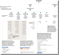
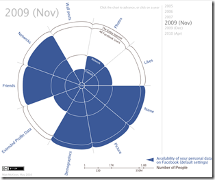
Facebook’s 170 Privacy Options
13 May 20105 Myths of Visual Communication
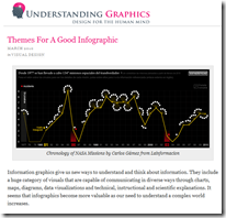
12 May 2010and while we’re at it, here’s another excellent article from the same blog (Understanding Grahics) on “Themes for a Good Infographic“:
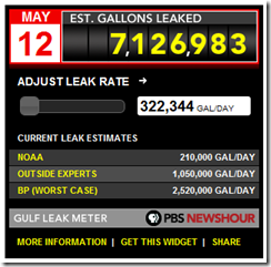
Oil Spill Calculators
12 May 2010Enter your own leak rate (nobody knows what it really is) and see what the running total is. (via)
Overlay the spill onto your own location with this googlemaps mashup:
Driving Habits vs Gas Prices
12 May 2010Interesting chart and analysis. I question a bit how accurate the underlying data is (does an unweighted mean of gas prices really reflect a year?; how is miles per capita measured?). Still, nicely done. (via)
What We Eat and Drink
12 May 2010Food spending by city, age, income, household. Related article.
When to Use Motion Charts
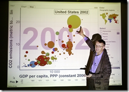
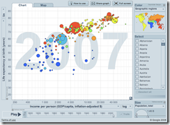
11 May 2010Everyone loves Hans Roslings Ted Talks, but when is motion a good thing to add to your visualizations? Juice Analytics has written up a short answer.
Excellent article by Sarah Slobin (who has worked for NYT, Fortune, CNN, WSJ, etc) on how to research and design your own work. (via)

Updated: US Unemployment
11 May 2010S&P Executive Compensation 2009
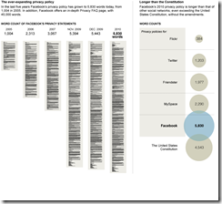
10 May 2010The Evolution of Facebook Privacy
In: Culture Internet/tech
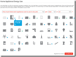
9 May 2010Energy Use
7 May 2010View energy use for various appliances — in dollars/watts/gas, over different periods and in different states.
What is Chart Porn?
An addictive collection of beautiful charts, graphs, maps, and interactive data visualization toys -- on topics from around the world.
Categories
- Bailout (118)
- Chartporn Related (3)
- Commentary (21)
- Culture (669)
- Emerging Markets (66)
- Employment (245)
- Environment/weather (133)
- Finance (298)
- Food (92)
- Global Economy (373)
- Graphic Design (bad) (26)
- Graphic Design (general) (183)
- Graphic Tools (23)
- History (158)
- Housing (162)
- Humor (204)
- Innovative (183)
- Interactive (545)
- Internet/tech (97)
- Maps (578)
- News Media (34)
- Politics (329)
- Reference (97)
- Science (331)
- Source: Economist (101)
- Source: FT (92)
- Source: NYT (147)
- Source: Ritholtz (76)
- Source: USA Today (27)
- Source: Washington Post (90)
- Source: WSJ (135)
- Sports (58)
- Stock Market (74)
- Uncategorized (2)
- Updated regularly (76)
- US Economy (553)
- Video (22)
- Aram Korevaar: This chart is now being used as a projection in which countries such as China see themselves as in a [...]
- David: Welcome back Chart Porn! [...]
- J S: Thanks for the great story. Miss reading this blog. Hope to see you more active again. [...]
- jake: I lived in a DC row house for 6 years, and I'm writing this comment from my tiny 1 bedroom apartment [...]
- ronny pettersen: Hilarious and unfortunately accurate... ;-) [...]

