Tracking Indexes for the Global Economic Recovery (TIGER)
In: Finance Global Economy Interactive Maps Source: FT Updated regularly
26 May 2010Joint effort of the Brookings Institute and the Financial Times. Click on a country to open a PDF with detailed information. Or, you can look at the summary for all countries. Related Brookings post.
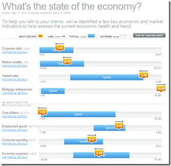
Economic Indicators Dashboard (May ‘10 update)
25 May 2010One of my favorite summaries of economic indicators. Click on any of the “historical details” to see what each indicator means and why it’s important.
A Tourist World
24 May 2010Tourist intensity, based on photos posted on Panoramio. (via Information is Beautiful)
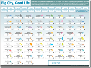
Best Cities in the USA
In: Culture
24 May 201067 cities ranked on 24 indicators. I like that it autosorts, but it would be nice if you could highlight a country and see all of it’s rankings. Related article.
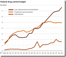
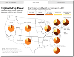
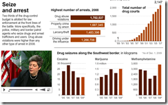
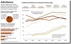
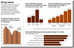
The Drug War
24 May 2010FTSE 350: Executive Pay
24 May 2010Some interesting filters and graphic options in this interactive summary. (via)
Are you Ready for the World Cup?
In: Sports
22 May 2010It starts June 12th 11th. First off, to get you psyched:
Interactive guide to pools and teams:
Calendar from the BBC (highlight your team and print):
A “scientific” prediction of the results, from UK Wired:
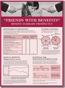
Friend With Benefits: Benefit Summary
21 May 2010It’s Friday, so here’s something a bit silly. (via)
Odds of Being Killed
19 May 2010I don’t much care for the infographic, but I love weird warning signs. (via)
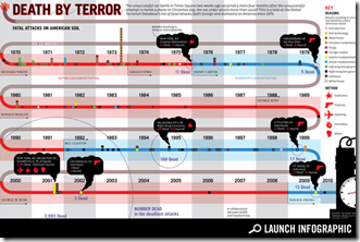
Terrorist Attacks: 1970-2010
19 May 2010In America:
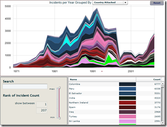
I wished Good had provided more detail on some of the earlier small ones – which led me to the Global Terrorism Database project and the cool interactive tool below (covering all countries).
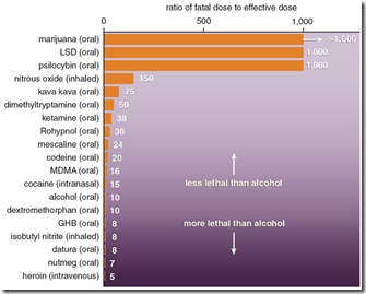
Recreational Substance Toxicity
19 May 2010I think I’d have to question some of the sources for this data. 1000 hits of LSD? Related article. (via)
What is Chart Porn?
An addictive collection of beautiful charts, graphs, maps, and interactive data visualization toys -- on topics from around the world.
Categories
- Bailout (118)
- Chartporn Related (3)
- Commentary (21)
- Culture (669)
- Emerging Markets (66)
- Employment (245)
- Environment/weather (133)
- Finance (298)
- Food (92)
- Global Economy (373)
- Graphic Design (bad) (26)
- Graphic Design (general) (183)
- Graphic Tools (23)
- History (158)
- Housing (162)
- Humor (204)
- Innovative (183)
- Interactive (545)
- Internet/tech (97)
- Maps (578)
- News Media (34)
- Politics (329)
- Reference (97)
- Science (331)
- Source: Economist (101)
- Source: FT (92)
- Source: NYT (147)
- Source: Ritholtz (76)
- Source: USA Today (27)
- Source: Washington Post (90)
- Source: WSJ (135)
- Sports (58)
- Stock Market (74)
- Uncategorized (2)
- Updated regularly (76)
- US Economy (553)
- Video (22)
- Aram Korevaar: This chart is now being used as a projection in which countries such as China see themselves as in a [...]
- David: Welcome back Chart Porn! [...]
- J S: Thanks for the great story. Miss reading this blog. Hope to see you more active again. [...]
- jake: I lived in a DC row house for 6 years, and I'm writing this comment from my tiny 1 bedroom apartment [...]
- ronny pettersen: Hilarious and unfortunately accurate... ;-) [...]


