Hurricane Season 2010
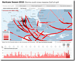
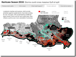
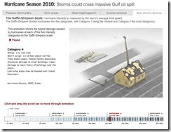
2 Jun 2010A multi-part interactive. They’ve included one of my favorites: an animation of the effects of different Hurricane Category storms.
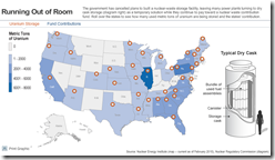
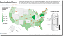
Map: Uranium Storage
In: Science
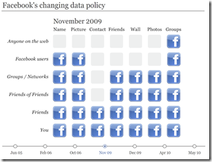
2 Jun 2010Facebook’s Changing Privacy Policies
In: Internet/tech
2 Jun 2010An interactive timeline from the Financial Times.
BP’s Safety Record
2 Jun 2010Last night’s Daily Show had a great bit about “egregious, willful safety violations” by BP, compared to only 19 by other companies. (starts around minute 9)
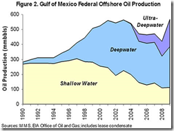
Looking around for the original data brought us the below. Note: this is for refineries, not offshore drilling sites:
Maps: Iraq and Afghanistan Casualties
In: Interactive Maps Politics
1 Jun 2010An extremely well designed dual-map interface that shows individual casualties – where they lived and where they were killed. Clicking on any dot brings up a photo and detailed information about the person. You can view coalition deaths by scrolling the map to those countries. There’s even a place to leave notes about each person. (via)
Increasingly Awesome Volcano Names
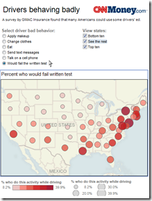
1 Jun 2010Map: USA’s Dumbest Drivers
In: Culture Interactive Maps
28 May 2010Sins and Virtues
In: Culture
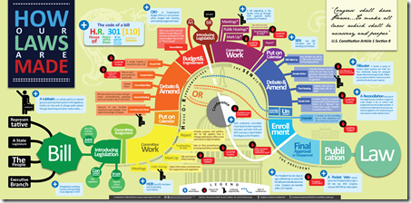
28 May 2010How Laws are Made
In: Politics
28 May 2010A very nice design – and accurate as far as I can tell. (via)
Abstract Art
26 May 2010What is Chart Porn?
An addictive collection of beautiful charts, graphs, maps, and interactive data visualization toys -- on topics from around the world.
Categories
- Bailout (118)
- Chartporn Related (3)
- Commentary (21)
- Culture (669)
- Emerging Markets (66)
- Employment (245)
- Environment/weather (133)
- Finance (298)
- Food (92)
- Global Economy (373)
- Graphic Design (bad) (26)
- Graphic Design (general) (183)
- Graphic Tools (23)
- History (158)
- Housing (162)
- Humor (204)
- Innovative (183)
- Interactive (545)
- Internet/tech (97)
- Maps (578)
- News Media (34)
- Politics (329)
- Reference (97)
- Science (331)
- Source: Economist (101)
- Source: FT (92)
- Source: NYT (147)
- Source: Ritholtz (76)
- Source: USA Today (27)
- Source: Washington Post (90)
- Source: WSJ (135)
- Sports (58)
- Stock Market (74)
- Uncategorized (2)
- Updated regularly (76)
- US Economy (553)
- Video (22)
- Aram Korevaar: This chart is now being used as a projection in which countries such as China see themselves as in a [...]
- David: Welcome back Chart Porn! [...]
- J S: Thanks for the great story. Miss reading this blog. Hope to see you more active again. [...]
- jake: I lived in a DC row house for 6 years, and I'm writing this comment from my tiny 1 bedroom apartment [...]
- ronny pettersen: Hilarious and unfortunately accurate... ;-) [...]

