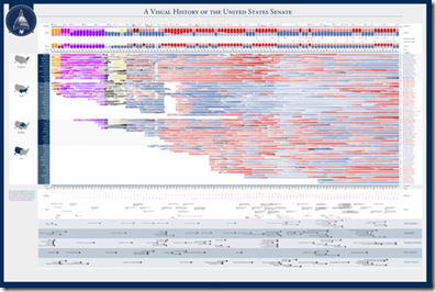
Visual History of the US Senate (1789-2010)
4 Jun 2010A very detailed visualization from the good people at Timeplots.
Injury and Death Rates
In: Science
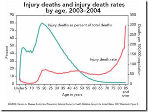
4 Jun 2010Lots of interesting charts at the CDC if you dig around. Here’s a sample – they’re a bit dated, but still worth a look:
A Great World Cup Schedule
In: Interactive Sports
3 Jun 2010The Greek Crisis in Three Acts
3 Jun 2010Ok, apparently this is only the first three acts – so stay tuned!!!
The Shadow Congress
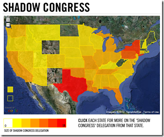
3 Jun 2010A map of Congressmen who are now lobbyists. Related article. (via)
BBC Top 40
In: Culture Interactive
3 Jun 2010Cool interactive display. (discussion/explanation at FlowingData) Of course, I recognize none of this music. Note: I had to turn off Firefox adblocker to get it to work.
Retail Store Closings
In: Culture US Economy
3 Jun 2010EPI’s Economy Track
In: Employment Interactive Maps Updated regularly US Economy
3 Jun 2010The Economic Policy Institute has a collection of interactive charts covering employment, GDP, and capacity utilization. There are also filters to facilitate quick comparisons across recession periods.
Unemployment Length by State
3 Jun 2010Roll-over the states for the rates. (via The Big Picture)
Wealth vs Health
In: Global Economy Maps
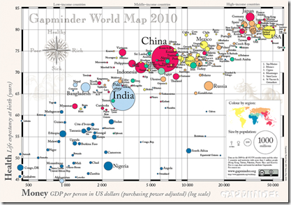
2 Jun 2010Gapminder 2010 World Map of countries’ GDP per capita vs life expectancy. Bubbles are sized by population.
What is Chart Porn?
An addictive collection of beautiful charts, graphs, maps, and interactive data visualization toys -- on topics from around the world.
Categories
- Bailout (118)
- Chartporn Related (3)
- Commentary (21)
- Culture (669)
- Emerging Markets (66)
- Employment (245)
- Environment/weather (133)
- Finance (298)
- Food (92)
- Global Economy (373)
- Graphic Design (bad) (26)
- Graphic Design (general) (183)
- Graphic Tools (23)
- History (158)
- Housing (162)
- Humor (204)
- Innovative (183)
- Interactive (545)
- Internet/tech (97)
- Maps (578)
- News Media (34)
- Politics (329)
- Reference (97)
- Science (331)
- Source: Economist (101)
- Source: FT (92)
- Source: NYT (147)
- Source: Ritholtz (76)
- Source: USA Today (27)
- Source: Washington Post (90)
- Source: WSJ (135)
- Sports (58)
- Stock Market (74)
- Uncategorized (2)
- Updated regularly (76)
- US Economy (553)
- Video (22)
- Aram Korevaar: This chart is now being used as a projection in which countries such as China see themselves as in a [...]
- David: Welcome back Chart Porn! [...]
- J S: Thanks for the great story. Miss reading this blog. Hope to see you more active again. [...]
- jake: I lived in a DC row house for 6 years, and I'm writing this comment from my tiny 1 bedroom apartment [...]
- ronny pettersen: Hilarious and unfortunately accurate... ;-) [...]

