The Trail of Debt
9 Jun 2010China’s Housing Market
7 Jun 2010History of Programmers
In: Internet/tech Science
7 Jun 2010There’s also a detailed discussion of the design process that went into producing this infographic. (via)
Finviz Financial Visualizations
In: Finance Global Economy Interactive Reference Stock Market Updated regularly US Economy
7 Jun 2010Some really great financial analysis tools here.
Treemaps (for S&P, world, filter by sector, period, drill down as far as you want)

Same info as bubbles, with roll over graphs:
Bar, Spectrum, and other performance charts by industry, country, or capitalization:
Tables of insider trading:
Futures:
Foreign Exchange:
And a crazy filter system for stock tables:
From the Guardian, a detailed history from 1930-2006.
From the Washington Post, an interesting Map/Calendar menu leads to team info and recent news.
Unemployment: Dream vs Reality
In: Employment Humor
4 Jun 2010Forecast Weather Using Your Eyes
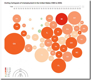
4 Jun 2010Unemployment 1980-2009
4 Jun 2010What is Chart Porn?
An addictive collection of beautiful charts, graphs, maps, and interactive data visualization toys -- on topics from around the world.
Categories
- Bailout (118)
- Chartporn Related (3)
- Commentary (21)
- Culture (669)
- Emerging Markets (66)
- Employment (245)
- Environment/weather (133)
- Finance (298)
- Food (92)
- Global Economy (373)
- Graphic Design (bad) (26)
- Graphic Design (general) (183)
- Graphic Tools (23)
- History (158)
- Housing (162)
- Humor (204)
- Innovative (183)
- Interactive (545)
- Internet/tech (97)
- Maps (578)
- News Media (34)
- Politics (329)
- Reference (97)
- Science (331)
- Source: Economist (101)
- Source: FT (92)
- Source: NYT (147)
- Source: Ritholtz (76)
- Source: USA Today (27)
- Source: Washington Post (90)
- Source: WSJ (135)
- Sports (58)
- Stock Market (74)
- Uncategorized (2)
- Updated regularly (76)
- US Economy (553)
- Video (22)
- Aram Korevaar: This chart is now being used as a projection in which countries such as China see themselves as in a [...]
- David: Welcome back Chart Porn! [...]
- J S: Thanks for the great story. Miss reading this blog. Hope to see you more active again. [...]
- jake: I lived in a DC row house for 6 years, and I'm writing this comment from my tiny 1 bedroom apartment [...]
- ronny pettersen: Hilarious and unfortunately accurate... ;-) [...]


