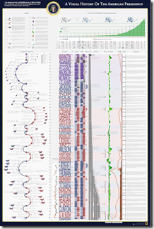
Visual History of the American Presidency
13 Jun 2010More beautifully detailed work from Timeplots.
Hockey: Stanley Cup Appearances and Team History
In: Interactive Sports
13 Jun 2010A cool interactive that shows Stanley Cup appearances, as well as when each team was founded and whether they moved/renamed.
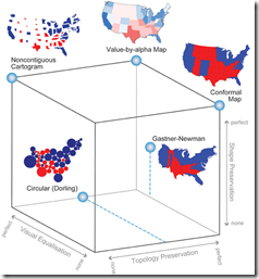
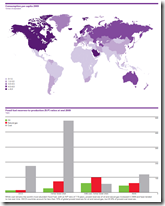
A detailed article discussing using alpha values (transparency) instead of standard cartograms. I really really like the cube of thematic map typography. Related paper.
Sparklines in Twitter
9 Jun 2010World Cup Stadiums
In: Sports
9 Jun 2010I can’t imagine why you might want all this information in one place.. but here it is. (via)
The Greek Tangle
9 Jun 2010Plotweaver Graphing Software
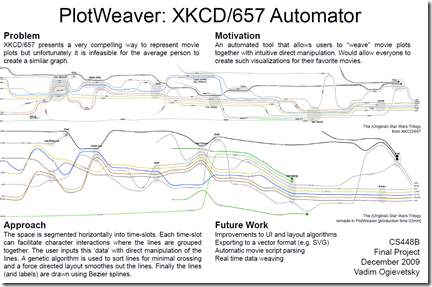
9 Jun 2010Stanford Student Vadim Ogievetsky is writing some software to allow the automated creation of timeline charts like XKCD’s “Interactions of Move Characters”. I didn’t dig too deep into this, but there’s lots of detail there is you’re interested. (via)
The World: Top to Bottom
In: Maps
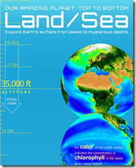
9 Jun 2010The below image is just a tiny bit of the Top. the whole annotated graphic is quite LOOONNGGGG. (via Cool Infographics)
Color Strata
9 Jun 2010A beautiful chart of the most popular colors (based on the xkcd survey data).
Emerging Africa: in Depth
In: Emerging Markets Environment/weather Global Economy Interactive Maps Politics Source: FT
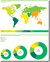
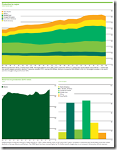
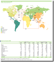
9 Jun 2010Several interactive graphics related to the FT’s June 2010 “in depth” analysis of Africa.
What is Chart Porn?
An addictive collection of beautiful charts, graphs, maps, and interactive data visualization toys -- on topics from around the world.
Categories
- Bailout (118)
- Chartporn Related (3)
- Commentary (21)
- Culture (669)
- Emerging Markets (66)
- Employment (245)
- Environment/weather (133)
- Finance (298)
- Food (92)
- Global Economy (373)
- Graphic Design (bad) (26)
- Graphic Design (general) (183)
- Graphic Tools (23)
- History (158)
- Housing (162)
- Humor (204)
- Innovative (183)
- Interactive (545)
- Internet/tech (97)
- Maps (578)
- News Media (34)
- Politics (329)
- Reference (97)
- Science (331)
- Source: Economist (101)
- Source: FT (92)
- Source: NYT (147)
- Source: Ritholtz (76)
- Source: USA Today (27)
- Source: Washington Post (90)
- Source: WSJ (135)
- Sports (58)
- Stock Market (74)
- Uncategorized (2)
- Updated regularly (76)
- US Economy (553)
- Video (22)
- Aram Korevaar: This chart is now being used as a projection in which countries such as China see themselves as in a [...]
- David: Welcome back Chart Porn! [...]
- J S: Thanks for the great story. Miss reading this blog. Hope to see you more active again. [...]
- jake: I lived in a DC row house for 6 years, and I'm writing this comment from my tiny 1 bedroom apartment [...]
- ronny pettersen: Hilarious and unfortunately accurate... ;-) [...]

