Infographomania
23 Jun 2010Another self-loathing infographic (that I am in complete agreement with). You might have noticed that Chartporn doesn’t post every infographic out there. I try to filter out the more boilerplate ones – I read all the crap, so you don’t have to.
Education Documentary Trailer
21 Jun 2010Video infographics seem to be a growing trend. Here’s a well animated one in the form of a promotional for the education documentary “Waiting for Superman” (by Davis Guggenheim, who did An Inconvenient Truth). Note: if you want to see the whole movie, it is being shown as part of this weeks Silverdocs Film Festival in Washington, DC.
World Wine
21 Jun 2010A collection of interactives from the FT:
Drill down maps of each region:
Grape varieties, and production stats:
Green Death
In: Culture
16 Jun 2010Standard vs Green burial methods. Burial always struck me as kind of stupid in general. (via)
Flowchart: Should you Get the New [x]?
16 Jun 2010Highly accurate. (via)
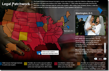
Map: Same-Sex Marriage Laws
16 Jun 2010American Migrations: 2008
16 Jun 2010More than 10 million Americans moved from one county to another during 2008. The map below visualizes those moves. Click on any county to see comings and goings: black lines indicate net inward movement, red lines net outward movement.
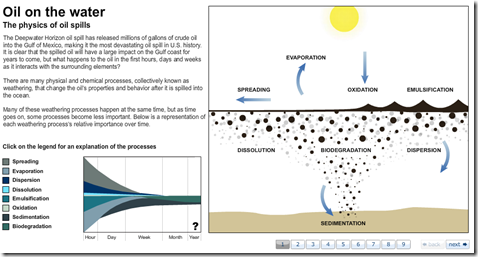
Oil: How it Breaks Down in the Ocean
14 Jun 2010MSNBC takes you through the 8 steps of weathering. (via)
Habitat Gap Map
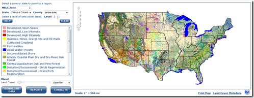
14 Jun 2010Through ground and satellite surveys of land cover, the U. S. Geological Survey’s Gap Analysis Program has generated data that conservationists may be able to use to create and sustain habitat for wildlife.
The Gap Analysis Program is charged with figuring out which common species’ habitats may not be well represented by existing parks and conservation areas. The only way to do that is to mash up a bunch of data about species and land use (via)
History of the World Cup
In: Interactive Sports
13 Jun 2010What is Chart Porn?
An addictive collection of beautiful charts, graphs, maps, and interactive data visualization toys -- on topics from around the world.
Categories
- Bailout (118)
- Chartporn Related (3)
- Commentary (21)
- Culture (669)
- Emerging Markets (66)
- Employment (245)
- Environment/weather (133)
- Finance (298)
- Food (92)
- Global Economy (373)
- Graphic Design (bad) (26)
- Graphic Design (general) (183)
- Graphic Tools (23)
- History (158)
- Housing (162)
- Humor (204)
- Innovative (183)
- Interactive (545)
- Internet/tech (97)
- Maps (578)
- News Media (34)
- Politics (329)
- Reference (97)
- Science (331)
- Source: Economist (101)
- Source: FT (92)
- Source: NYT (147)
- Source: Ritholtz (76)
- Source: USA Today (27)
- Source: Washington Post (90)
- Source: WSJ (135)
- Sports (58)
- Stock Market (74)
- Uncategorized (2)
- Updated regularly (76)
- US Economy (553)
- Video (22)
- Aram Korevaar: This chart is now being used as a projection in which countries such as China see themselves as in a [...]
- David: Welcome back Chart Porn! [...]
- J S: Thanks for the great story. Miss reading this blog. Hope to see you more active again. [...]
- jake: I lived in a DC row house for 6 years, and I'm writing this comment from my tiny 1 bedroom apartment [...]
- ronny pettersen: Hilarious and unfortunately accurate... ;-) [...]


