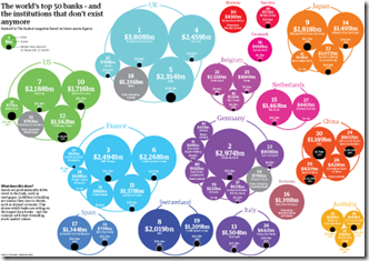
Sovereign Debt Levels 1980-2009
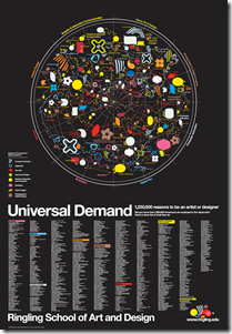
1 Jul 2010Art and Design Professions
30 Jun 2010The graphic at the top is kind of pointless, but the list of professions at the bottom might be an inspirational reference for some. By Tyler Lang – c.2007. (via)
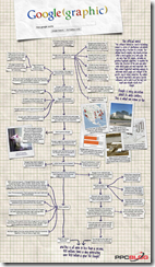
Interesting analysis of both the print and online versions, from a layout point of view. (via)
RSA Animations
28 Jun 2010The RSA (Royal Society for the encouragement of Arts, Manufactures and Commerce) has been producing a series of fascinating animated info-lectures on a variety of topics. Below is a sampling.
on time:
on being "happy!":
Superfreakonomics:
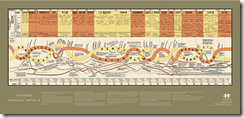
British Political Parties (1830-2010)
28 Jun 20102009: How Americans Spent Their Time
28 Jun 2010Roll-over details alleviate the normal pie-chart problems (somewhat). However, who averages 8.6 hours of sleep a day and only 3.5 hours of work? Maybe I’m just not average. The related article talks about the impact of higher unemployment on this data.
World Cup Goals: When, Where, Who
28 Jun 2010I’m getting a little tired of World Cup visualizations (especially since the US lost on Saturday), but the WSJ’s views of individual goals is interesting. You can view them by date, country, field position, stadium, club team, game time, or player.
Weird World Cup Stats
In: Interactive Sports
26 Jun 2010This is a combination of great and shitty. Some of the stats look accurate and are very interesting (202 yellow cards, 11 penalty kicks), some look like bad estimates (calories eaten?!?), and it’s intermixed with way too many oil company ads.
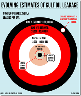
Changing Oil Spill Estimates
25 Jun 2010I’ve seen a lot of headlines, but this chart brings them all together nicely — however, I can’t tell if the concentric arcs are the right proportion? (via)
Global Debt
In: Finance Global Economy Interactive Maps Source: Economist
25 Jun 2010Often these charts only deal with government or household debt – this one covers it all. Click on any country to bring up a time series chart – use the tabs at the top to view time series of debt types.
What is Chart Porn?
An addictive collection of beautiful charts, graphs, maps, and interactive data visualization toys -- on topics from around the world.
Categories
- Bailout (118)
- Chartporn Related (3)
- Commentary (21)
- Culture (669)
- Emerging Markets (66)
- Employment (245)
- Environment/weather (133)
- Finance (298)
- Food (92)
- Global Economy (373)
- Graphic Design (bad) (26)
- Graphic Design (general) (183)
- Graphic Tools (23)
- History (158)
- Housing (162)
- Humor (204)
- Innovative (183)
- Interactive (545)
- Internet/tech (97)
- Maps (578)
- News Media (34)
- Politics (329)
- Reference (97)
- Science (331)
- Source: Economist (101)
- Source: FT (92)
- Source: NYT (147)
- Source: Ritholtz (76)
- Source: USA Today (27)
- Source: Washington Post (90)
- Source: WSJ (135)
- Sports (58)
- Stock Market (74)
- Uncategorized (2)
- Updated regularly (76)
- US Economy (553)
- Video (22)
- Aram Korevaar: This chart is now being used as a projection in which countries such as China see themselves as in a [...]
- David: Welcome back Chart Porn! [...]
- J S: Thanks for the great story. Miss reading this blog. Hope to see you more active again. [...]
- jake: I lived in a DC row house for 6 years, and I'm writing this comment from my tiny 1 bedroom apartment [...]
- ronny pettersen: Hilarious and unfortunately accurate... ;-) [...]


