Congressional Conversation Index
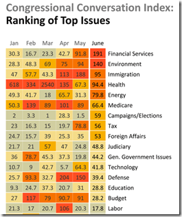
16 Jul 2010The Congressional Conversation Index tracks what topics people are contacting their Representatives about, produced by a joint effort between Fireside21 and the Adfero Group. (thanks to Brad Johnson for the link)
50 Ways to Visualize the Oil Spill
15 Jul 2010I’ve posted some of these before, but Inspired Mag has come up with a pretty definitive list.
Data Visualization Timeline
15 Jul 2010An interactive timeline of innovations and milestones, from the 1600s-today. Note: click on any item for more details.
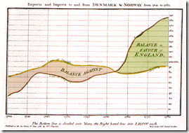
A Brief History of Visualization
15 Jul 2010This is the first part of a course from the School of Visual Arts. Its a very good introductory read. (via)
Quality of Death
In: Culture
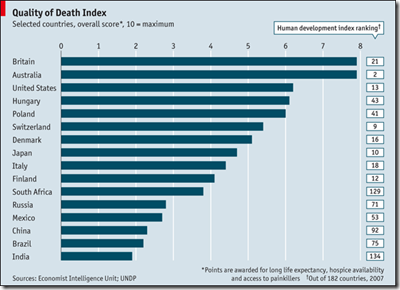
15 Jul 2010CUSTOMER-satisfaction surveys are, alas, unsuitable for rating the quality of death. So the Economist Intelligence Unit […] has devised a ranking of end-of-life care.
Vacuous Supreme Court Nomination Hearings
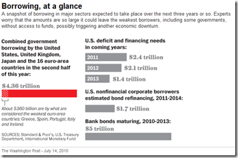
15 Jul 2010Global Tidal Wave of Debt
14 Jul 2010Online Dating Lies
In: Culture
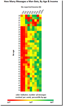
13 Jul 2010Another fascinating data analysis from Okcupid’s online dating blog “Oktrends“. Christian Rudder compares users self-identified characteristics to population norms for height and income, looks at photo EXIF information to see how many people are posting dated pictures of themselves, and examines how many bisexuals actually contact both sexes.
These bold colors (below) contain a subtle message: if you’re a young guy and don’t make much money, cool. If you’re 23 or older and don’t make much money, go die in a fire. It’s not hard to see where the incentive to exaggerate comes from.
The upshot here is, if you see a good-looking picture of a man over 30, that photo is very likely to be out-of-date.
Map: Amtrak Routes in Subway Style
In: Maps
13 Jul 2010For comparison, the official Amtrak national map is the second one below. It’s interesting to see how much additional clarity comes from breaking state geography just a little. Designer’s blog post.
8-bit Washington DC
13 Jul 2010These maps are very odd. At first, I thought, why bother? Is there really a need for low-res maps based on 1980s video game graphic style? Then I typed in my address and realized how much was really going on. It’s still pretty silly, but it’s an impressive silly – and not everything has to be utilitarian. Available for 10 different cities.
Update: Moody’s Global Recovery Map
In: Global Economy Maps
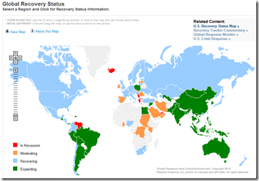
12 Jul 2010I gave this map a bit of grief when I first posted about it, so it’s only fair that I point out that they now appear to be keeping it up to date, and annotating the analysis better.
Where to Get Harassed by Cops in NYC
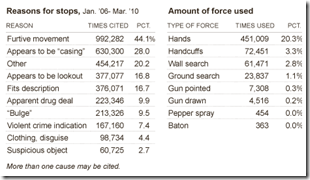
12 Jul 2010The NYT has an interactive map and related charts of where NYC police have been utilizing the “stop, question, and frisk” policy. Related article.
Apple vs Google vs Microsoft
12 Jul 2010What is Chart Porn?
An addictive collection of beautiful charts, graphs, maps, and interactive data visualization toys -- on topics from around the world.
Categories
- Bailout (118)
- Chartporn Related (3)
- Commentary (21)
- Culture (669)
- Emerging Markets (66)
- Employment (245)
- Environment/weather (133)
- Finance (298)
- Food (92)
- Global Economy (373)
- Graphic Design (bad) (26)
- Graphic Design (general) (183)
- Graphic Tools (23)
- History (158)
- Housing (162)
- Humor (204)
- Innovative (183)
- Interactive (545)
- Internet/tech (97)
- Maps (578)
- News Media (34)
- Politics (329)
- Reference (97)
- Science (331)
- Source: Economist (101)
- Source: FT (92)
- Source: NYT (147)
- Source: Ritholtz (76)
- Source: USA Today (27)
- Source: Washington Post (90)
- Source: WSJ (135)
- Sports (58)
- Stock Market (74)
- Uncategorized (2)
- Updated regularly (76)
- US Economy (553)
- Video (22)
- Aram Korevaar: This chart is now being used as a projection in which countries such as China see themselves as in a [...]
- David: Welcome back Chart Porn! [...]
- J S: Thanks for the great story. Miss reading this blog. Hope to see you more active again. [...]
- jake: I lived in a DC row house for 6 years, and I'm writing this comment from my tiny 1 bedroom apartment [...]
- ronny pettersen: Hilarious and unfortunately accurate... ;-) [...]

