Tweet Mood Ring Maps
In: Culture Internet/tech Maps
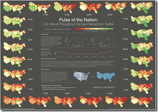
23 Jul 2010Researchers analyzed the words of 300 million tweets for “happiness” content and plotted the changes over time. The findings are kind of cool, but this would have looked a lot better with non-contiguous cartograms.
Update: Economic Indicators Dashboard (July ‘10)
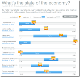
23 Jul 2010A great monthly status board for market and economic indicators. Click on anything – the popup details are great.
Is the Tour de France Getting Easier?
20 Jul 201026 Infographics on Child Obesity
20 Jul 2010A contest from Good magazine produced a number of different designs. The winner will be announced next week.
Top Secret America
19 Jul 2010Interactive exploration of the 45 Government agencies, 2000+ companies, and 854,000+ people working on government security. Part of the Washington Post’s 3-part series on the growth of national security infrastructure since 9/11.
$4 Trillion Housing Bubble Hangover
19 Jul 2010Why housing prices (and the economy) are not going to recover any time soon. (via The Big Picture; earlier post)
Fattest States in the USA
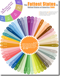
18 Jul 2010Wow. This would be my nomination for most pointless use of a radial diagram (and color) 2010 if they gave out such awards. Hmmm. maybe I’ll start giving out those awards. (via)
Grandparents Competing with Teenagers for Jobs
17 Jul 2010Interesting multi-part interactive analysis from Bloomberg about changing job-force dynamics. (via the Big Picture)
The Financial Overhaul Bill: What Does it Fix?
16 Jul 2010Patio Shade
In: Humor
16 Jul 2010Energy Subsidies
16 Jul 2010Turns out we massively subsidize oil companies with huge tax breaks, despite their equally huge profits. (via the Big Picture)
What is Chart Porn?
An addictive collection of beautiful charts, graphs, maps, and interactive data visualization toys -- on topics from around the world.
Categories
- Bailout (118)
- Chartporn Related (3)
- Commentary (21)
- Culture (669)
- Emerging Markets (66)
- Employment (245)
- Environment/weather (133)
- Finance (298)
- Food (92)
- Global Economy (373)
- Graphic Design (bad) (26)
- Graphic Design (general) (183)
- Graphic Tools (23)
- History (158)
- Housing (162)
- Humor (204)
- Innovative (183)
- Interactive (545)
- Internet/tech (97)
- Maps (578)
- News Media (34)
- Politics (329)
- Reference (97)
- Science (331)
- Source: Economist (101)
- Source: FT (92)
- Source: NYT (147)
- Source: Ritholtz (76)
- Source: USA Today (27)
- Source: Washington Post (90)
- Source: WSJ (135)
- Sports (58)
- Stock Market (74)
- Uncategorized (2)
- Updated regularly (76)
- US Economy (553)
- Video (22)
- Aram Korevaar: This chart is now being used as a projection in which countries such as China see themselves as in a [...]
- David: Welcome back Chart Porn! [...]
- J S: Thanks for the great story. Miss reading this blog. Hope to see you more active again. [...]
- jake: I lived in a DC row house for 6 years, and I'm writing this comment from my tiny 1 bedroom apartment [...]
- ronny pettersen: Hilarious and unfortunately accurate... ;-) [...]

