Why Nothing Gets Done in Washington DC
In: Politics
28 Jul 2010I’ve lived in DC for 25 years – this timeline is completely accurate. It’s a lot of sound and fury that produces nothing more than clever dinner party conversations. (via)
Modern Television
28 Jul 2010A videographic full of interesting charts and facts. For example: we all watch more television then we think we do.
Reforming the Global Financial System
In: Finance Global Economy Interactive Maps Politics Source: FT
28 Jul 2010From Dodd-Frank to Basel III, this graphic explains the current plans for global financial regulatory reform in advanced economies, from the US to the eurozone.
(note: some FT items require a subscription – you can view up to 10 articles a month for free)
Art of Complex Problem Solving
27 Jul 2010The roll-over explanations are almost detailed to a distracting level, but the overall design is superb.
Durham Univeristy’s International Boundaries Research Unit (IBRU) maintains some interesting maps and history.
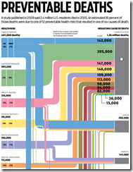
Preventable Deaths
26 Jul 2010Interactive look at 12 preventable health risks that result in six different causes of death. A very nice design — if you ignore having to manually close the popups. (via Visual Loop)
SF-NY-CHI-BOS Marathons
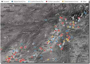
26 Jul 2010Map: Wikileaks Afghan Incidents
In: Interactive Maps Politics
26 Jul 2010Interactive map of 300 accidents, friendly fires, civilian casualties, and demonstrations. Drill down to detailed reports.
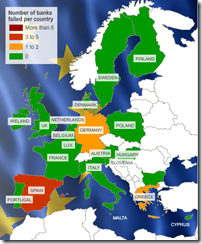
Map: European Bank Stress Tests
26 Jul 2010This is kind of a silly map considering only 7 of 91 banks failed. Related article.
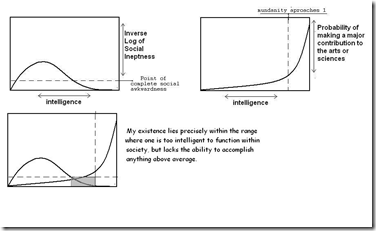
The Truth About Most Artists/Scientists
In: Employment Humor Science
25 Jul 2010I think you could make a nice series of charts like this about most careers.
(note: I couldn’t figure out which version of this was the original. I first saw it here)
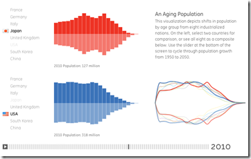
Demographics (1950-2050)
25 Jul 2010A very smooth interactive that allows you to compare the population composition of 8 countries over time. You can see some interesting trends by playing with the timeline control at the bottom — like watching the baby boom bulge move through the USA population then disappear, or the holes left in european age groups by WWII.
The Big Mac Index
25 Jul 2010Asia remains the cheapest place to enjoy a burger. China’s recent decision to increase the “flexibility” of the yuan has not made much difference yet. A Big Mac costs $1.95 in China at current exchange rates, against $3.73 in America. […] In other words the yuan is undervalued by 48%.
Update: NPR’s Toxic Real Estate Asset
24 Jul 2010Planet Money bought a toxic mortgage asset and has been tracking it’s death spiral. It’s now almost completely dead (non-performing). In a recent article they also tried to track down the people who originally took out the mortgages.
We’re Having a Heat Wave
23 Jul 2010My desktop weather app is displaying a cactus – that can’t be a good sign. If it makes anyone feel better, the whole world is burning up this summer.
Russia is getting it even worse. Reportedly as many as 300 1000 1200+ people have drowned trying to get away from the heat, and shoes are sinking into melted tarmac.
It’s not just our imagination — 2010 has been one of the hottest years on record: 

What is Chart Porn?
An addictive collection of beautiful charts, graphs, maps, and interactive data visualization toys -- on topics from around the world.
Categories
- Bailout (118)
- Chartporn Related (3)
- Commentary (21)
- Culture (669)
- Emerging Markets (66)
- Employment (245)
- Environment/weather (133)
- Finance (298)
- Food (92)
- Global Economy (373)
- Graphic Design (bad) (26)
- Graphic Design (general) (183)
- Graphic Tools (23)
- History (158)
- Housing (162)
- Humor (204)
- Innovative (183)
- Interactive (545)
- Internet/tech (97)
- Maps (578)
- News Media (34)
- Politics (329)
- Reference (97)
- Science (331)
- Source: Economist (101)
- Source: FT (92)
- Source: NYT (147)
- Source: Ritholtz (76)
- Source: USA Today (27)
- Source: Washington Post (90)
- Source: WSJ (135)
- Sports (58)
- Stock Market (74)
- Uncategorized (2)
- Updated regularly (76)
- US Economy (553)
- Video (22)
- Aram Korevaar: This chart is now being used as a projection in which countries such as China see themselves as in a [...]
- David: Welcome back Chart Porn! [...]
- J S: Thanks for the great story. Miss reading this blog. Hope to see you more active again. [...]
- jake: I lived in a DC row house for 6 years, and I'm writing this comment from my tiny 1 bedroom apartment [...]
- ronny pettersen: Hilarious and unfortunately accurate... ;-) [...]

