Walking on the Moon: Apollo 11
3 Aug 2010Some cool map overlays showing how little of the moon we actually explored on that one day. On a soccer and baseball field: 

on a photo:
(via)
First Global Census of Marine Life
In: Environment/weather Graphic Design (bad) Interactive Maps Science
3 Aug 2010I think this project has been cursed by the data visualization gods. First, take a look at the Guardian’s interactive map below. There’s no legend to explain the colors, and the popups show a picture of just one animal (which they apparently included only because they happen to have a nice picture of it). The only information conveyed here at all is in the small bubbles at the bottom — which aren’t labeled and are presumably in percent of all marine life, but you can’t be sure because they don’t add up to 100%.
So I tracked down the original study, and their project map is actually worse! In addition to being quite possibly the most butt-ugly acronym ridden map I’ve ever seen, it has a bizarre infinity scrolling feature that allows you to view five earths at once.
But wait, there’s more: a huge interactive rotating globe that takes up 3/4s of the screen. See the tiny red dots on the map? – those are how you call up the related info that is squeezed into the small box on the left. There are other critiques, but I think I’ve picked on this poor project enough.
All of this is a shame, of course, because it looks like a very worthwhile project that has accomplished a lot of valuable work. Here is the Guardian’s related article, and the project’s press release.
State Budget Deficits
2 Aug 2010Yields on top-rated, tax exempt US municipal bonds have dropped to near-record lows, allowing many local borrowers to access cheap financing in spite of their recent fiscal troubles. Following concerns over public finances in Europe, the $2,800bn market for “munis” has come into the spotlight after several years of budget deficits. Related articles.
Update: AP Economic Stress Map
2 Aug 2010This map displays unemployment, foreclosures, bankruptcies, or a composite “stress index”, by county. Easy to miss: in the upper right you can change the scale of the mapping (rates, m-t-m, y-t-y). To look at data over time, click on the “monthly rates” option and a historical slider will appear at the bottom. Double click on a region to zoom in. Updated 8/2/10.
God vs Satan
In: Culture
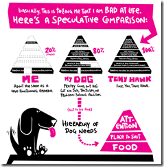
2 Aug 2010I tried to track down the original, but only discovered that this analysis has been around for a while. Here’s another version.
Where Your Money is Stored
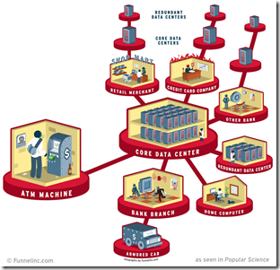
2 Aug 2010There’s not a lot of surprising information here, but I’m posting it anyway to reward the graphic designer for including the horns and pitchfork in the “Credit Card Company” section, and the holdup man in the “Bank Branch”. Well done! (via)
This is Burning Man
In: Culture
29 Jul 2010A fantastic infographic about the annual arts festival.
Godzilla Attacks BP Helicopter
29 Jul 2010BP recently released some (badly) photoshopped PR pictures – and a group of artists decided to show them how to do it properly. I can’t stop laughing at the godzilla ones.
If You Were on the Supreme Court
29 Jul 2010For each of six questions, your answers will be compared to public opinion polls and recent decisions of the supreme court.
How Conservative is the US Supreme Court?
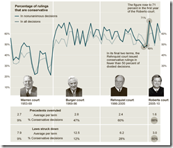
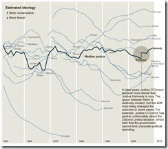
29 Jul 2010The Roberts Court has issued conservative decisions at a slightly higher rate than the Rehnquist or the Burger Courts. [Related article]
Thanks to epetrela for the link!
Global Executions
29 Jul 2010Yikes! Anybody want to re-jigger this to per-capita? Or does that not really matter in this case? Thoughts?
History of Home Values (1890-2010)
28 Jul 2010Golden Parachutes
28 Jul 2010Losing Our Religion
In: Culture
28 Jul 2010This graphic is based on a survey of the religious affiliations of adults (bottom) versus when they were children (top). One of the biggest winners: “None”.
The Junk Charts blog attempted another way of visualizing the same data:
What is Chart Porn?
An addictive collection of beautiful charts, graphs, maps, and interactive data visualization toys -- on topics from around the world.
Categories
- Bailout (118)
- Chartporn Related (3)
- Commentary (21)
- Culture (669)
- Emerging Markets (66)
- Employment (245)
- Environment/weather (133)
- Finance (298)
- Food (92)
- Global Economy (373)
- Graphic Design (bad) (26)
- Graphic Design (general) (183)
- Graphic Tools (23)
- History (158)
- Housing (162)
- Humor (204)
- Innovative (183)
- Interactive (545)
- Internet/tech (97)
- Maps (578)
- News Media (34)
- Politics (329)
- Reference (97)
- Science (331)
- Source: Economist (101)
- Source: FT (92)
- Source: NYT (147)
- Source: Ritholtz (76)
- Source: USA Today (27)
- Source: Washington Post (90)
- Source: WSJ (135)
- Sports (58)
- Stock Market (74)
- Uncategorized (2)
- Updated regularly (76)
- US Economy (553)
- Video (22)
- Aram Korevaar: This chart is now being used as a projection in which countries such as China see themselves as in a [...]
- David: Welcome back Chart Porn! [...]
- J S: Thanks for the great story. Miss reading this blog. Hope to see you more active again. [...]
- jake: I lived in a DC row house for 6 years, and I'm writing this comment from my tiny 1 bedroom apartment [...]
- ronny pettersen: Hilarious and unfortunately accurate... ;-) [...]

