Fire!
11 Aug 2010Recent blog posts on Russia’s summer of fire (Wired; Jotman) led me to the University of Maryland’s Fire Information for Resource Management System (FIRMS) which provides online or Google Earth Based maps of fires from all over the world based on satellite data.
Fires in Russia and the USA in the past 24 hours: 
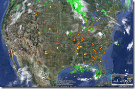
FIRMs online map of the past 7 days: 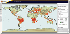
Also, apparently the fires are emitting dangerous amount of CO2 and may be radioactive: 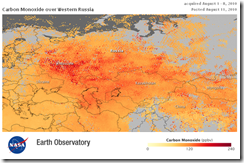
Google’s Widening Reach (1998-2010)
11 Aug 2010Personal Finance Advice on Napkins
10 Aug 2010Napkins are not where you would expect to find good financial advice, but when they come from the New York Times they are worth reading (and each is linked to a related blog post).
Foursquare Visualization
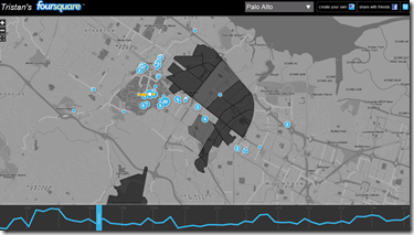
10 Aug 2010I haven’t gotten the Foursquare bug yet, but some of you may be interested in this map-based visualization of you and your friends. (The authors’ blog).
How Not to Take Ugly Portraits
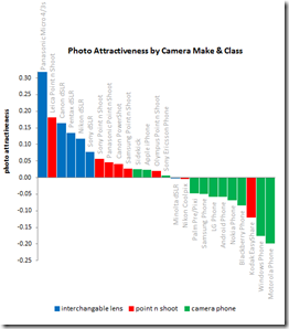
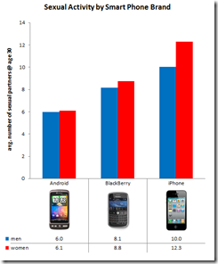
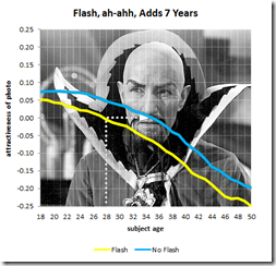
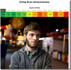
10 Aug 2010OkCupid is at it again. This time comparing user attractiveness to photo EXIF data. Findings? Panasonics will make you look better than Canons or Nikons. Iphone users have more sex. Using a flash adds 7 years to your appearance. Lower f-stops make you prettier. Taking pictures during the “golden hour” is not a myth. Have I mentioned that I love that blog?!?
History of Communication
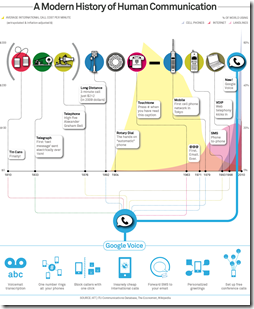
10 Aug 2010This infographic is intriguing because the most interesting part: the graph of call costs is hidden behind the jumble of labels – I didn’t even notice it until Ben Edmonds pointed it out. For the heck of it, I’ve also linked to other communication timelines.
Church Attendance and Liars
9 Aug 2010A simple chart showing the percentage of europeans that never attend religious services. FYI, similar polls put the USA at 40%. But apparently, most people lie about this when asked.
2010 Social Networking Map
In: Internet/tech Maps
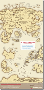
9 Aug 2010An update of xkcd’s 2007 map, this one by Flowtown. It’s interesting to see what they consider to be “social networking” (besides facebook and twitter).
Death Fees
In: Culture
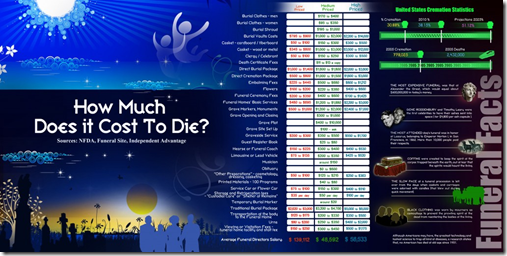
9 Aug 2010Seems appropriate for a monday morning: A look at the costs associated with funerals. For the record, please roll my corpse into a hole in the woods and spend the money celebrating being alive.
The Breakfast Index
5 Aug 2010Commodity prices are on the rise again. The Economist picked a pretty recent base year for this graph of wheat, orange juice, and coffee prices – a longer trend would have shown the big ups and downs of the past few years.
How Pitchers Dominate
4 Aug 2010Two cool analyses (even if you don’t care about baseball) of how Mariano Rivera and Stephen Strasbourg pitch. You have to wonder what kinds of similar work team scouts do behind the scenes.
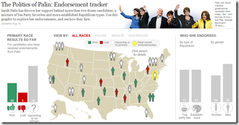
As much as I hate to draw more attention to anything this woman has to say, I thought some of you wonks might find this interesting in the run-up to this November.
To counterbalance the bad taste that left in my throat, I’ll give another shoutout to the WashPost’s overall Campaign tracker, which is excellent:
Whales
In: Environment/weather Graphic Design (general) Interactive Maps Science
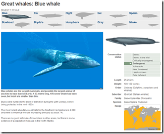
4 Aug 2010A well designed and simple interactive of the 10 “great” whale species. It conveys images, scale, history, endangered status, and region all on one screen.
What is Chart Porn?
An addictive collection of beautiful charts, graphs, maps, and interactive data visualization toys -- on topics from around the world.
Categories
- Bailout (118)
- Chartporn Related (3)
- Commentary (21)
- Culture (669)
- Emerging Markets (66)
- Employment (245)
- Environment/weather (133)
- Finance (298)
- Food (92)
- Global Economy (373)
- Graphic Design (bad) (26)
- Graphic Design (general) (183)
- Graphic Tools (23)
- History (158)
- Housing (162)
- Humor (204)
- Innovative (183)
- Interactive (545)
- Internet/tech (97)
- Maps (578)
- News Media (34)
- Politics (329)
- Reference (97)
- Science (331)
- Source: Economist (101)
- Source: FT (92)
- Source: NYT (147)
- Source: Ritholtz (76)
- Source: USA Today (27)
- Source: Washington Post (90)
- Source: WSJ (135)
- Sports (58)
- Stock Market (74)
- Uncategorized (2)
- Updated regularly (76)
- US Economy (553)
- Video (22)
- Aram Korevaar: This chart is now being used as a projection in which countries such as China see themselves as in a [...]
- David: Welcome back Chart Porn! [...]
- J S: Thanks for the great story. Miss reading this blog. Hope to see you more active again. [...]
- jake: I lived in a DC row house for 6 years, and I'm writing this comment from my tiny 1 bedroom apartment [...]
- ronny pettersen: Hilarious and unfortunately accurate... ;-) [...]


