Bankruptcies Back on the Rise
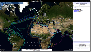
19 Aug 2010Undersea Cable Map
19 Aug 2010The information isn’t terribly interesting, but this interactive Bing-based map of undersea communications cables is a nice example of what can be done with public data and a little hard work. (Thanks to mapgirl for the link!)
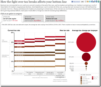
Bush’s Tax Cuts by the Numbers
18 Aug 2010A very well done interactive of how people will be affected by the expiration of the 2001/03 tax breaks, as well as a what Obama is proposing.
China Leads World in Beer Consumption
In: Food Global Economy Maps
18 Aug 2010Forget GDP, China now drinks more beer than either the US or Europe, and is growing by 10 percent a year.
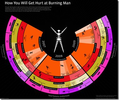
How You Will Get Hurt at Burning Man
In: Culture
17 Aug 2010A graph of the injury reports from the past three years of the Burning Man arts festival. (Thanks to Sean R for spotting it!)
History of GDP (1-2008)
17 Aug 2010Data compiled by Angus Maddison, an economist who died earlier this year, suggest that China and India were the biggest economies in the world for almost all of the past 2000 years. Why they fell so far behind may be more of a mystery than why they are currently flourishing.
(ps – the comments at the Economist are worth the read)
30 Creative Wedding Invitations
17 Aug 2010A collection of novel wedding invitation designs. Does anyone really send the embossed letter anymore?
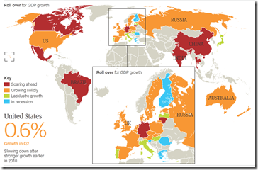
Recession Recovery Map
16 Aug 2010The History of Social Security
16 Aug 2010Roll over the timeline to see how funding, eligibility, and benefits have changed over the last 75 years. However, I think AP got the beneficiaries numbers completely wrong – the 2009 total is more like 52 million (source).
Correct graph:
Why do Video Game Movies Keep Getting Made?
In: Culture
16 Aug 2010A comparison of Rotten Tomatoes ratings, production costs, and revenue. A baseline of other movie genres would be interesting – and where’s Mortal Kombat? 🙂
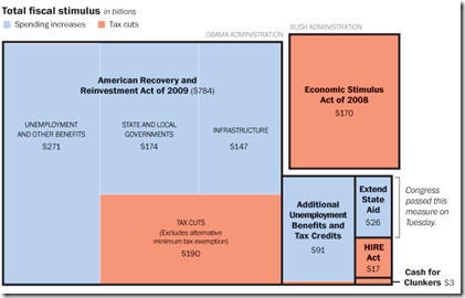
US Fiscal Stimulus
12 Aug 2010Includes the recent $26 billion state aid package. Related article.
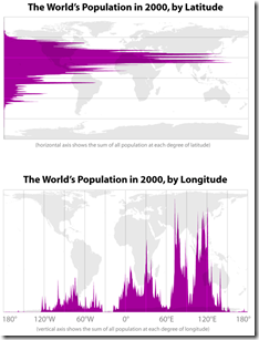
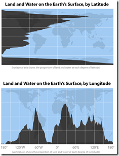
Latitude and Longitude
In: Maps
12 Aug 2010Interesting cartographic analysis by Bill Rankin. (via)
The Yankees Rock!
In: Sports
11 Aug 2010Nicely executed infographic on how much the Yankees have dominated baseball. (via)
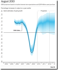
England’s Poor GDP Projections
11 Aug 2010Animated timeline of BOE’s fan projections. I think they should have included some “shadow” of the earlier projections to illustrate just how far off they were. A longer time frame would have been nice to show whether they were as inaccurate during non-recession periods.
What is Chart Porn?
An addictive collection of beautiful charts, graphs, maps, and interactive data visualization toys -- on topics from around the world.
Categories
- Bailout (118)
- Chartporn Related (3)
- Commentary (21)
- Culture (669)
- Emerging Markets (66)
- Employment (245)
- Environment/weather (133)
- Finance (298)
- Food (92)
- Global Economy (373)
- Graphic Design (bad) (26)
- Graphic Design (general) (183)
- Graphic Tools (23)
- History (158)
- Housing (162)
- Humor (204)
- Innovative (183)
- Interactive (545)
- Internet/tech (97)
- Maps (578)
- News Media (34)
- Politics (329)
- Reference (97)
- Science (331)
- Source: Economist (101)
- Source: FT (92)
- Source: NYT (147)
- Source: Ritholtz (76)
- Source: USA Today (27)
- Source: Washington Post (90)
- Source: WSJ (135)
- Sports (58)
- Stock Market (74)
- Uncategorized (2)
- Updated regularly (76)
- US Economy (553)
- Video (22)
- Aram Korevaar: This chart is now being used as a projection in which countries such as China see themselves as in a [...]
- David: Welcome back Chart Porn! [...]
- J S: Thanks for the great story. Miss reading this blog. Hope to see you more active again. [...]
- jake: I lived in a DC row house for 6 years, and I'm writing this comment from my tiny 1 bedroom apartment [...]
- ronny pettersen: Hilarious and unfortunately accurate... ;-) [...]


