College Ranking Methodologies
In: Employment
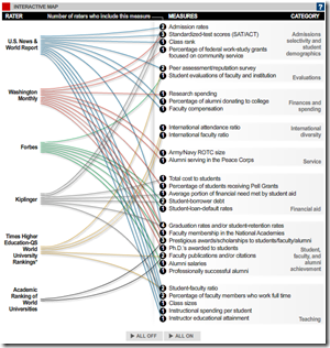
15 Sep 2010Speaking of college – here’s a comparison of six different college ratings. These probably would have been more useful a few months ago, eh?
How Americans Pay for College
In: Employment US Economy
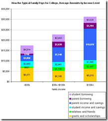
15 Sep 2010Interesting variations by income level. (via)
Breaking the Glass Ceiling
In: Culture Employment
14 Sep 2010Young single women in the majority of America’s largest cities are now earning more than their male peers. (Related Time article; NPR report)
US Energy Use 2009
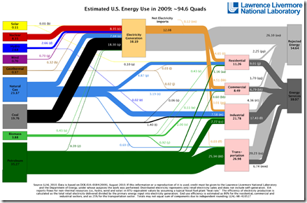
14 Sep 2010A nice sankey diagram. Americans used less energy overall due to the combined effects of the economic slowdown and increased efficiency. News release. Thanks to Terrance Kean for pointing it out.
Pentagon Procurement
14 Sep 2010Ok, this system certainly looks like a mess, but I have to admit that the chart is not as badly designed as it might first appear.
Financial Stress (1981-2009)
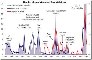
13 Sep 2010Interesting graph of global financial crises. I can’t tell why it has two different axis, though. I suppose the data is from the IMF’s Financial Stress Index.
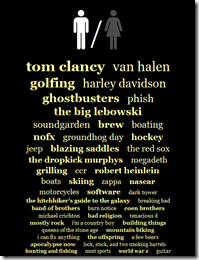
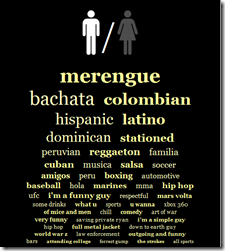
Okcupid has beautifully abused their users’ profiles again for some entertaining statistical analysis. This time they extracted unique keywords from profile description by race – and as usual, the commentary is priceless:
If I had to choose over-arching themes for white people’s lists, for men, I’d go with "frat house" and for women, "escapism." Whether one begot the other is a question I’ll leave to the reader.
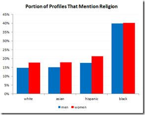
Some other interesting profile content analysis:
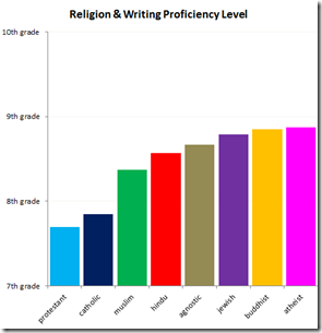
Exhibited writing proficiency vs religion:
Faith and Poverty
In: Culture
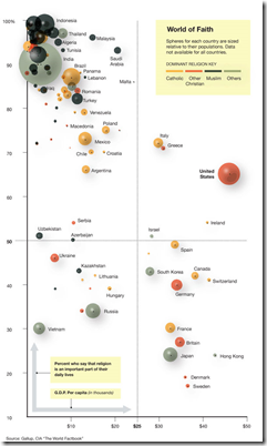
10 Sep 2010Faith is heavily correlated with poverty – with the United States being a very notable exception. (via/via, original poll)
Global Competitiveness Report 2010-11
In: Employment Finance Global Economy Interactive Maps Politics Updated regularly
10 Sep 2010The World Economic Forum has a number of interactive tools for examining the results of it’s Global Competitiveness Report. You can view the aggregate index or any of the many (very interesting) sub-components as maps, bar charts, scatter plots, rankings, or individual profiles. FYI – The United States has slipped from 2nd to 4th overall.
Trail Maps and Trips
In: Maps
9 Sep 2010Backpacker Magazine’s Destinations tool (based on Trimble Outdoors) lets you find free detailed information on hiking and biking trails across the country. You can read descriptions, view photos, print out topo maps, download gpx waypoints, filter by hike/bike/run, and even post your own trips. The “quick search” can be a little janky, bringing up only Backpacker trips – use the zip code search for the best results.
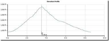
Below is the topo and elevation profile for Old Rag Mountain – one of the best hikes on the east coast:
Your Pants are Lying to You
In: Culture
7 Sep 2010Sugar Water Companies
In: Food Global Economy
22 Aug 2010A wonderful (and quite detailed) visualization of the wide world business of sugar water. (via)
Movie Sequels: Best to Worst
In: Culture
22 Aug 2010Can We Date?
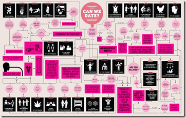
20 Aug 2010A detailed flowchart on whether it is socially acceptable for two people to date. (via Flowingdata)
What is Chart Porn?
An addictive collection of beautiful charts, graphs, maps, and interactive data visualization toys -- on topics from around the world.
Categories
- Bailout (118)
- Chartporn Related (3)
- Commentary (21)
- Culture (669)
- Emerging Markets (66)
- Employment (245)
- Environment/weather (133)
- Finance (298)
- Food (92)
- Global Economy (373)
- Graphic Design (bad) (26)
- Graphic Design (general) (183)
- Graphic Tools (23)
- History (158)
- Housing (162)
- Humor (204)
- Innovative (183)
- Interactive (545)
- Internet/tech (97)
- Maps (578)
- News Media (34)
- Politics (329)
- Reference (97)
- Science (331)
- Source: Economist (101)
- Source: FT (92)
- Source: NYT (147)
- Source: Ritholtz (76)
- Source: USA Today (27)
- Source: Washington Post (90)
- Source: WSJ (135)
- Sports (58)
- Stock Market (74)
- Uncategorized (2)
- Updated regularly (76)
- US Economy (553)
- Video (22)
- Aram Korevaar: This chart is now being used as a projection in which countries such as China see themselves as in a [...]
- David: Welcome back Chart Porn! [...]
- J S: Thanks for the great story. Miss reading this blog. Hope to see you more active again. [...]
- jake: I lived in a DC row house for 6 years, and I'm writing this comment from my tiny 1 bedroom apartment [...]
- ronny pettersen: Hilarious and unfortunately accurate... ;-) [...]












Beware of Greeks Bearing Bonds
In: Commentary Global Economy
13 Sep 2010I rarely post articles that are not graphics related, but Michael Lewis qualifies for the occasional exception by offering remarkable insights into financial and economic issues. Read this article if you want to understand the Greek crisis in a very accessible and hilarious way.