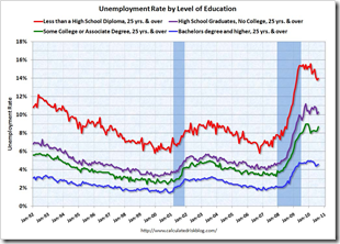
Stay in School
In: Employment
21 Sep 2010Saturday Morning Cartoons (1966-88)
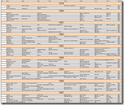
21 Sep 2010The website is not the prettiest, and they skip a lot of the 80s, but looking at the annotated timeline I can literally remember how I got off the couch and switched channels each year.
Here’s an un-annotated version, covering 1979-1990 – sourced from TV guides:
and one for the 90s.
Your Coming Tax Cut (or not)
20 Sep 2010A very nice analysis from the New York Times – as usual. (via)
Job Happiness Index
19 Sep 2010Marijuana Price Map
19 Sep 2010The data is crowdsourced by consumer submissions. Amusing and interesting. (via)
Update: European Economic Weather Map
19 Sep 2010Topographic Map of the Moon
In: Maps
19 Sep 2010The map was created using data from NASA’s Lunar Reconnaissance Orbiter that has been circling the moon since June 2009. The orbiter measured the height of the surface by sending billions of laser pulses towards the surface and measuring the time it took for the pulses to return. The method is precise enough it would have been able to detect a small house if there were one
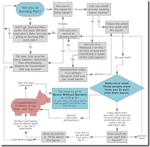
How to Get Bacon at Burning Man
16 Sep 2010Tea Party Demographics
16 Sep 2010Who supports the tea party? (entire poll)
I’m not a huge fan of these infographics that are just numbers and clipart, but the name of the blog is ChartPORN — so I suppose I have to post it anyway.
This is Your Brain on Drugs
15 Sep 2010A new study visualizes the effects of drug use on your brain using SPECT scans. Interesting — though the footnote “colors do not have significant meaning” dilutes the impact quite a bit.
Still, it’s an improvement over what we were taught in the 80s:
Web Icons
In: Internet/tech
15 Sep 2010You know those little icons that appear next to your bookmarks? Well, someone threw all those little 80×80 ico files together, resizing them by popularity. You can search for your site and zoom in. (via Flowing Data)
SAT Scores (1972-2010)
15 Sep 2010What is Chart Porn?
An addictive collection of beautiful charts, graphs, maps, and interactive data visualization toys -- on topics from around the world.
Categories
- Bailout (118)
- Chartporn Related (3)
- Commentary (21)
- Culture (669)
- Emerging Markets (66)
- Employment (245)
- Environment/weather (133)
- Finance (298)
- Food (92)
- Global Economy (373)
- Graphic Design (bad) (26)
- Graphic Design (general) (183)
- Graphic Tools (23)
- History (158)
- Housing (162)
- Humor (204)
- Innovative (183)
- Interactive (545)
- Internet/tech (97)
- Maps (578)
- News Media (34)
- Politics (329)
- Reference (97)
- Science (331)
- Source: Economist (101)
- Source: FT (92)
- Source: NYT (147)
- Source: Ritholtz (76)
- Source: USA Today (27)
- Source: Washington Post (90)
- Source: WSJ (135)
- Sports (58)
- Stock Market (74)
- Uncategorized (2)
- Updated regularly (76)
- US Economy (553)
- Video (22)
- Aram Korevaar: This chart is now being used as a projection in which countries such as China see themselves as in a [...]
- David: Welcome back Chart Porn! [...]
- J S: Thanks for the great story. Miss reading this blog. Hope to see you more active again. [...]
- jake: I lived in a DC row house for 6 years, and I'm writing this comment from my tiny 1 bedroom apartment [...]
- ronny pettersen: Hilarious and unfortunately accurate... ;-) [...]

