Penis Size Preference Chart
In: Culture
29 Sep 2010The Penis Size preference Chart is a graph showing virtually all the possible combinations of penis length and penis girth in 1/4 inch intervals. For each combination it lists the matching grade of women’s preference (A to E), stating its ability to satisfy the average woman.
Ok, the chart below is SFW but the page it comes from isn’t. If you want to see the original chart click the image below. If you want to see the detailed explanation on the (slightly odd) original webpage click here.
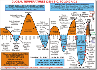
Global Warming Explained(?)
29 Sep 2010I post a lot of charts establishing that industrialization is causing global warming — it’s only fair to share one that gives an alternative explanation. Of course, it would be more convincing if it included a scale. (here’s a big discussion of it)
Israeli Settlements (1990-2010)
27 Sep 2010From the Economist, a graph of public and private settlements. From the BBC, a map of the settlements and a summary of previous peace talks. note: we posted a (slightly better) WSJ settlement map in Feb.
Bank Failures
27 Sep 2010Interactive map of banks that have been shut down in 2010. You can also resize markers by metrics such as total deposits, number of branches, or cost to FDIC. The related WSJ article is very depressing to read.
Rap and Beer
27 Sep 2010The Pop Chart Lab is selling two well designed posters showing the taxonomies of Beer and Rap names.
Swear Word Modifiers
27 Sep 2010Update: Economic Indicators Dashboard
In: Employment Finance Housing Interactive Updated regularly US Economy
24 Sep 2010One of my favorite summaries of economic indicators. Click on any of the “historical details” to see what each indicator means and why it’s important. Updated 9/22/10.
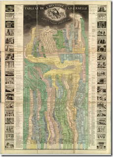
Tableau De L’Histoire Universelle
In: History
24 Sep 2010A beautifully drawn timeline of history, from creation to 1858 (when it was published). Very impressive..
Yummy Yummy Fall
24 Sep 2010Some seasonal interactive toys: Why the seasons happen? Why the leaves change color and fall? How to make maple syrup? and a couple of foilage peak maps.
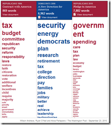
Political Pledges
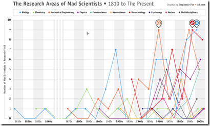
24 Sep 2010Mad Scientists: Areas of Study
23 Sep 2010American Stress
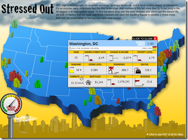
23 Sep 2010Interactive map of stress based on unemployment, change in income, poverty, sunshine, ozone, crime, and cost of living.
We’re All Stupid
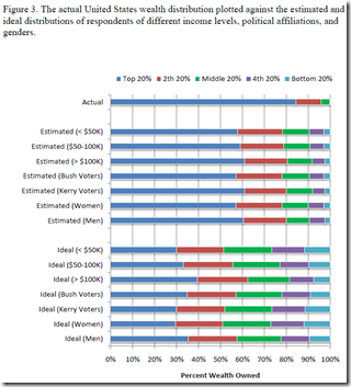
23 Sep 2010Actual wealth distribution versus what people think it is. (via)
This reminded me of a survey the Washington Post did a while ago which compared the ethnic distribution of the USA to what different ethnic groups thought it was – everyone got that horribly wrong too. Quick test: what percent of the population is White, Black, and Asian? Highlight the next line for the answer:
White: 75% Black: 12% Asian: 3.6% (2000 Census)
Even When you Own, You’re Really Renting
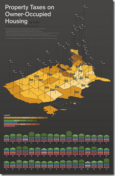
23 Sep 2010Property taxes nation-wide. Uses “median property tax paid” rather than the actual tax rate, so might be saying more about the size and value of houses in that state rather than the tax differential.
WWI-II Economics and Design
In: Culture Graphic Design (general) History Politics Science
21 Sep 2010What is Chart Porn?
An addictive collection of beautiful charts, graphs, maps, and interactive data visualization toys -- on topics from around the world.
Categories
- Bailout (118)
- Chartporn Related (3)
- Commentary (21)
- Culture (669)
- Emerging Markets (66)
- Employment (245)
- Environment/weather (133)
- Finance (298)
- Food (92)
- Global Economy (373)
- Graphic Design (bad) (26)
- Graphic Design (general) (183)
- Graphic Tools (23)
- History (158)
- Housing (162)
- Humor (204)
- Innovative (183)
- Interactive (545)
- Internet/tech (97)
- Maps (578)
- News Media (34)
- Politics (329)
- Reference (97)
- Science (331)
- Source: Economist (101)
- Source: FT (92)
- Source: NYT (147)
- Source: Ritholtz (76)
- Source: USA Today (27)
- Source: Washington Post (90)
- Source: WSJ (135)
- Sports (58)
- Stock Market (74)
- Uncategorized (2)
- Updated regularly (76)
- US Economy (553)
- Video (22)
- Aram Korevaar: This chart is now being used as a projection in which countries such as China see themselves as in a [...]
- David: Welcome back Chart Porn! [...]
- J S: Thanks for the great story. Miss reading this blog. Hope to see you more active again. [...]
- jake: I lived in a DC row house for 6 years, and I'm writing this comment from my tiny 1 bedroom apartment [...]
- ronny pettersen: Hilarious and unfortunately accurate... ;-) [...]


