Update: Wall Street Compensation
In: Employment Finance Interactive Source: WSJ Stock Market US Economy
12 Oct 2010Explore what percentage of revenue at Wall Street firms goes to compensation. Updated with 2010 data.
Who Owns Congress
In: Politics
12 Oct 2010A seating chart of the Senate and House, organized by who they have accepted the most campaign contributions from. The person by person descriptions are interesting.
Gay Sex vs Straight Sex
12 Oct 2010OkTrends has analyzed it’s database of user behavior to examine several rumors about homosexual behavior, compared to heterosexuals. Not surprisingly, none of them are true. The whole article is fascinating.
From Wolves to Dogs
In: Science
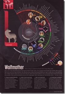
12 Oct 2010A timeline of dog breeds. (originally produced by AWH).
Google Election Maps
In: Interactive Maps Politics
12 Oct 2010The New Campaign Money Paradigm
In: Politics Source: NYT
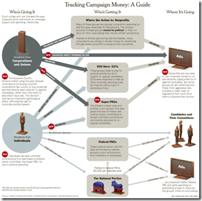
12 Oct 2010The Supreme Court’s ruling on contributions last year is having a strong impact on how money is flowing into elections this year – but it’s not the only reason spending has doubled since 2006. Related article.
Average Expenses
In: Culture Employment
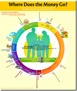
7 Oct 2010Where does your paycheck go? Survey numbers lay out the 2010 averages. (note: I am apparently soooo not average)
Map: Online Communities
In: Culture Internet/tech Maps
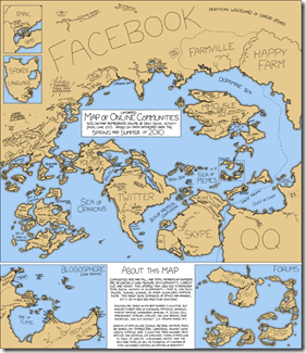
7 Oct 2010Another beautiful thematic map from xkcd.
The Mobile Industry: Who Suing Who
In: Internet/tech
5 Oct 2010Rolling up TARP
4 Oct 2010A summary of the infamous Troubled Asset Relief Program. (via)
Poverty and Food
4 Oct 2010An interesting radial variation on a scatter plot, displaying multiple variable from 50 states. It’s . (via the promising new visualization site Visualizing.org)
Who to Vote For?
In: Interactive Politics
2 Oct 2010Vote Easy is a pretty smooth interactive voting guide. You select your state/zip then answer a series of questions on 12 different issues to see which candidates most agree with you. Then you can drill down to pictures and detailed candidate profiles. The questions are a bit simplistic, and they are missing some states (and DC) at the moment – but this could grow into a very useful tool. (via)
State Debt
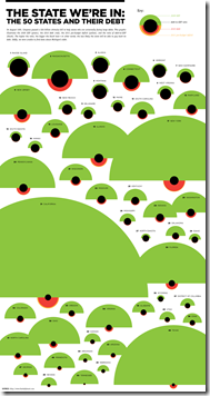
30 Sep 2010Interesting presentation of multiple debt related indicators. The alien invasion look is a bit strong, but they did refrain from including red circles and having them all look like ladybugs – just sayin.
Fly Me! Airlines 1975-2010
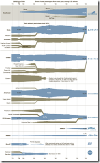
30 Sep 2010A typically cool graphic from the NYT showing the births, deaths, assimilations, and growth of airlines since the 1970s.
Music Preference by Gender
In: Culture
29 Sep 2010Based on listening habits of Last.fm users. (via FlowingData)
What is Chart Porn?
An addictive collection of beautiful charts, graphs, maps, and interactive data visualization toys -- on topics from around the world.
Categories
- Bailout (118)
- Chartporn Related (3)
- Commentary (21)
- Culture (669)
- Emerging Markets (66)
- Employment (245)
- Environment/weather (133)
- Finance (298)
- Food (92)
- Global Economy (373)
- Graphic Design (bad) (26)
- Graphic Design (general) (183)
- Graphic Tools (23)
- History (158)
- Housing (162)
- Humor (204)
- Innovative (183)
- Interactive (545)
- Internet/tech (97)
- Maps (578)
- News Media (34)
- Politics (329)
- Reference (97)
- Science (331)
- Source: Economist (101)
- Source: FT (92)
- Source: NYT (147)
- Source: Ritholtz (76)
- Source: USA Today (27)
- Source: Washington Post (90)
- Source: WSJ (135)
- Sports (58)
- Stock Market (74)
- Uncategorized (2)
- Updated regularly (76)
- US Economy (553)
- Video (22)
- Aram Korevaar: This chart is now being used as a projection in which countries such as China see themselves as in a [...]
- David: Welcome back Chart Porn! [...]
- J S: Thanks for the great story. Miss reading this blog. Hope to see you more active again. [...]
- jake: I lived in a DC row house for 6 years, and I'm writing this comment from my tiny 1 bedroom apartment [...]
- ronny pettersen: Hilarious and unfortunately accurate... ;-) [...]


