Scale of the Universe
In: Interactive Science
22 Oct 2010Why People Drink as They Get Older
In: Humor
22 Oct 2010Currency Wars Explained
21 Oct 2010The FT has an interactive feature explaining the latest financial mainstream media buzz-word, and tracking individual country actions. Related articles.
note: some FT articles require a subscription.
Balance the UK Budget
In: Interactive Politics
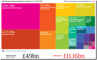
21 Oct 2010A cool interactive treemap tool lets you suggest what programs to cut in each spending category. (kind of like this one from the spring). This type of presentation should be a standard component in all accounting software.
Varieties of Intimate Relationships
In: Culture
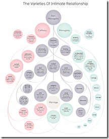
21 Oct 2010Some interesting distinctions, from Informationisbeautiful and Franklin Veaux.
Homebuyer Tax Credits
21 Oct 2010Personally, I don’t know why we’re still subsidizing homebuying. (via Ritholtz, who points out per-capita would probably have been more useful)
NBA Schedule 2010
In: Sports
20 Oct 2010Alternative Medicine Flowchart
19 Oct 2010Science Subway Map
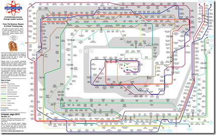
19 Oct 2010I’m getting pretty sick of subway style maps (when used for anything other than a subway), but this one is actually pretty good.
Some fantastic graphics over at Crispian Jago’s blog. First up, the Periodic Table of Irrational Nonsense:
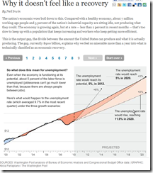
A nice animated/annotated series of charts explaining the output gap and its effects on unemployment.
Obama is a Gay Mexican Gangster Terrorist
In: Politics
15 Oct 2010As evidenced by the below Colorado billboard, the imagery rhetoric is getting a bit ridiculous. I am only surprised that they somehow missed putting a nazi or sickle/hammer in there somewhere. On the other hand, it is a classic demonstration of the strong emotional response that images and design can evoke.
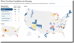
Tea Party Faces, Beefs, and Races
In: Interactive Maps Politics
15 Oct 2010Faces and names, organized loosely by their complaints. Also, a map of where they are running and what the polls are saying.
Our Old Congress
13 Oct 2010What is Chart Porn?
An addictive collection of beautiful charts, graphs, maps, and interactive data visualization toys -- on topics from around the world.
Categories
- Bailout (118)
- Chartporn Related (3)
- Commentary (21)
- Culture (669)
- Emerging Markets (66)
- Employment (245)
- Environment/weather (133)
- Finance (298)
- Food (92)
- Global Economy (373)
- Graphic Design (bad) (26)
- Graphic Design (general) (183)
- Graphic Tools (23)
- History (158)
- Housing (162)
- Humor (204)
- Innovative (183)
- Interactive (545)
- Internet/tech (97)
- Maps (578)
- News Media (34)
- Politics (329)
- Reference (97)
- Science (331)
- Source: Economist (101)
- Source: FT (92)
- Source: NYT (147)
- Source: Ritholtz (76)
- Source: USA Today (27)
- Source: Washington Post (90)
- Source: WSJ (135)
- Sports (58)
- Stock Market (74)
- Uncategorized (2)
- Updated regularly (76)
- US Economy (553)
- Video (22)
- Aram Korevaar: This chart is now being used as a projection in which countries such as China see themselves as in a [...]
- David: Welcome back Chart Porn! [...]
- J S: Thanks for the great story. Miss reading this blog. Hope to see you more active again. [...]
- jake: I lived in a DC row house for 6 years, and I'm writing this comment from my tiny 1 bedroom apartment [...]
- ronny pettersen: Hilarious and unfortunately accurate... ;-) [...]


