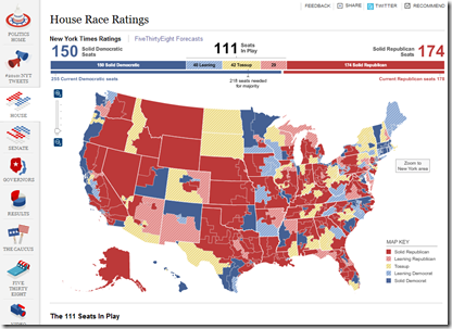
Election Forecast Map
1 Nov 2010Interactive map of forecasts from the NYT’s FiveThirtyEight blog, covering all the races. (via Ritholtz)
Chinese Imports
In: Global Economy Maps
29 Oct 2010CHINA is now the biggest export market for countries as far afield as Brazil (accounting for 12.5% of Brazilian exports in 2009), South Africa (10.3%) Japan (18.9%) and Australia (21.8%). Each surge or wobble in China’s economy has a material impact in these places.
Visual Survey of Tree Visualization
29 Oct 2010I can’t say that I understand all the differentiations being made here, but it’s a treasure trove of examples to feed your creativity-rolodex. (via)
Sex in the USA
29 Oct 2010Flowingdata had a design contest this week based on data from the National Survey of Sexual Health and Behavior. Here are some of the interesting results:
Deaths in Iraq
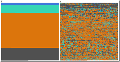
29 Oct 2010An interesting example of how completely different data can look when visualized over time versus when it is categorized.
Blue = *Friendly*, Green = *Host* Nation, Orange = Civilians, Grey = Enemies.
First one is function of sum, second one is function of time, or how you can dilute the media impact of a massacre by killing a few people each day for 6 years.
Based on the Guardian’s analysis of the Wikileaks data.
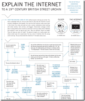
Explain the Internet to a 19th c. Street Urchin
In: Internet/tech
27 Oct 2010“You do not really understand something unless you can explain it to your grandmother” – Albert Einstein
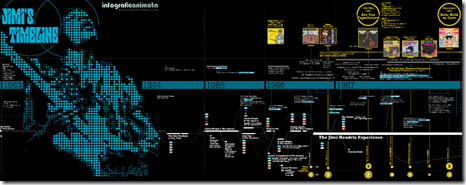
Jimi Hendrix Timeline
In: Culture
26 Oct 2010Updated: Periodic Table of Irrational Nonsense
25 Oct 2010Update: The State of the Economy
25 Oct 2010October’s update of the Economic Indicators Dashboard:
and while we’re at it, here is the AP’s Economic Stress Map, which shows unemployment, foreclosures, and bankruptcies from 2007-today, by county.
Facebook Portrait Interpretation
24 Oct 2010This chart will hopefully help you view specific Facebook portraits within the context of the larger genre, and therefore lead to a richer, more complex appreciation of Facebook portraiture as an emerging form of banal, eye-numbing expression.
Thanks to Tom Dawkins for the link.
Share Your Stuff
In: Internet/tech Science
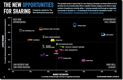
23 Oct 2010A matrix of potential sharing businesses. Full report.
American Poverty
In: Employment Maps US Economy
22 Oct 2010And keep in mind that the “poverty rate” for a single person is less than $11,000. In other words, the majority of us should be skipping happily to work in the morning instead of popping prozac and lamenting our “tough” lives. Thanks to Kelly Brooks for the link.
Hipmunk: Visual Airline Reservations
22 Oct 2010Some airlines (Southwest and Jetblue) have made choosing flights an almost pleasant experience by clearly presenting available flights and costs — most other airlines still suck. Hipmunk is a new flight search tool which applies some simple design techniques to aggregate options clearly. I also love that they have a “sort by agony” option which combines price, duration, and layovers. (via FlowingData)
What is Chart Porn?
An addictive collection of beautiful charts, graphs, maps, and interactive data visualization toys -- on topics from around the world.
Categories
- Bailout (118)
- Chartporn Related (3)
- Commentary (21)
- Culture (669)
- Emerging Markets (66)
- Employment (245)
- Environment/weather (133)
- Finance (298)
- Food (92)
- Global Economy (373)
- Graphic Design (bad) (26)
- Graphic Design (general) (183)
- Graphic Tools (23)
- History (158)
- Housing (162)
- Humor (204)
- Innovative (183)
- Interactive (545)
- Internet/tech (97)
- Maps (578)
- News Media (34)
- Politics (329)
- Reference (97)
- Science (331)
- Source: Economist (101)
- Source: FT (92)
- Source: NYT (147)
- Source: Ritholtz (76)
- Source: USA Today (27)
- Source: Washington Post (90)
- Source: WSJ (135)
- Sports (58)
- Stock Market (74)
- Uncategorized (2)
- Updated regularly (76)
- US Economy (553)
- Video (22)
- Aram Korevaar: This chart is now being used as a projection in which countries such as China see themselves as in a [...]
- David: Welcome back Chart Porn! [...]
- J S: Thanks for the great story. Miss reading this blog. Hope to see you more active again. [...]
- jake: I lived in a DC row house for 6 years, and I'm writing this comment from my tiny 1 bedroom apartment [...]
- ronny pettersen: Hilarious and unfortunately accurate... ;-) [...]














How Stupid is it to Buy a Diamond?
In: Commentary Culture History
29 Oct 2010This classic Atlantic article explains in detail how the USA was manipulated into thinking diamond rings are a classy expression of your love – when in fact they are just a ripoff. While reading it I couldn’t help but see multiple parallels to what happened to the housing market and the “american dream”.
Here is a chart of diamond prices, 1960-2010: