Sensory Mapping Timeline
10 Nov 2010An interesting way to map out an experience of positive/negative feelings across all five senses. (via)
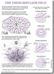
The Graduate Thesis Repulsor Field
10 Nov 2010The Thesis Repulsor Field is characterized by an attractor vector field directed towards completion, but accompanied by an intensive repulsive singularity at the center. Thanks to Claire for the link.
iPhone vs Android vs Blackberry
In: Humor Internet/tech
6 Nov 2010A hilarious look at how different phone users view each other. Thanks to Stephen Dobson for pointing it out.
I don’t care much for this style of infographic nowadays, but this one managed to hold my attention – something about actually using interesting information and the retro style graphics, I think.
Linkbait
In: Internet/tech
4 Nov 2010I didn’t know there was a term for all the infographics out there that largely serve no other purpose than to draw people to a site. Here’s a pretty darn good infographic explaining how linkbait works. (and yes, I totally fell for the bait. Here, fishy fishy!)
Who Voted for Who
In: Politics
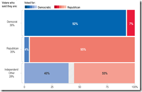
4 Nov 2010A look at votes broken down by party, income, gender, education, age, and race (based on exit polling). Some of the results are very interesting: For example, I would have expected the income and education bias to be even higher.
As of today you can tack on another half trillion.
2010 Election Results
3 Nov 2010As usual, the best graphical analysis comes from the New York Times. Click through this map to understand the big shifts in the clearest possible way.
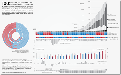
100 Years of US Government and Economy
2 Nov 2010A comprehensive timeline of parties and indicators. (via)
The Burden of Public Debt
2 Nov 2010A pretty slick interactive look at the numbers from the FT (though I’m not sure what some of the subtle animations really accomplish).
(note: Some Financial Times features require a subscription to view)
When your Relationship Will End
In: Culture Internet/tech
2 Nov 2010David McCandless used data from Facebook updates to look at when people break up with each other throughout the year. It looks like people like dating in the winter and being single in the summer – and a lot of people use breakups as an April Fool’s joke.
Prescription for a Sickly Economy
In: Finance Interactive Source: Washington Post Stock Market US Economy
2 Nov 2010Five-part interactive explanation of quantitative easing. My favorite part: “The Fed will likely buy $100s of billions of Treasury bonds using money that it creates out of thin air”
Most Harmful Drugs
1 Nov 2010A new study ranks 20 drugs on 16 measures of harm (both to users and to society). Thanks to Drave Cramer for sending the link.
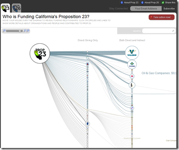
This is an interesting design for examining funding sources using a zoomable SVG network. (by Skye Bender-deMoll)
What is Chart Porn?
An addictive collection of beautiful charts, graphs, maps, and interactive data visualization toys -- on topics from around the world.
Categories
- Bailout (118)
- Chartporn Related (3)
- Commentary (21)
- Culture (669)
- Emerging Markets (66)
- Employment (245)
- Environment/weather (133)
- Finance (298)
- Food (92)
- Global Economy (373)
- Graphic Design (bad) (26)
- Graphic Design (general) (183)
- Graphic Tools (23)
- History (158)
- Housing (162)
- Humor (204)
- Innovative (183)
- Interactive (545)
- Internet/tech (97)
- Maps (578)
- News Media (34)
- Politics (329)
- Reference (97)
- Science (331)
- Source: Economist (101)
- Source: FT (92)
- Source: NYT (147)
- Source: Ritholtz (76)
- Source: USA Today (27)
- Source: Washington Post (90)
- Source: WSJ (135)
- Sports (58)
- Stock Market (74)
- Uncategorized (2)
- Updated regularly (76)
- US Economy (553)
- Video (22)
- Aram Korevaar: This chart is now being used as a projection in which countries such as China see themselves as in a [...]
- David: Welcome back Chart Porn! [...]
- J S: Thanks for the great story. Miss reading this blog. Hope to see you more active again. [...]
- jake: I lived in a DC row house for 6 years, and I'm writing this comment from my tiny 1 bedroom apartment [...]
- ronny pettersen: Hilarious and unfortunately accurate... ;-) [...]


