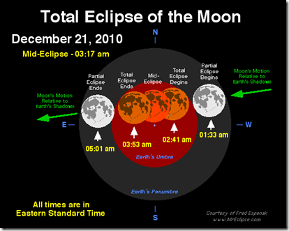
Lunar Eclipse Tonight (Dec 20-21)
In: Science
20 Dec 2010if you are residing in the US particularly in the East Coast, expect to see the lunar eclipse as it begins half an hour after midnight on Tuesday, December 21, 2010. On the West Coast, it begins around 9:30 p.m. PST Monday. In all cases, the whole eclipse will be observable before the moon sets in the west just as the sun is rising in the east. Maximum eclipse is at 3:17 a.m. (via)
For the geekier details check out MrEclipse.com:
Retail Sales by Business
In: Finance Interactive Source: WSJ Updated regularly US Economy
20 Dec 2010A beautiful data visualization of retail sales by type of business. I usually hate stacked bar charts because you really can’t compare what’s happening to any stack except the bottom and the total. The WSJ solves that problem by letting you click on any individual sector, which smoothly animates into a chart of just those bars. Well done! It would be interesting to see this done for the components of GDP.
Update: Philip Izzo pointed out to me that the WSJ’s interactive area chart of the Fed’s balance sheet (below) also allows the same kind of drill-down. In addition, both of these are updated regularly as new data is released.
The Santa Brand
17 Dec 2010Several charts from a hilarious parody of the typical marketing “brand” report. Thanks to Sam Freund for the link.
Bubble Charts: The Right Way
17 Dec 2010Flowingdata points out the right and wrong way to create proportionate circles, using a gaffe from Good to illustrate the point. You are supposed to size them to the AREA of the bubble (square root of the radius).
This is a nice followup to their tutorial last month on how to create bubble scatter diagrams in R (which also is a nice introduction to R if you’ve never played with it before.
For a more general discussion of bubble charts, try Junk Charts’ many critiques, or this article from Aventine Partners: “Bubble Charts, Good or Bad?”
More Party Animals
16 Dec 2010Ok, I’m swerving off the chart meme a bit — but I love the graphic design of the More Party Animals site.
More Party Animals is an apolitically-political idea of a heartfelt disenchantment with the status quo. As the current system continues to polarize this country, we strongly believe America is in need of a wider selection of political parties.
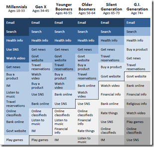
How Different Generations Use the Internet
In: Culture Internet/tech
16 Dec 2010Based on Pew Internet’s 2010 Generations report. (via; Thanks to Rebecca Southers for the link)
DC Commuters
16 Dec 2010Maps of who commutes using public transport, and who has to get up before 7am to make it to work (an odd metric, no?). Related story.
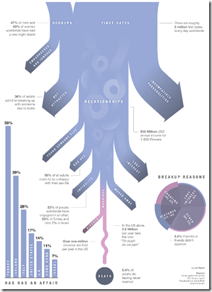
Relationship Death
In: Culture Innovative
16 Dec 2010Battling Tax Agreement Charts
In: Politics
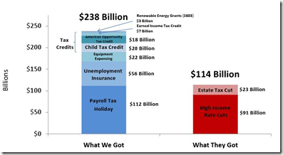
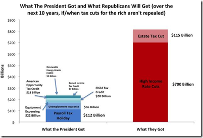
15 Dec 2010A good article by Jonathan Chait comparing two charts on the costs of the proposed tax agreement: one from the White House, and one from Moveon.org. (The difference between the two is whether the tax cuts for the rich are actually allowed to expire in 2012)
White house:
Moveon:
Mapping America
15 Dec 2010The NYT’s has created a huge variety of interactive maps based on the Census Bureau’s American Community Survey. Click on “view more maps” to see different breakdowns (income, race, housing, education). Roll-overs popup details at the county or census area level. Related article.
Here’s the percentage of foreign born population in Washington DC:
Change in income level since 2000:
This one shows how racially divided DC still is (green vs blue)”:
They also used the data for some more detailed analysis, such as “How NYC’s Racial Makeup has changed since 2000” (clockwise from upper left: white, hipanic, asian, black). Related article.
A Decade of Facts and Figures
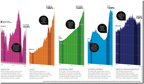
15 Dec 2010I suppose we should prepare ourselves for the inevitable deluge of “end of decade” infographics. The below are from Time Magazine (which also has already compiled 40+ 2010 top ten lists – ick.)
50 Stupidest Passwords
15 Dec 2010You may have heard that Gawker (home of Gizmodo, Lifehacker, and other terrific blogs) had its user database hacked and posted online. The WSJ used that data to take a look at people’s revealed password stupidity.
Map of American Slavery:1860
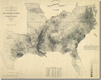
14 Dec 2010Contrary to my expectations, the use of slaves across the pre-civil war South was pretty diverse – as this map and accompanying article in the NYT shows. There is also an interactive version with annotated popups. (via)
Facebook Friends
In: Culture Internet/tech Maps
14 Dec 2010Facebook engineering intern Paul Butler mapped out a global network of 10 million friendships. Some interesting things about the image: there aren’t any country outlines on the map – the countries “appear” as drawn by the network lines themselves; China, Russia, and Brazil are barely visible because they are dominated by non-Facebook social networks
2010 Election: No Mandate
In: Politics
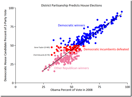
13 Dec 2010If you had one thing, and one thing only, to predict which Democratic House incumbents would lose their seats in 2010, what would you take? The amount of money they raised? Their TARP vote? Their health care vote? Whether they had a Tea Party opponent? A Nazi reenactor opponent?
The best predictor by far is none of those. It is simply how Democratic their district is.
Here is an related entertaining rant about how stupid MSM and Americans are. (thanks to David Cramer for point it out!)
What is Chart Porn?
An addictive collection of beautiful charts, graphs, maps, and interactive data visualization toys -- on topics from around the world.
Categories
- Bailout (118)
- Chartporn Related (3)
- Commentary (21)
- Culture (669)
- Emerging Markets (66)
- Employment (245)
- Environment/weather (133)
- Finance (298)
- Food (92)
- Global Economy (373)
- Graphic Design (bad) (26)
- Graphic Design (general) (183)
- Graphic Tools (23)
- History (158)
- Housing (162)
- Humor (204)
- Innovative (183)
- Interactive (545)
- Internet/tech (97)
- Maps (578)
- News Media (34)
- Politics (329)
- Reference (97)
- Science (331)
- Source: Economist (101)
- Source: FT (92)
- Source: NYT (147)
- Source: Ritholtz (76)
- Source: USA Today (27)
- Source: Washington Post (90)
- Source: WSJ (135)
- Sports (58)
- Stock Market (74)
- Uncategorized (2)
- Updated regularly (76)
- US Economy (553)
- Video (22)
- Aram Korevaar: This chart is now being used as a projection in which countries such as China see themselves as in a [...]
- David: Welcome back Chart Porn! [...]
- J S: Thanks for the great story. Miss reading this blog. Hope to see you more active again. [...]
- jake: I lived in a DC row house for 6 years, and I'm writing this comment from my tiny 1 bedroom apartment [...]
- ronny pettersen: Hilarious and unfortunately accurate... ;-) [...]

