Map: North American Accents, eh?
6 Jan 2011An interesting attempt to map out linguistic differences in the great American melting pot. It’s a bit much to absorb at first, but the more you dig, the more fascinating it is. For example, if you zoom in and click on one of the little dots, you realize that author Rick Aschmann has included links to more than 600 audio file examples of different accents. (via)
Facebook vs Twitter 2010
4 Jan 2011I usually try to avoid Facebook/Twitter infographics because 1) there are too damn many of them; 2) they don’t convey much information; and 3) most of them are badly designed. The one below manages to convey some very interesting comparative information, but I can’t help but think it could be better. Perhaps separating out each indicator so they can be compared side by side instead of constantly jumping back and forth between the two circles? Is this a good example of how graphic designers have to choose between aesthetics and ease of use? Anyone want to take a crack at a do-over?
Top Movies of 2010
In: Culture Interactive
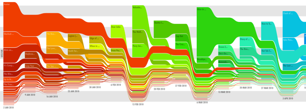
4 Jan 2011A beautiful stream graph of the top 25 movies of 2010, sized by box office gross per week. Created by Zach Beane – his site also includes similar graphs for earlier years. (via)

Economist: Top 20 Charts of 2010
In: Global Economy Graphic Design (general) Interactive Source: Economist
3 Jan 2011Interactive tree map of the top 20 charts viewed on the Economist’s website.
People Who Touch Your Junk Venn
In: Humor
27 Dec 2010Bloodwork Results Re-Visualized
In: Innovative Science
24 Dec 2010Information is Beautiful won a Wired contest to re-design the standard medical bloodwork test results – you know, so you could actually understand what they meant. The result is much easier to understand.
 | to |  |
Life Flowchart: Love-Limbo-Trouble-Denial
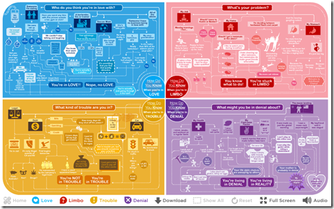
23 Dec 2010Sony pictures sponsored these awesome flowcharts to promote the upcoming movie “How Do You Know”. The best part is you don’t see the whole chart at once – you make your choices, and it reveals just those results (why is this the first time I’ve seen this done!? It’s so simple.). Created by Jetset Studios.
The Bermuda Triangle of Productivity
In: Humor Internet/tech Maps
23 Dec 2010Forget all those “TOP TEN” lists, this pretty much sums up 2010 for me. (via)
Carbon Counting, Global Warming, and Dumbass Comments
In: Environment/weather Science Source: NYT Source: Ritholtz
23 Dec 2010 | The New York Times has an excellent article and accompanying charts about the scientist who first discovered rising CO2 levels. I came across the article via Barry Ritholtz’s blog, where he delivered this lovely bit of snark:
|
Seven Billion People
22 Dec 2010The Economist produced this video explaining population trends using a series of well designed radial diagrams, including the birth of the 7th billion living person, expected in 2011. The surprising part: after ridiculous growth in the past century, things are starting to slow down.
Washington DC Metro Map Distortion
In: Maps
21 Dec 2010A very cool comparison, by Don Whiteside, of Washington DC’s stylized subway map versus what it would look like if the stations were mapped accurately. It’s shocking how different it looks, particularly as it heads out to the suburbs. (related WELOVEDC blog post)
Accurate map with station names:
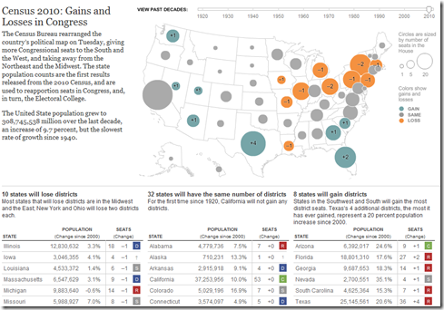
10 states will lose congressional districts (mostly in the northeast) ; 8 will gain (mostly in the south and southwest), and the other 32 will stay the same. The tables below the map show the change in state populations since 2000. You can also use the timeline to view the re-apportionments back to 1920. (related article; related NYT political blog; Census press release)
And the official total? There are 308,745,538 people in the United States.
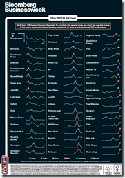
The 2010 Lexicon
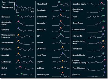
20 Dec 2010Bloomberg mapped out the use of 2010’s buzzwords using sparklines, marking the peaks with some confusing colored dots (there’s a gaga color?!?). Oh, and the chart is sponsored by FourLoko – way to keep it classy, Bloomberg!
Ok, I’m being a little harsh – the charts are actually pretty cool to look through, and the use of sparklines is spot on.
Do It Yourself Climate Change Analysis
20 Dec 2010Kelly O’Day runs a fantastic blog where he takes publicly available datasets and walks you through how to visualize them in excel and R. If you just want to view his personal conclusions on climate change, check out ProcessTrends.
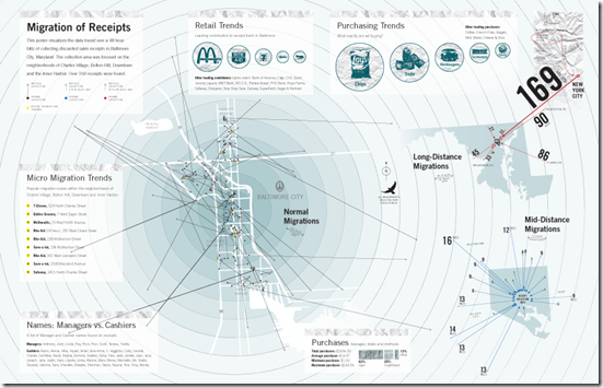
Baltimore Trash Migration
20 Dec 2010Artist Cameron Zotter collected discarded receipts over a 48 hour period and mapped out how far they had traveled. I love the resulting infographic. Note, the image below is linked to Cameron’s site; here is a higher resolution version of the image on Flickr. (via)
FYI, MIT has a higher tech version of this idea, where they tag trash with GSM cellular phone markers that periodically call home with their location:
What is Chart Porn?
An addictive collection of beautiful charts, graphs, maps, and interactive data visualization toys -- on topics from around the world.
Categories
- Bailout (118)
- Chartporn Related (3)
- Commentary (21)
- Culture (669)
- Emerging Markets (66)
- Employment (245)
- Environment/weather (133)
- Finance (298)
- Food (92)
- Global Economy (373)
- Graphic Design (bad) (26)
- Graphic Design (general) (183)
- Graphic Tools (23)
- History (158)
- Housing (162)
- Humor (204)
- Innovative (183)
- Interactive (545)
- Internet/tech (97)
- Maps (578)
- News Media (34)
- Politics (329)
- Reference (97)
- Science (331)
- Source: Economist (101)
- Source: FT (92)
- Source: NYT (147)
- Source: Ritholtz (76)
- Source: USA Today (27)
- Source: Washington Post (90)
- Source: WSJ (135)
- Sports (58)
- Stock Market (74)
- Uncategorized (2)
- Updated regularly (76)
- US Economy (553)
- Video (22)
- Aram Korevaar: This chart is now being used as a projection in which countries such as China see themselves as in a [...]
- David: Welcome back Chart Porn! [...]
- J S: Thanks for the great story. Miss reading this blog. Hope to see you more active again. [...]
- jake: I lived in a DC row house for 6 years, and I'm writing this comment from my tiny 1 bedroom apartment [...]
- ronny pettersen: Hilarious and unfortunately accurate... ;-) [...]


