More Horoscope Nonsense
In: Culture
19 Jan 2011A lovely diagram by Information is Beautiful of the words most commonly used in 22,000 horoscopes, organized by sign. And what do you know, they mostly share the same words!
What Causes Gun Deaths?
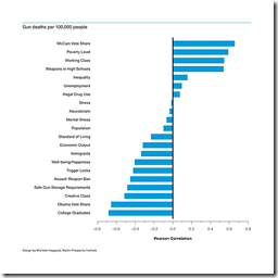
17 Jan 2011Richard Florida and Charlotta Mellander of the Atlantic took a crack at examining the statistical relationship between gun related deaths and several commonly associated causes.
Firearm-related deaths were positively associated with states that voted for McCain (.66) and negatively associated with states that voted for Obama (-.66).
[.] fatal gun violence is less likely to occur in richer states with more post-industrial knowledge economies, higher levels of college graduates, and tighter gun laws. Factors like drug use, stress levels, and mental illness are much less significant than might be assumed.
The authors correctly point out the difference between correlation and causation, and I have problems with some of the indicators used, but this analysis is one step closer to reality than most of the other crap articles floating around our news media lately on this topic. As usual with politically fiery articles like this, the comments are an entertaining read. Thanks to Tom Dawkins for the link!
Movie Sequels: Better or Worse Than Original?
In: Culture Innovative
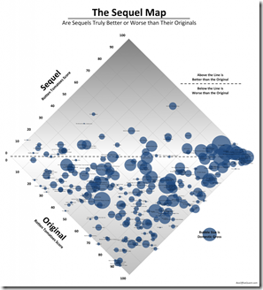
16 Jan 2011Using crowd-sourced ratings from Rotten Tomatoes, this chart puts the original movies on one axis and the sequels on the other. At first the 45 degree rotation threw me off, but the more I stared at it, the more I liked it. It would be interesting to color the circles by decade – I think I see some groupings of bad choices.
The Media Universe
14 Jan 2011It’s surprising to me how often the organizations who create the data are so rarely the ones who take the time to visualize it properly <cough! US Government Cough!>. However in the below example TV habit watchdog nielsen has done a fine job of summing up the television and mobile phone markets. (via)
The Original Venn Diagram
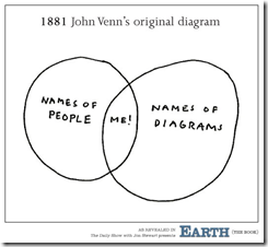
14 Jan 2011Contrary to the below, John Venn wasn’t an egomaniac when he developed venn diagrams; he called them “Eulerian Circles” in his July 1880 paper “On the Diagrammatic and Mechanical Representation of Propositions and Reasonings” (which includes a number of the “real” originals).
How the Recession Changed Us
In: Culture History US Economy
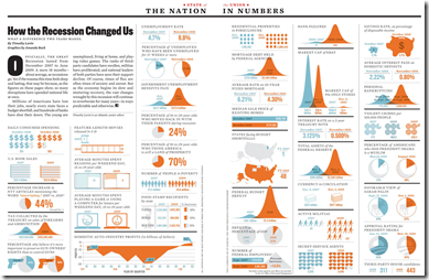
14 Jan 2011I’ve tried to avoid posting most of the trite “end of the year” infographics, but this one from the Atlantic comparing today to before the recession is interesting. (via)
Cross-Country Risks: Financial and Trade
In: Finance Global Economy Interactive Source: Washington Post
13 Jan 2011Cross-country financial and trade exposures are hard to visualize, but this interactive network diagram from the Washington Post is a good attempt. And the sovereign spread sparklines at the bottom are a nice addition.
I somehow missed catching this when it came out in December.
History of Global Health and Happiness (1960-2010)
In: History Interactive
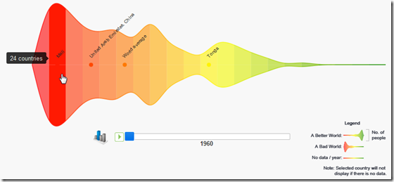
13 Jan 2011Using data from the World Bank’s open data initiative, this interactive tool let’s you pick from a variety of social indicators, then animate how the world’s countries perform over time. It’s basically a colorful histogram, and I know some people are critical of mirroring above and below the axis like this – but it sure is pretty. (via)
You Are Not The Center of the Universe
In: Science
11 Jan 2011I think everyone loved those cool visualizations of relative scale (example one, two) we’ve seen lately. Here’s a new one showing the relative size of planetary objects. Three thoughts occurred to me while watching this: 1: This guy has some crazy good animation skills. 2: We really are insignificant specks floating in an endless black void. 3: I can’t believe I recognize that annoying music from the Black Hole movie.
Chart Love for Children
11 Jan 2011A sesame-street style singing introduction to charts. Charts rule!
Thanks to Thibeaux Lincecum for the link!
What You Don’t Know About Unemployment
11 Jan 2011We hear the big unemployment number each month (currently 9.4%), and we all know someone who’s been unemployed for a while. But how bad is it really? Let’s say I lost my job tomorrow – how bad is it out there for someone just like me? (note: if you click on the links you can enter your own attributes)
Geography?: Washington DC traditionally has higher unemployment, but it looks like that trend might soon reverse?
Age?: That’s good news. Someone my age has a slight advantage.
Sex?: Wow. I didn’t see that coming. Men have been disproportionately affected by this recession.
If you don’t mind that the data is from 2009, you can select all of the above and also add in education using the NYT visualization below. So all together, someone like me only faces a 3.9% unemployment rate – versus, say, a 15-24 yr old black male with no college, who faces a 48.5% unemployment rate. 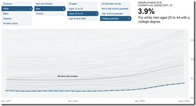
Another piece of the unemployment picture that doesn’t get much coverage is how different sectors are performing. Let’s take a look at jobs gained and lost since 2000 (note: this is in millions of jobs, not percent)
Manufacturing, construction, and retail have gotten clobbered, while government, health care, and education are about the only professions showing growth.
Well, I hope you found these tools enlightening and helped you understand that the one number they spend so much time talking about in the media doesn’t even begin to tell the whole story. If you want to dig further yourself, all of the raw data is available for download from the BLS.
I always love this type of kinetic video-graphic. It seems to me, though, that they are best suited to broad overview topics where you are trying to establish perspective, and not so good when your audience is already well informed. If you want to play with creating something like this yourself, a good tool to start with would be Prezi. (via)
Who Men Find Attractive vs Who They Date
In: Culture
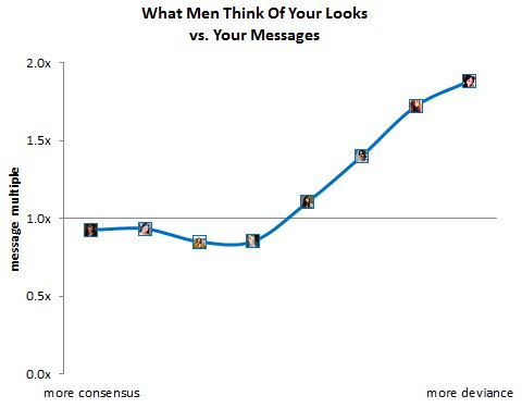
10 Jan 2011Once again, OkCupid has data-mined information from online dating profiles and actions to tell us how weird we are. Today they compare how “attractive” a woman’s pictures are, compared to how many times they get sent messages. Some of the interesting findings:
- The more men disagree about a women’s looks, the more they like her.
- Guys tend to ignore girls who are just cute.
- If someone doesn’t think you’re hot, the next best thing is for them to think you’re ugly.
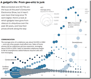
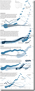
A very cool look at the cost and popularity of gadgets since the 1980s – covering phones, computers, TV, video, and audio. You can clearly see the “digital revolution” start around 2000, killing off earlier technologies; it’s also interesting to see the cost of any gizmo fall over time (the circles get smaller). By Alicia Parlapiano for the Washington post. (related article)
Map: Factory Farms
In: Food Interactive Maps
7 Jan 2011Want to know how many cows live in your state? How about the average chickens per farm? The site obviously has a slight bias on food issues, but the data is well presented and the methodology is laid out clearly (something that is missing on too many data visualizations). Personally, I have no problem with killing animals and eating them, and agree that they shouldn’t suffer horribly crappy lives beforehand. (Related blog post).
What is Chart Porn?
An addictive collection of beautiful charts, graphs, maps, and interactive data visualization toys -- on topics from around the world.
Categories
- Bailout (118)
- Chartporn Related (3)
- Commentary (21)
- Culture (669)
- Emerging Markets (66)
- Employment (245)
- Environment/weather (133)
- Finance (298)
- Food (92)
- Global Economy (373)
- Graphic Design (bad) (26)
- Graphic Design (general) (183)
- Graphic Tools (23)
- History (158)
- Housing (162)
- Humor (204)
- Innovative (183)
- Interactive (545)
- Internet/tech (97)
- Maps (578)
- News Media (34)
- Politics (329)
- Reference (97)
- Science (331)
- Source: Economist (101)
- Source: FT (92)
- Source: NYT (147)
- Source: Ritholtz (76)
- Source: USA Today (27)
- Source: Washington Post (90)
- Source: WSJ (135)
- Sports (58)
- Stock Market (74)
- Uncategorized (2)
- Updated regularly (76)
- US Economy (553)
- Video (22)
- Aram Korevaar: This chart is now being used as a projection in which countries such as China see themselves as in a [...]
- David: Welcome back Chart Porn! [...]
- J S: Thanks for the great story. Miss reading this blog. Hope to see you more active again. [...]
- jake: I lived in a DC row house for 6 years, and I'm writing this comment from my tiny 1 bedroom apartment [...]
- ronny pettersen: Hilarious and unfortunately accurate... ;-) [...]


