Muni Market Woes
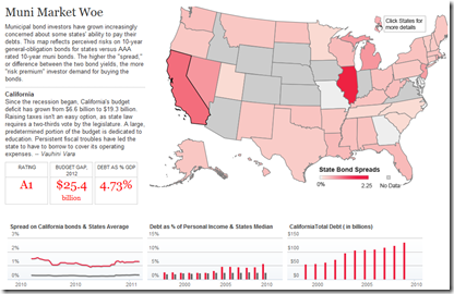
10 Feb 2011There’s a lot of attention on the national debt, but states are in even deeper trouble. In part because investors don’t trust them to get their act together, resulting in lower ratings and higher borrowing costs. The below clickable map lets you view debt levels and interest rate spreads by state.
And while we’re talking about state fiscal policies, here’s a beautiful representation of the Massachusetts 2011 budget:
Super Bowl XLV
In: Sports
9 Feb 2011This chart of the Green Bay Packer’s season, including play by play analysis of the entire playoffs, is a testament to how well evolved sports statistics are. The designers, Chartball, also do amazing things with baseball statistics.
Walt Disney’s Production Diagram
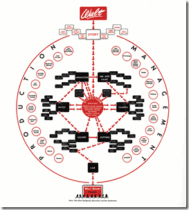
9 Feb 2011A testament to what a genius Walt Disney was, his 1943 production process diagram is a Harvard MBA’s wet dream that beautifully lays out the flow and departments. (via)
Human Charts
In: Culture Innovative
9 Feb 2011Taking a more artistic approach to chart design, artist Peter Ørntoft explored the results of an opinion poll on various Danish social topics with striking photographs. (via)
Southern Democrats (1964-2010)
8 Feb 2011The Economist produced this annotated video-graphic of mapped donut charts illustrating the dominance of southern democrats in the 1960s, and their subsequent decline.
The Organized Crime Network
7 Feb 2011Just how organized is organized crime? Think of it as the world’s largest and most illicit social network.
Ok, that may not be the best analogy ever, but this interactive map of transnational crime with popup details is a fascinating way to explore the $2 trillion global grey market of illegal activity. (via Ritholtz)
Global Debt (1880-2009)
In: Finance Global Economy History Interactive Maps Politics
7 Feb 2011The IMF has released a new database of sovereign debt-to-gdp ratios for 174 countries, going back as far as 1880 (for G7 countries).
The data shows how government debt has risen and fallen over the years as important events, such as wars and stock market crashes, affect a country’s decisions about when to save and when to spend. It turns out the relationship between debt and economic growth has changed over time; historically, fast growing countries had low debt ratios, while slow growers struggled under higher debt. In the past 30 years that relationship has altered as advanced economies’ debt levels have risen and their economies have grown.The data also debunks some old clichés, for example that African countries have the highest debt levels. In fact, low income countries in Africa today have lower debt ratios than do advanced economies in Europe and North America.
The below charts appear in a slightly slow, but interesting, IMF You-tube video:
The data can also be explored and exported using the IMF’s DataMapper (note the links at the bottom of the mapper to the related working paper and dataset):
Where the Streets Have Your Name
In: Culture Interactive Maps
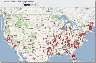
7 Feb 2011Stephen von Worley tracked down streets, places, and things all across the the world that use one of over 10,000 first names. Just enter your name and click on a pushpin to go to that location in either Google Maps or Google Earth. You can even use street view to see the signs and streets themselves. I can’t help but see this leading to a sign-theft crime spree. 😉
Interracial Marriage
In: Culture
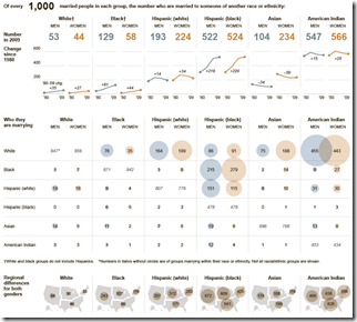
7 Feb 2011A well laid out table from the NYT on who is marrying whom. Using 1000 married people as a base is slightly odd, but you get used to it as you pore over the numbers. Related article. Thanks to Francois Botha for the link!
I have realized, after numerous conversations about politics and economics, that many people haven’t grasped that the economy doesn’t work the same way it did when they were growing up. As a commenter on The Big Picture said:
The role of a healthy financial sector is to support the “real economy”. But now it’s the opposite, like the tail wagging the dog.
UFO Sightings
4 Feb 2011Apparently aliens prefer the west coast.
There’s also an interactive version that overlays type of sighting by week onto Google maps.
The Best Companies to Work For
4 Feb 2011Fortune surveyed employees of 211 companies about management credibility, job satisfaction, and camaraderie, then combined that with information on pay, benefits, and management practices to rank the best companies to work for. The below interactive word cloud allows you to drill down through the words employees used the most to describe their companies.
You can also see who pays the most, and who has the best perks (explorable using the below perk-finder):
The World is Getting Fat(ter)
4 Feb 2011Male and female body mass indices by country, from 1980-2008. Some interesting, but perhaps not surprising, observations: European men are consistently fatter than the women, poor people are skinny, and everyone has gotten fatter over the past 18 years. (related article)
Facebook Comment Flowchart
4 Feb 2011Volunteering in America
In: Culture
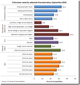
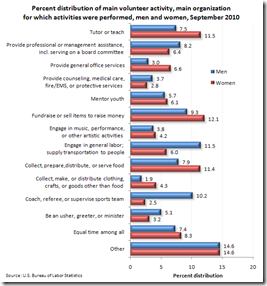
2 Feb 2011Some interesting charts about who volunteered in 2010, and what kind of work they did. (related NYT post)
What is Chart Porn?
An addictive collection of beautiful charts, graphs, maps, and interactive data visualization toys -- on topics from around the world.
Categories
- Bailout (118)
- Chartporn Related (3)
- Commentary (21)
- Culture (669)
- Emerging Markets (66)
- Employment (245)
- Environment/weather (133)
- Finance (298)
- Food (92)
- Global Economy (373)
- Graphic Design (bad) (26)
- Graphic Design (general) (183)
- Graphic Tools (23)
- History (158)
- Housing (162)
- Humor (204)
- Innovative (183)
- Interactive (545)
- Internet/tech (97)
- Maps (578)
- News Media (34)
- Politics (329)
- Reference (97)
- Science (331)
- Source: Economist (101)
- Source: FT (92)
- Source: NYT (147)
- Source: Ritholtz (76)
- Source: USA Today (27)
- Source: Washington Post (90)
- Source: WSJ (135)
- Sports (58)
- Stock Market (74)
- Uncategorized (2)
- Updated regularly (76)
- US Economy (553)
- Video (22)
- Aram Korevaar: This chart is now being used as a projection in which countries such as China see themselves as in a [...]
- David: Welcome back Chart Porn! [...]
- J S: Thanks for the great story. Miss reading this blog. Hope to see you more active again. [...]
- jake: I lived in a DC row house for 6 years, and I'm writing this comment from my tiny 1 bedroom apartment [...]
- ronny pettersen: Hilarious and unfortunately accurate... ;-) [...]

