Jobs that Pay Women Less
In: Employment
22 Feb 2011Women who worked full time in wage and salary jobs had median weekly earnings of $657 in 2009. This represented 80 percent of men’s median weekly earnings ($819).
But it differs a lot by industry:
(via)
American Shame
In: Culture Employment Global Economy Science Source: NYT US Economy
21 Feb 2011How America compares to other industrial countries based on a variety of basic indicators (income inequality, life expectancy, education) as well as some uncommon ones (prison population, level of democracy, and “wellbeing”). Conclusion: America is not #1! Can anyone think of indicators that WOULD make us look good in this crowd?
What is Data Visualization?
19 Feb 2011Worth staring at for a few minutes. There’s a discussion about it with author Audree Lapierre over at ReadWriteCloud.
Inflation: The Details
18 Feb 2011Sure, inflation in January was only 1.6%:
but there’s a lot of variation in the products that make up the CPI (butter was up 19.6% y-y, for example), which this tool from the WSJ lets you explore:
Want to know how the CPI weights all of these goods? Check out this oldie but goodie:
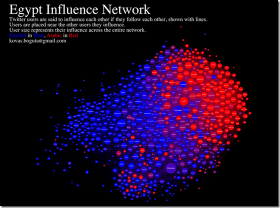
Egypt Twitter Network
16 Feb 2011Consumer debt is down, though nobody knows whether that’s a sign of changing consumer habits or changing banker habits. (related article)
Middle Eastern Demographics
16 Feb 2011Many middle eastern countries have a large percentage of young people in the population. Compare this to the United States, where it is easier for our politicians to ignore the voice of the young (most of the time).
Combine this with high unemployment, and you’re going to have political problems no matter how autocratic you are:
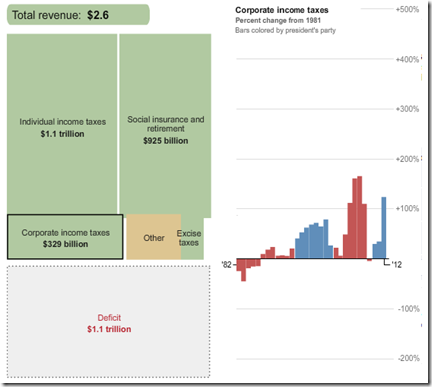
US Budget 1981-2012
15 Feb 2011Here are some interactive tools to let you explore the President’s recent budget proposal, where that money comes from, and where it goes. First, from the Washington Post, a look at 30 years of budgets: Revenue is on the left, expenses on the right; click on any box to see the percentage change since 1981; bars are colored by the president’s party.
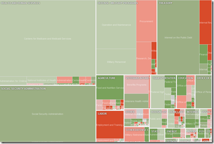
Next, a more detailed treemap from the NYT, but only covering the 2012 values and change from 2010.
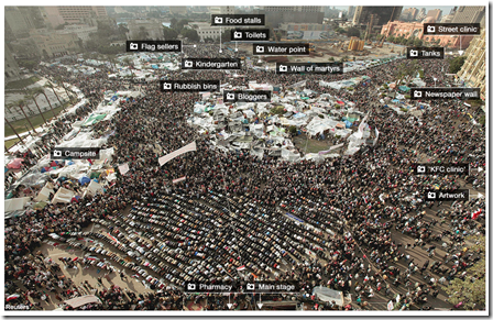
Tahrir Square: Spontaneous Community
14 Feb 2011This interactive photo-map of Tahrir Square from the BBC highlights the creative ways the community organized itself, from news to medical care to flag merchants.
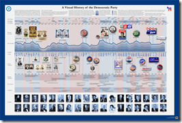
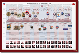
Visual History of the Democrat and Republican Parties
In: Politics
14 Feb 2011Two more beautifully detailed historical timelines from the good people at Timeplots – these can also be purchased as posters, if you have a wonk in need.
Cost of Renting vs Owning
In: Housing Interactive Maps
14 Feb 2011Real estate listing service Trulia has created this interactive map of median rental costs vs purchase prices on a two bedroom home. In case you are thinking of moving, they also supply bar charts of unemployment, foreclosure, and job growth for the same cities.
The data is updated each quarter and supplemented with a series of simpler infographics:
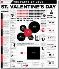
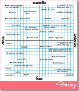
Valentine’s Day
In: Humor
14 Feb 2011What Brands are Seared into Your Brain?
In: Culture
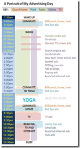
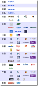
11 Feb 2011Rosiesays sent me a timeline mapping out one day of her media exposure. Searching the internets, it turns out that brand mapping was a big meme a few years ago — there’s even an website to help you keep track. I think I deliberately block out most of the advertising I am exposed to, but I’m sure its all swishing around somewhere in my subconscious.
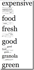
Do you want to see what brands have been successfully seared into our brains? Brand Tags crowd-sourced traditional brand research by asking people to type one word in response to seeing a brand logo, then creating a word cloud based on the results. Here are Costco, Whole Foods, and Cirque du Soleil:
Procrastination Flowchart
In: Humor
11 Feb 20111 Line + 500 Monkeys = Chaos
10 Feb 2011Clement Valla drew a line. Then he asked 500 people to trace it, one after the other. The below video is the result. This lovely video art illustrates how individual differences can compound changes in perception over time, even when starting with the simplest of designs.
He also did it with a circle:
I can’t help but wonder if the results were affected by how the 500 people were chosen: They were paid 2 cents each using Amazon’s Mechanical Turk marketplace. At first I thought the quality would be worse from paid workers, but then I realized that if this was in a museum or art show some idiot would sign his name or draw a smiley face and screw the whole thing up. (via)
What is Chart Porn?
An addictive collection of beautiful charts, graphs, maps, and interactive data visualization toys -- on topics from around the world.
Categories
- Bailout (118)
- Chartporn Related (3)
- Commentary (21)
- Culture (669)
- Emerging Markets (66)
- Employment (245)
- Environment/weather (133)
- Finance (298)
- Food (92)
- Global Economy (373)
- Graphic Design (bad) (26)
- Graphic Design (general) (183)
- Graphic Tools (23)
- History (158)
- Housing (162)
- Humor (204)
- Innovative (183)
- Interactive (545)
- Internet/tech (97)
- Maps (578)
- News Media (34)
- Politics (329)
- Reference (97)
- Science (331)
- Source: Economist (101)
- Source: FT (92)
- Source: NYT (147)
- Source: Ritholtz (76)
- Source: USA Today (27)
- Source: Washington Post (90)
- Source: WSJ (135)
- Sports (58)
- Stock Market (74)
- Uncategorized (2)
- Updated regularly (76)
- US Economy (553)
- Video (22)
- Aram Korevaar: This chart is now being used as a projection in which countries such as China see themselves as in a [...]
- David: Welcome back Chart Porn! [...]
- J S: Thanks for the great story. Miss reading this blog. Hope to see you more active again. [...]
- jake: I lived in a DC row house for 6 years, and I'm writing this comment from my tiny 1 bedroom apartment [...]
- ronny pettersen: Hilarious and unfortunately accurate... ;-) [...]


