College Degrees (1940-2009)
12 Mar 2011An interactive map of adults with college degrees. Filter by race or income or drill down to your county. I’m not sure if it’s more surprising that it went from 4.6% to 27.5%, or that we’re only at 27.5% today. How long do you suppose before someone puts this next to a red/blue state map? (via Sociological Images)
1940 vs 2009:
There is No God
In: Culture
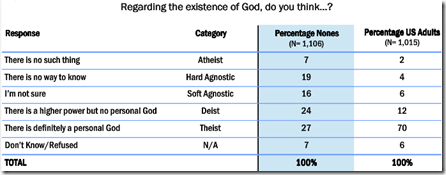
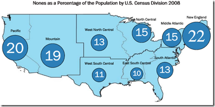
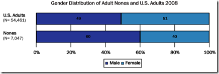
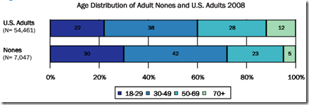
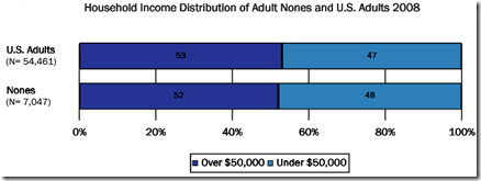
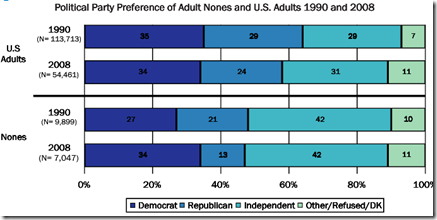
11 Mar 2011The 2008 American Religious Identification Survey has some interesting statistics on the atheists, agnostics, and “spiritual but not religious” among us. Interestingly, non-belief in god does not seem to correlate with income, education, political party, or your upbringing – but is most strongly related to age and gender. Somewhat bizarrely, 33% of the “nones” are of Irish descent. (via Sociological Images)
What People are Liking on Facebook
In: Culture Internet/tech
11 Mar 2011Yahoo labs examined over 40 million likes on 45 different news/blog sites to see what people are interested in. The most popular article: “Why Chinese Mothers are Superior”; “New Zodiac Signs” was #2. Yes, this means our civilization is doomed, but in the meantime there are some interesting findings about articles’ social popularity and lifespans, and recommendations for more efficient social marketing (barf). Below are word clouds for the New York Times and Engadget – colors indicate how many likes the word received, size indicates how many articles the word appeared in. They have similar clouds for 27 different sites. (via Data Pointed)
Chart of average article social lifespans:
Artist Ward Shelly draws some fascinating cultural flow charts, as I’ve mentioned before. I’m never quite sure what the size and width of the shapes are supposed to represent, but shit — they’re done by hand, comprehensive, and gorgeous. (via via)
Weather Porn
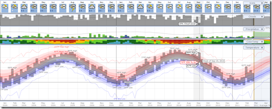
10 Mar 2011Weatherspark allows you to explore the entire historical record of more than 4,000 weather stations around the globe, using a variety of beautifully interactive graphs. Sites like this make me so click-happy – everything is so smooth and well-executed I can’t stop playing with all the options just to see what happens. Try drilling down from annual to daily data, for example, and watch how everything dynamically rescales. (via)
Here is Washington, DC 2009-11:
US GDP Per Capita (1871-2009)
In: History US Economy
9 Mar 2011I’m just posting this into the chart rolodex in case I ever have a need for it. Long time series can be a surprisingly big pain in the ass to pull together. Case in point: I had never seen the site MeasuringWorth before (which is where this data came from). Nice!
Middle Eastern Demographics, Part 2
9 Mar 2011The Washington Post has updated the population bulge charts I mentioned last month. This time they are interactive, and include three additional countries (Egypt, Bahrain, Tunisia). Below you can see the big differences between Egypt and the United States.
Movie Barcode Art
In: Culture Innovative
9 Mar 2011Moviebarcode takes each frame of a movie, stretches it out vertically, then squashes them all together into a uniform block. I’ve read some criticism of these for not conveying much useful information (true), but I think they have value from an aesthetic point of view — particularly when comparing them to each other.
Case-Shiller as Rollercoaster (1890-2010)
In: History Housing Innovative
8 Mar 2011View the inflation adjusted Case-Shiller home price index as if you were riding the chart on a roller coaster. An update of the classic version from Speculative Bubble (that only went through 2007).
The Gender Gap
8 Mar 2011The Wall Street Journal has pulled together some interesting differences between the sexes concerning marital, educational, and employment trends.
Why Traffic Jams Happen
7 Mar 2011I hate traffic. Nothing makes me hate humanity more (except perhaps watching commercials – thank god for DVRs). If you want to know more about why we drive the way we do, read Tom Vanderbilt’s Traffic (which, somewhat strangely, includes no diagrams). (via Ritholtz)
Here’s a life-scale experiment that illustrates the shockwave effect:
Dow Jones 2010, in Music
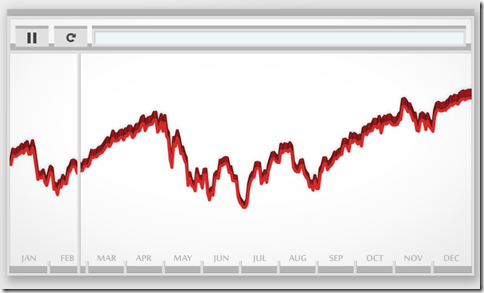
7 Mar 2011No it’s not a musical. Artist Bard Edlund’s “Dow Piano” translates the performance of the Dow each day onto a three octave scale, and adjusts the volume of each note according to trading volume. I guess instead of data visualization we could call this data audioization – or we could just call it cool.
Where are the Happiest People in America?
7 Mar 2011Gallup surveyed Americans on 20 different quality of life indicators (stress, depression, health problems, job satisfaction, exercise, etc), and the New York Times threw them all on a map for contemplation. Below is the composite “Well-Being index”. Thanks to Allison Stanfill for the link! (related article)
Gallup’s website compares the indicators over time:
A similar Gallup index of “US Satisfaction” was also recently visualized by Good:
Sexual Behavior
In: Culture
3 Mar 2011A new survey of 13,500 people regarding their sexual behavior by the National Center for Health Statistics is interesting to browse. Some of the headline findings: apparently virginity is making a comeback, and women are more likely than men to have had same-sex partners. (full report-pdf; via)
What is Chart Porn?
An addictive collection of beautiful charts, graphs, maps, and interactive data visualization toys -- on topics from around the world.
Categories
- Bailout (118)
- Chartporn Related (3)
- Commentary (21)
- Culture (669)
- Emerging Markets (66)
- Employment (245)
- Environment/weather (133)
- Finance (298)
- Food (92)
- Global Economy (373)
- Graphic Design (bad) (26)
- Graphic Design (general) (183)
- Graphic Tools (23)
- History (158)
- Housing (162)
- Humor (204)
- Innovative (183)
- Interactive (545)
- Internet/tech (97)
- Maps (578)
- News Media (34)
- Politics (329)
- Reference (97)
- Science (331)
- Source: Economist (101)
- Source: FT (92)
- Source: NYT (147)
- Source: Ritholtz (76)
- Source: USA Today (27)
- Source: Washington Post (90)
- Source: WSJ (135)
- Sports (58)
- Stock Market (74)
- Uncategorized (2)
- Updated regularly (76)
- US Economy (553)
- Video (22)
- Aram Korevaar: This chart is now being used as a projection in which countries such as China see themselves as in a [...]
- David: Welcome back Chart Porn! [...]
- J S: Thanks for the great story. Miss reading this blog. Hope to see you more active again. [...]
- jake: I lived in a DC row house for 6 years, and I'm writing this comment from my tiny 1 bedroom apartment [...]
- ronny pettersen: Hilarious and unfortunately accurate... ;-) [...]


