22 Free Data Visualization Tools
In: Graphic Tools
13 May 2011An excellent list from Computerworld, with good descriptions of each, including pros and cons. My favorites are Data Wrangler, Google Refine (which I had never heard of before), and Timeflow. Thanks to D2 for the link!
Dance Music Frequency Map
In: Reference
11 May 2011Here’s one for all you DJs out there. A map of where different instruments fall on the sonic scale.
Not quite as comprehensive as the version we posted in 2009 below:
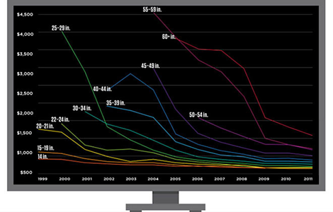
Falling Flatscreen Costs
In: Internet/tech Science
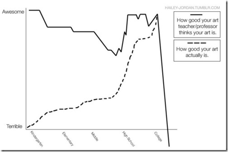
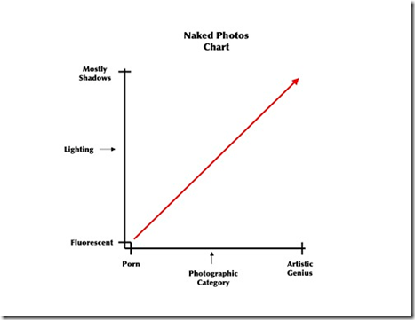
11 May 2011Art Professors (and Porn)
10 May 2011They Draw and Cook
In: Food Innovative
9 May 2011Recipes illustrated by artists. Some of them are just prettied up, but others are gorgeous diagrams. You can filter by meal type, ingredient, or illustration style.
Omnibus of Superpowers
In: Culture
6 May 2011A tree of over 100 super powers and 200 super-powered heroes and villains as examples. I think it would have been better without the examples.
Flying Carpet of Middle East Protests
In: Graphic Design (general) Interactive News Media Politics
4 May 2011There were so many of these last month I stopped looking at them – but this one is cute. Yes, I said cute. It’s an interactive flying timeline of protest milestones for 17 countries. Click on any of them to bring up a full Guardian article. They are also keeping it up to date (as of today, anyway).
Guantanamo Prisoners Database
4 May 2011Very nice interactive chart of the history of Guantanamo prisoners, based on some excellent research by the New York Times and NPR. I could point out all the thoughtful design elements going on here, but you’ll figure it out (hint: move the slider on the timeline at the top).
Bin Laden’s Death Causes Record Tweets
In: Culture Internet/tech
3 May 2011Over 5000 per second. (via)
Less depressing, the same flickr feed also has cool video of tweets per second on New Year’s Eve 2010 – you can watch midnight travel around the globe.
Starry Starry Night
In: Interactive Maps Science
3 May 2011The Photopic Sky Survey is an interactive 5000 megapixel photograph of the entire night sky stitched together from 37,000+ photos. A beautiful example of data aggregation, annotation, and exploration. One of the coolest parts? It was done by an “amateur” photographer, just because he wanted to. (project site)
Typographic Maps
In: Innovative Maps
28 Apr 2011Gorgeous city maps constructed only using words. Prints are available for Washington DC, NYC, San Francisco, Boston and Chicago. I love these. In fact, I just ordered one.
Human Development Index Tree
27 Apr 2011Visualization of several United Nations indices on education, income, and health. I’m not quite sure what the point of using a “tree” is, but they obviously put some thought into it: The height of the tree trunk is proportional to the total value of the HDI. The size of the three branches are proportional to each sub-indicator. The branches are ordered in increasing order from left to right. The color of the trunk is the average of the color of the components.
Here’s a tree “legend”:
and a comparison of the United States and China:
How (not) Fat Are You Really?
In: Culture Source: NYT
27 Apr 2011This graphic illustrates how a “size 8” differs across designers. You might recall this similar chart on men’s pants sizes from last fall. (related article)
State Budget Crises
In: Interactive Maps Politics Source: Washington Post US Economy
26 Apr 2011The Washington Post has mapped out a bunch of interesting stats concerning States’ Budget problems: shortfalls, pension liabilities, proposed cuts (health care, education, etc), and who is in charge. To sum up: this is yet another way we’re screwed beyond belief. (related article)
What is Chart Porn?
An addictive collection of beautiful charts, graphs, maps, and interactive data visualization toys -- on topics from around the world.
Categories
- Bailout (118)
- Chartporn Related (3)
- Commentary (21)
- Culture (669)
- Emerging Markets (66)
- Employment (245)
- Environment/weather (133)
- Finance (298)
- Food (92)
- Global Economy (373)
- Graphic Design (bad) (26)
- Graphic Design (general) (183)
- Graphic Tools (23)
- History (158)
- Housing (162)
- Humor (204)
- Innovative (183)
- Interactive (545)
- Internet/tech (97)
- Maps (578)
- News Media (34)
- Politics (329)
- Reference (97)
- Science (331)
- Source: Economist (101)
- Source: FT (92)
- Source: NYT (147)
- Source: Ritholtz (76)
- Source: USA Today (27)
- Source: Washington Post (90)
- Source: WSJ (135)
- Sports (58)
- Stock Market (74)
- Uncategorized (2)
- Updated regularly (76)
- US Economy (553)
- Video (22)
- Aram Korevaar: This chart is now being used as a projection in which countries such as China see themselves as in a [...]
- David: Welcome back Chart Porn! [...]
- J S: Thanks for the great story. Miss reading this blog. Hope to see you more active again. [...]
- jake: I lived in a DC row house for 6 years, and I'm writing this comment from my tiny 1 bedroom apartment [...]
- ronny pettersen: Hilarious and unfortunately accurate... ;-) [...]


