Honest Names for Yoga Poses
25 May 2011Too funny not to post. As a bonus, on the right, a comparison of nine poses to getting fall-down drunk.
Sorry about the sidestep into diagram and photo humor – I’ll post some boring econ charts soon to balance it all out for you.
Locals vs Tourists
In: Culture Innovative Maps
25 May 2011An analysis of implied preference based on Flickr photos. Blue photos are by locals, red by tourists, yellow could be either. Below are NYC and Washington DC; other cities are available. (via)
What’s Your Major Worth?
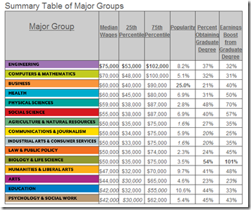
24 May 2011Average earnings of different college bachelor’s degrees. Good to see engineering at the top. The most popular major?: Business – ick. The original study also breaks down earnings by gender and ethnic groups. (related Washington Post article)
Electric Vehicle Charging Stations
23 May 2011Carstations.com lets you search for local charging sites, add new ones, and read reviews/comments about each. Personally, I was surprised there were this many out there.
Marriage and Divorce
In: Culture Source: WSJ
23 May 2011Flowing Data created some nice charts about trends in marriage based on the just released census survey data on Marriage and Divorce.
The original report has some very interesting tables, and includes data on divorces, for which the median length of the marriage was 8 years. The below chart indicated some surprising(?) differences in divorce trends between racial groups.
In related marriage research, the authors of the book "Spousonomics: Using Economics to Master Love, Marriage and Dirty Dishes", created the below infographic based on a survey of 1,100 married people.
Updated: Snake Oil Supplements
21 May 2011Information is Beautiful has updated their interactive visualization of the effectiveness of various health supplements, based on scientific research. You can also view the raw research data they dug up to draw your own conclusions.
Conflict Deaths (1915-Present)
21 May 2011In a strange juxtaposition of imagery, this photo uses fake blood and kitchen containers to visualize 38 million deaths from various conflicts. Overall, I really like the concept, but from the way the objects are arranged and the angle of the photograph (with the blood taking up only the lower 20% of the photo), they visually seem small to me. Also, I don’t quite get the “World Cuisine” title, despite the food/cooking metaphor.
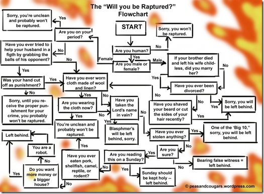
Rapture Flowchart
20 May 2011MacGyver’s Recipes
In: Culture
20 May 2011Interactive episode guide to all of MacGyver’s tricks and tool improvisations. One of my personal favorites: used a light bulb to melt water onto the lock of a freezer so that the water re-froze and expanded, breaking the lock (season1:7). Ummmm – sure!
(note: I had trouble getting this site to render properly on some computers)
Where are the Jobs?
In: Employment Interactive Source: Washington Post US Economy
20 May 2011A fantastic annotated heatmap from the Washington Post breaking down job creation/loss by sector. On the right is an interactive, slightly more annotated, line chart version of the same data. I prefer the heatmap. (related article)
Sitting is Killing You
19 May 2011Obvious link bait, but I have to confess that I love the colors and the chart-junk choices. Also, I know from personal experience that sitting all day is bad for us. Thanks to Megan Fowler for the link.
Daft Punk Mashup Visualized
In: Culture Innovative
18 May 2011The Man in Blue decided to visualize his own Daft Punk mashup using concentric colored waveforms, rendered in real time using html5 and CSS3. Very nice!
How to Respond to Blog Posts
In: Internet/tech
18 May 2011A well thought out flowchart from the US Air Force on communication strategies for responding to blog posts and comments.
Pharmaceutical company Pfizer adapted the Air Force’s version for their own use:
Either of which are preferable to the the instinctual response:
What is Chart Porn?
An addictive collection of beautiful charts, graphs, maps, and interactive data visualization toys -- on topics from around the world.
Categories
- Bailout (118)
- Chartporn Related (3)
- Commentary (21)
- Culture (669)
- Emerging Markets (66)
- Employment (245)
- Environment/weather (133)
- Finance (298)
- Food (92)
- Global Economy (373)
- Graphic Design (bad) (26)
- Graphic Design (general) (183)
- Graphic Tools (23)
- History (158)
- Housing (162)
- Humor (204)
- Innovative (183)
- Interactive (545)
- Internet/tech (97)
- Maps (578)
- News Media (34)
- Politics (329)
- Reference (97)
- Science (331)
- Source: Economist (101)
- Source: FT (92)
- Source: NYT (147)
- Source: Ritholtz (76)
- Source: USA Today (27)
- Source: Washington Post (90)
- Source: WSJ (135)
- Sports (58)
- Stock Market (74)
- Uncategorized (2)
- Updated regularly (76)
- US Economy (553)
- Video (22)
- Aram Korevaar: This chart is now being used as a projection in which countries such as China see themselves as in a [...]
- David: Welcome back Chart Porn! [...]
- J S: Thanks for the great story. Miss reading this blog. Hope to see you more active again. [...]
- jake: I lived in a DC row house for 6 years, and I'm writing this comment from my tiny 1 bedroom apartment [...]
- ronny pettersen: Hilarious and unfortunately accurate... ;-) [...]


