Better Life Index
11 Jun 2011The OECD’s Better Life Index covers 34 countries and is based on 11 topics (housing, income, jobs, community, education, environment, governance, health, life satisfaction, safety, and work-life balance). The ratings are graphed as (kind of) cute petals on country “flowers”. The cool part of their interactive data exploration tool is that you can assign your own priorities as to which of the 11 topics is most important, and see how countries’ rankings change. You could quibble with the statistical accuracy of some of the indicators – but overall, it’s a well executed cross-country comparison.
US Military Spending
10 Jun 2011Immigrants Highly Skilled
9 Jun 2011Despite public perception of immigrants as being poorly educated, the high-skilled U.S. immigrant population today outnumbers the low-skilled population. (related article; original study)
Indian Reservations Missing From Google Maps
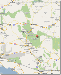
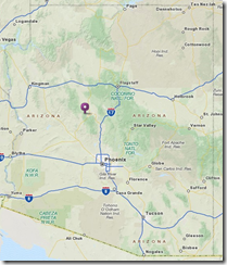
8 Jun 2011I don’t know how I never noticed this before – but Google Maps does not include American Indian reservations on it’s maps. WTF? Below are Google’s map of Arizona, and the Bureau of Indian Affairs’ map of reservations in that state:
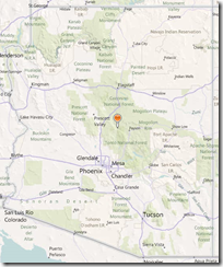
For comparison, below are Bing and Mapquest’s maps, which do identify the reservations:
Weird. I can drill down a map until I see a photo of my front door, but Google can’t label sovereign nations occupying millions of acres of land?!? (via, via)
Global Energy
8 Jun 2011A structured sankey diagram showing 2005 energy production and consumption, broken down several different ways.
Wednesday Night is All Right for Loving
In: Culture
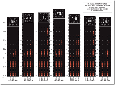
8 Jun 2011The NYT, with help from okCupid, took a look at what nights were best to meet up with someone at a bar, based on a calculated “sexual availability index”. Wednesday night won.
Living in the Danger Zone
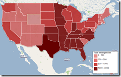
7 Jun 2011A map of every FEMA emergency since 1953 – you can also filter by disaster type.
Here’s a slightly more detailed one, for 1964-2010.
Update: and here’s a version from the NYT:
Crime Maps
In: Maps
7 Jun 2011Real estate site Trulia has created crime maps which let you see how violent different neighborhoods are based on data from CrimeReports.com, EveryBlock.com and SpotCrime.com. Below is Philadelphia:
by comparison, here is a similar map produced by the DC metropolitan police department, except this one is a visual piece of crap:
Below is one of the same area produced by spotcrime.com, which I like because it uses cute little little fists, burglars, and spray paint icons:
and for most disturbing map, we have this one from crimereports.com, which in addition to detailed crime information, includes pop-up pictures of registered sex offenders in your neighborhood.
Global Peace Index (2007-11)
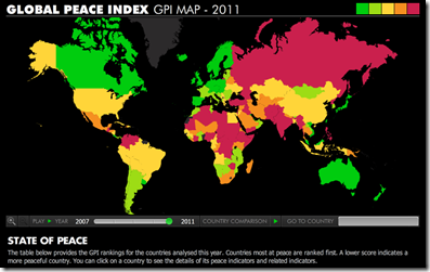
7 Jun 2011Based on 23 indicators. Iceland and New Zealand are at the top, with Somalia and Iraq at the bottom. (original study)
There is also a nice video explaining some of the results and changes over last year.
Mapnificent
In: Interactive Maps
7 Jun 2011Mapnificent shows you what areas you can reach via public transport (or w/bicycle) within any selected amount of time. The example below highlights how far you can go in 30 minutes, starting in downtown Washington DC. Those little bubbles in the suburbs are Metro stops. It is available for most major cities. (blogpost explaining methodology)
On the left, a comparison of budget proposals. On the right, a videographic that is sort of “debt ceiling for dummies”. Both from the Washington Post.
Housing Double Dip
In: Housing US Economy
31 May 2011Even with the low interest rates, housing prices continue to tank (with only Washington, DC showing an increase).
London Tube Maps (1889-Today)
In: Interactive Maps
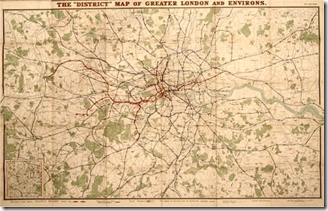
26 May 2011A collection of maps of London’s subway system, illustrating how the system evolved, and how cartography evolved with it. (via)
That site contained a link to the “Real Underground” – which is a cool interactive map that lets you morph between Beck’s classic 1933 map, the modern map, and a geographically accurate station map.
Beget Begot
In: Culture
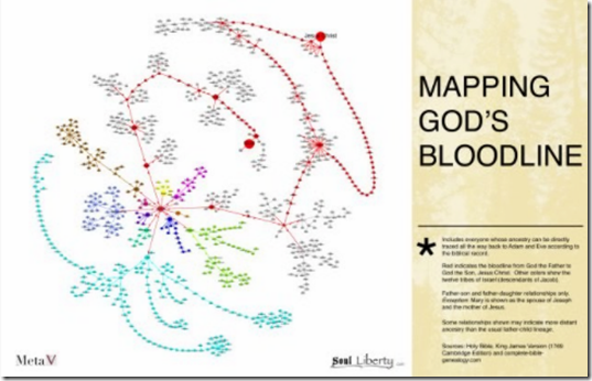
25 May 2011Zoomable genealogy of people in the bible, starting with Adam and Eve. I imagine there are dozens of these out there – but I don’t really care enough to find them. If you want an example of why not, go lookup online discussions as to whether Joseph and Mary were really both descendents of David. (via)
What is Chart Porn?
An addictive collection of beautiful charts, graphs, maps, and interactive data visualization toys -- on topics from around the world.
Categories
- Bailout (118)
- Chartporn Related (3)
- Commentary (21)
- Culture (669)
- Emerging Markets (66)
- Employment (245)
- Environment/weather (133)
- Finance (298)
- Food (92)
- Global Economy (373)
- Graphic Design (bad) (26)
- Graphic Design (general) (183)
- Graphic Tools (23)
- History (158)
- Housing (162)
- Humor (204)
- Innovative (183)
- Interactive (545)
- Internet/tech (97)
- Maps (578)
- News Media (34)
- Politics (329)
- Reference (97)
- Science (331)
- Source: Economist (101)
- Source: FT (92)
- Source: NYT (147)
- Source: Ritholtz (76)
- Source: USA Today (27)
- Source: Washington Post (90)
- Source: WSJ (135)
- Sports (58)
- Stock Market (74)
- Uncategorized (2)
- Updated regularly (76)
- US Economy (553)
- Video (22)
- Aram Korevaar: This chart is now being used as a projection in which countries such as China see themselves as in a [...]
- David: Welcome back Chart Porn! [...]
- J S: Thanks for the great story. Miss reading this blog. Hope to see you more active again. [...]
- jake: I lived in a DC row house for 6 years, and I'm writing this comment from my tiny 1 bedroom apartment [...]
- ronny pettersen: Hilarious and unfortunately accurate... ;-) [...]


