The Seven Chakras
25 Jul 2011I withhold the snarky pen and simply share this for those who might be interested. (Thanks to Katie Desmond for the link!)
Ok, can’t resist. Below are the seven chakras of R. Crumb:
Top 20 Google Keywords
In: Internet/tech
23 Jul 2011If you care about SEO, this is kind of interesting. Personally, I think it’s a chart of which industries are clearly taking too much money out of our pockets if they can afford to pay that much per click. I’d love to suggest we all click on every insurance ad we see just to stick it to them – but they’d probably just raise our rates to makes up the difference. (via)
State of Education
In: Culture
22 Jul 2011The state of education in the USA is a disgrace. Particularly appalling was this statistic:
In Singapore, South Korea, and Finland, 100% of teachers come from the top 1/3rd of their college classes. In the United States, nearly 50% come from the bottom 1/3rd.
Sigh.
Dodd-Frank Implementation
22 Jul 2011An interesting chart on different benchmarks that are required by the Bill. At closer inspection though, you realize all it does is describe the sections and count the requirements. It would have been nice if you could drill down and see the details of each of the colored lines, for example. The main impression remains, however: the Bill’s implementation is very complicated – which I suppose is in contrast to the wide agreement that it doesn’t actually solve any of our financial systems’ problems.
The Tech Company Web
In: Internet/tech
22 Jul 2011Interesting chart of how companies, employees, and acquisitions are all intertwined in the tech industry. Pay attention to which way the arrows are pointing (they look just like lines at first).
(via)
European Bank Stress Tests
21 Jul 2011An interactive map and table of the test results, showing debt levels by bank.
note: access to some FT features require a subscription.
Bloodstain Analysis
In: Science
21 Jul 2011Budget Hero
18 Jul 2011American Public Media created a fun online game where you try to balance the budget by selecting priorities and playing policy cards. The interface is amusing, but does take a few minutes to grasp – watch the introduction. (via)
Belief in Evolution vs GDP
15 Jul 2011USA is an outlier. Hahaha! USA! USA! USA!
Why is it so hard to believe we’re just a bunch of monkeys?
College Grade Inflation (1960-2008)
15 Jul 2011There’s a new study on the history of collegiate grade inflation. Fascinating stuff – particularly the difference in giving As in private vs public schools. Thanks to David Cramer for passing on the link!
Future According to Sci-Fi Films
In: Culture
13 Jul 2011There’s not much point to this large timeline of science fiction movies and shows, but it’s pretty damn entertaining, nonetheless – particularly the plot summaries.
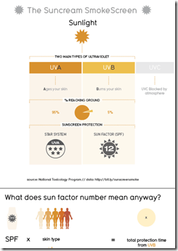
David McCandless and his team over at Information is Beautiful did a ton of research into sunscreen and threw it all into one massive infographic. It’s rather overwhelming and I’m not sure it turned out that great – and it’s kind of blurry for some reason (the excerpt over at the Guardian looks fine).
Topically speaking, I can’t help but agree with Lewis Black that it’s odd that we’ve all assimilated the idea that smearing chemicals on our skin is the healthy thing to do. Being in the sun isn’t unhealthy – not going in the sun until July and then burning to a crisp is what’s unhealthy.
Thanks to Caryn Sykes for sending in the link!
What is Chart Porn?
An addictive collection of beautiful charts, graphs, maps, and interactive data visualization toys -- on topics from around the world.
Categories
- Bailout (118)
- Chartporn Related (3)
- Commentary (21)
- Culture (669)
- Emerging Markets (66)
- Employment (245)
- Environment/weather (133)
- Finance (298)
- Food (92)
- Global Economy (373)
- Graphic Design (bad) (26)
- Graphic Design (general) (183)
- Graphic Tools (23)
- History (158)
- Housing (162)
- Humor (204)
- Innovative (183)
- Interactive (545)
- Internet/tech (97)
- Maps (578)
- News Media (34)
- Politics (329)
- Reference (97)
- Science (331)
- Source: Economist (101)
- Source: FT (92)
- Source: NYT (147)
- Source: Ritholtz (76)
- Source: USA Today (27)
- Source: Washington Post (90)
- Source: WSJ (135)
- Sports (58)
- Stock Market (74)
- Uncategorized (2)
- Updated regularly (76)
- US Economy (553)
- Video (22)
- Aram Korevaar: This chart is now being used as a projection in which countries such as China see themselves as in a [...]
- David: Welcome back Chart Porn! [...]
- J S: Thanks for the great story. Miss reading this blog. Hope to see you more active again. [...]
- jake: I lived in a DC row house for 6 years, and I'm writing this comment from my tiny 1 bedroom apartment [...]
- ronny pettersen: Hilarious and unfortunately accurate... ;-) [...]


