Sovereign Debt Ratings
1 Aug 2011I’m posting this more because it’s an example of a well designed cartogram map, more than because of the content. (via)
Federal Crimes
1 Aug 2011Interactive graph of federal crimes. I wish it had better dynamic filtering so you could look closer at some of the more interesting categories.
Deficit has a Numerator and Denominator
1 Aug 2011Ok, I’m pretty bored with the debt graphics, but Barry Ritholtz today had a few that illustrate the problem quite well.
This one makes clear our deficit is as much a result of falling revenue as it is of rising spending:
The same numbers in percent of GDP make sense when you take the recession shading into account:
I highly recommend you read the article and discussion over there.
Job-Killing Taxes!
29 Jul 2011I keep hearing from Republicans that eliminating tax breaks and loopholes for corporations will cut jobs. The truth is that corporations are experiencing huge profits, and are not hiring. I did a quick and dirty chart over at Fred to illustrate this:
if I had the time I’d look into sector breakdowns and who is currently enjoying these tax loopholes – maybe someone else wants to do it?
Here’s another way of looking at it:
The profits are also not being passed on to employees: The long-term perspective below shows the degree to which the working man is currently getting the shaft:
(These later two charts are via)
Data Journalism
29 Jul 2011As excellent article over at the Guardian about the rise of data journalism and what it takes to do it right.
Debt Debt Debt Goose!
29 Jul 2011Four perfect graphs from the NYT (as usual) putting the debt crisis into perspective.
Thanks to Kanal Eliezer for sending in the link!
How Much is That Again?
28 Jul 2011Days of the Week
In: Culture Innovative
27 Jul 2011Another beauty from xkcd. “Polar graph of what stuff happen on which days, based on number of google results… The relative frequency of <day> in <phrase> is shown by the distance from the center.”
Bad Credit Calculator
26 Jul 2011This interactive tool from the Washington post lets you see how much your credit score affects the interest you will pay on mortgage and auto loans.
Long-Term Unemployment
26 Jul 2011The percent of people unemployed greater than a year is scary. (related article)
1hour 55min to Pay your Taxes
In: Politics
26 Jul 2011This graphic illustrates the average amount of time people work each day to pay their taxes, and where it goes. (via)
Satellites in Google Earth
In: Interactive Maps Science
25 Jul 2011Real-time mapping of ~13,000 satellite in Google Earth (updated every 30 seconds). Completely ridiculous.
Bytes vs Bricks (1999-2010)
In: Culture
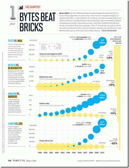
25 Jul 2011Nicolas Rapp is back creating graphics after his 2-year vacation. Lucky us, as Nicolas produces some quality stuff. Below is a graphic showing the demise of brick & mortar information delivery vs the internet.
What is Chart Porn?
An addictive collection of beautiful charts, graphs, maps, and interactive data visualization toys -- on topics from around the world.
Categories
- Bailout (118)
- Chartporn Related (3)
- Commentary (21)
- Culture (669)
- Emerging Markets (66)
- Employment (245)
- Environment/weather (133)
- Finance (298)
- Food (92)
- Global Economy (373)
- Graphic Design (bad) (26)
- Graphic Design (general) (183)
- Graphic Tools (23)
- History (158)
- Housing (162)
- Humor (204)
- Innovative (183)
- Interactive (545)
- Internet/tech (97)
- Maps (578)
- News Media (34)
- Politics (329)
- Reference (97)
- Science (331)
- Source: Economist (101)
- Source: FT (92)
- Source: NYT (147)
- Source: Ritholtz (76)
- Source: USA Today (27)
- Source: Washington Post (90)
- Source: WSJ (135)
- Sports (58)
- Stock Market (74)
- Uncategorized (2)
- Updated regularly (76)
- US Economy (553)
- Video (22)
- Aram Korevaar: This chart is now being used as a projection in which countries such as China see themselves as in a [...]
- David: Welcome back Chart Porn! [...]
- J S: Thanks for the great story. Miss reading this blog. Hope to see you more active again. [...]
- jake: I lived in a DC row house for 6 years, and I'm writing this comment from my tiny 1 bedroom apartment [...]
- ronny pettersen: Hilarious and unfortunately accurate... ;-) [...]


