Airline Timeline
In: History US Economy
22 Sep 2011The good people over at HistoryShots created this beautiful geneology of airline companies. It’s interesting to note how many airlines disappeared right around the time of industry de-regulation in the late 1970s.
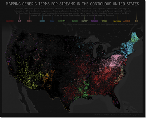
Sometimes a Stream is just a Stream
19 Sep 2011Tax Break Breakdown
In: Innovative Interactive Politics Source: Washington Post US Economy
19 Sep 2011To be cliché: the truth may surprise you. This is a great look at the “loopholes” in our tax system, point by point. You can filter by kind of break, compare individual vs corporate, find out when they were first implemented, and see how they all add up. However, I really wish the lines in the main bar graph had matched width with the amount of the break (with the y-axis being billions of $) – at first glance that’s what I thought was going on. I’m also not sure how I feel about things like “employer contributions to health care” being considered a break. (related article)
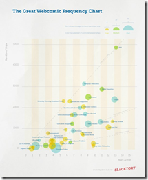
Webcomic Frequency Chart
In: Culture
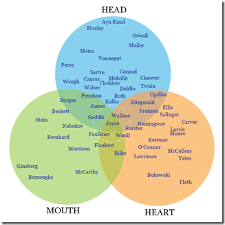
18 Sep 2011Author Venn
In: Culture
17 Sep 2011Do you agree? I’m not sure how Bukowski doesn’t at least overlap with Mouth, and Joyce smack in the middle?
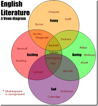
Here’s another version:
Newspapers (1690-2011)
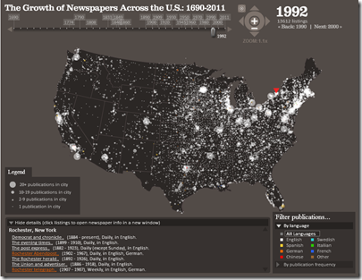
16 Sep 2011Much like the post office timeline movie I posted last month, below we have the history of newspaper expansion across the USA. Interestingly, this movie is actually an extraction from a very well done interactive visualization of the Library of Congress’s newspaper database. You can even drill down to individual towns and see information about each newspaper. (via)
Capital Inflows
In: Emerging Markets Finance Global Economy Interactive Maps Source: WSJ
15 Sep 2011Cheap money and slow growth in the advanced countries has led to large capital flows to emerging market countries, as this interactive tool from the WSJ shows. If you mouse over each country you can view countries’ policy responses. I really like these map/graph combo designs – the two go very well together.
How Healthy is Your Bank?
13 Sep 2011From MSNBC and the American University: Identify your bank (or credit union) by name or location, then see how many non-performing loans and other troubled assets it has:
of related interest is this 2010 chart that Barry Ritholtz recently noted:
Girl Scout Cookies
In: Food
11 Sep 2011What are the most popular varieties?
Besides making me hungry, this reminded me of this Dilbert classic:
The Cost of 9/11
11 Sep 2011NYT presents a graphical breakdown of some cost estimates for 9/11:
You can drill down into the different categories:
Banks: Then and Now
10 Sep 2011Interactive comparison of bank market capitalization, income, and employees. The data are interesting, but the color selection could use more contrast, and the representation of negative values for net income is just bizarre.
Note: some FT features require a subscription.
How Much is Your Life Worth?
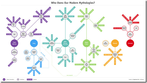
9 Sep 2011Who Owns Our Modern Mythologies?
In: Culture
9 Sep 2011Not Your Parents’ Economy
9 Sep 2011An elegant multi-indicator graphic from the NYT on income inequality and jobs. It’s disappointing that it took so long for the story of these trends to get traction in the media. (related article)
What is Chart Porn?
An addictive collection of beautiful charts, graphs, maps, and interactive data visualization toys -- on topics from around the world.
Categories
- Bailout (118)
- Chartporn Related (3)
- Commentary (21)
- Culture (669)
- Emerging Markets (66)
- Employment (245)
- Environment/weather (133)
- Finance (298)
- Food (92)
- Global Economy (373)
- Graphic Design (bad) (26)
- Graphic Design (general) (183)
- Graphic Tools (23)
- History (158)
- Housing (162)
- Humor (204)
- Innovative (183)
- Interactive (545)
- Internet/tech (97)
- Maps (578)
- News Media (34)
- Politics (329)
- Reference (97)
- Science (331)
- Source: Economist (101)
- Source: FT (92)
- Source: NYT (147)
- Source: Ritholtz (76)
- Source: USA Today (27)
- Source: Washington Post (90)
- Source: WSJ (135)
- Sports (58)
- Stock Market (74)
- Uncategorized (2)
- Updated regularly (76)
- US Economy (553)
- Video (22)
- Aram Korevaar: This chart is now being used as a projection in which countries such as China see themselves as in a [...]
- David: Welcome back Chart Porn! [...]
- J S: Thanks for the great story. Miss reading this blog. Hope to see you more active again. [...]
- jake: I lived in a DC row house for 6 years, and I'm writing this comment from my tiny 1 bedroom apartment [...]
- ronny pettersen: Hilarious and unfortunately accurate... ;-) [...]


