China’s One Child Policy
6 Oct 2011I usually don’t post these info-posters, but this one does contain a lot of interesting information. (via)
The Value of Data Visualization
5 Oct 2011This 2 minute video from Column Five is excellent.
The US Military – Maybe Not What You Think
5 Oct 2011Pew Research Center released a study on civilian and military views in the post 9/11 era. Headline MSM coverage (MSNBC; CNN) has focused on the finding that 1-out-of-3 veterans say the wars were not worth fighting – but the report actually contains a treasure trove of interesting graphics about our military.
The complete study in PDF format can be found here.
Cougars and Cubs
5 Oct 2011Using one of the more sexist charts in recent memory, the dating site whatsyourprice.com attempts to explain that the Ashton Kutcher/Demi Moore breakup is perfectly understandable. While this at first glance this resembles some of the quality revealed preference work done over at OkCupid, the selection bias here is quite large – along with a number of other flaws (as Adam Weinstein points out over at MotherJones).
Chinese Investment Abroad
4 Oct 2011A nice interactive analysis of Chinese investment. Click on the sector symbols below the colored bar graph to filter the data.
Leader Timeline
3 Oct 2011Interesting photo timeline design idea. To be fair, they should have used a linear scale. (via; thanks to David Cramer for the link).
What’s in a Tweet
3 Oct 2011Even though the “content limit” is only 140 characters, each tweet actually contains a crazy amount of meta-data. (related Economist article; via The Big Picture)
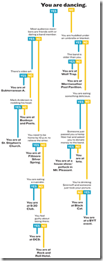
DC Rock Venue Recognition Tree
30 Sep 2011If you live in Washington DC this will make sense to you.
Hat tip to Jennifer D for sending it to me.
Proof That Mondays Suck
30 Sep 2011Cornell researchers analyzed mood content in 2.4million tweets (based on word choice) and found that Saturdays and Sunday garnered the most positive expressions and Mondays the most negative – well, during the day anyway. Interestingly, Saturday and Sunday nights were way up (down) there too. On a design note, perhaps the lower graph should have inverted the scale? (related article)
Female World Leaders
29 Sep 2011Choosing Sci-Fi and Fantasy Books
In: Culture
29 Sep 2011A flowchart for navigating topics, based on NPR’s list of top 100 books. Thanks to Mouse for sending it to me! (via)
US State Budget Gaps
In: Finance Interactive Internet/tech Politics Source: FT US Economy
27 Sep 2011What is shocking to me is that there are 12 states with no shortfall.
Note: Some Financial Times features require a subscription.
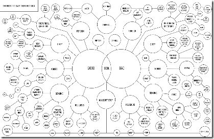
Flowchart: Things to Say During Sex
In: Humor
27 Sep 2011Weather and Conception
26 Sep 2011Statistics indicate that more people are born in the fall (in the USA anyway), with the quick explanation being that we have more sex during the winter holidays (9 months earlier). GE takes a cut at this notion by comparing average temperatures and deviations from the national average birthrate. Statistically, however, using annual data adds enough noise in my mind to make drawing conclusions kind of tough. Anyone want to dig up the monthly data (even for one state) and do a lagged scatter plot? Hmmmm… how would you seasonally adjust this data?
(one minor complaint: the 3d scale is interesting for comparing states, but you can’t tell what the values are for any of them because of the angle)
What is Chart Porn?
An addictive collection of beautiful charts, graphs, maps, and interactive data visualization toys -- on topics from around the world.
Categories
- Bailout (118)
- Chartporn Related (3)
- Commentary (21)
- Culture (669)
- Emerging Markets (66)
- Employment (245)
- Environment/weather (133)
- Finance (298)
- Food (92)
- Global Economy (373)
- Graphic Design (bad) (26)
- Graphic Design (general) (183)
- Graphic Tools (23)
- History (158)
- Housing (162)
- Humor (204)
- Innovative (183)
- Interactive (545)
- Internet/tech (97)
- Maps (578)
- News Media (34)
- Politics (329)
- Reference (97)
- Science (331)
- Source: Economist (101)
- Source: FT (92)
- Source: NYT (147)
- Source: Ritholtz (76)
- Source: USA Today (27)
- Source: Washington Post (90)
- Source: WSJ (135)
- Sports (58)
- Stock Market (74)
- Uncategorized (2)
- Updated regularly (76)
- US Economy (553)
- Video (22)
- Aram Korevaar: This chart is now being used as a projection in which countries such as China see themselves as in a [...]
- David: Welcome back Chart Porn! [...]
- J S: Thanks for the great story. Miss reading this blog. Hope to see you more active again. [...]
- jake: I lived in a DC row house for 6 years, and I'm writing this comment from my tiny 1 bedroom apartment [...]
- ronny pettersen: Hilarious and unfortunately accurate... ;-) [...]


