The Road to 7 Billion
27 Oct 2011The Financial Times has pulled together some interactive visualizations of world demographics as we approach 7 billion people. I would have liked to see the population pyramids for more countries. The fertility/education graph is a bit shocking.
Note: Some FT features require a subscription.
Shoe Throwing Index
24 Oct 2011This is a strange little tool: an interactive index to middle east unrest.
Move the sliders to ascribe different weightings to the various indicators that may influence instability (since the values shown are rounded, they may not always add up to exactly 100). Lock individual sliders by clicking the checkboxes. Roll over the chart to see indicators for each country.
Guide to the Euro Crisis
24 Oct 2011A well annotated graphic from the NYT. Over at Visual Journalism, they point out the design differences between the print and online versions of this graphic.
Scary Movies (1933-2006)
20 Oct 2011Halloween is next week! This graphic compares budget, box office revenue, and rotten tomatoes ratings of most of the classics.
Occupy George
19 Oct 2011Hacking money with graphics to draw attention to economic inequalities. I love that they included accurate titles and legends. (via Ritholtz)
Bible Sentiment
In: Culture Innovative
18 Oct 2011These types of positive/negative word content analysis usually raise more questions than they answer (and there is discussion on that over at FlowingData), but they sure are pretty.
Candy Bars
In: Food
18 Oct 2011A charting of the very many bars wherein chocolate intersects with delightful compatriots, such as gooey caramel, sprightly nougat, and cookie crunch.
I can’t find anything bad to say about this. Now excuse me as I have to run to the corner market for a minute.
Preattentive Attributes
17 Oct 2011Over at Storytelling with Data, Cole provides a well written example of how to use preattentive attributes to make a better graphic. What the hell are “preattentive attributes”?
"Preattentive attributes" in the world of information visualization is a fancy descriptor for aspects of a visual that hit our iconic memory. Iconic memory is what happens in our brain before short term memory kicks in, before we even really know that we’re thinking. Iconic memory is tuned to pick up preattentive attributes: things like color, size, added marks, and spacial position (related Stephen Few article)
vs
This reminded me of some efforts on the education front to teach Graphicacy (Graphic literacy). While “graphicacy” is one of the dumber new words I’ve heard in a while, the concept is sound – the skill set of interpreting graphs. I have definitely witnessed people learning how to interpret new graph types, and it’s a fascinating process. The American Society for Innovation Design in Education (ASIDE) have done some interesting work on the subject if you want to look into it further:
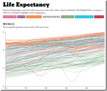
Life Expectancy (1960-2009)
15 Oct 2011Highlight by region, roll over for individual country info. The interface is a little janky – you can join the discussion over at FlowingData if you have any suggestions.
10 Essential Fiscal Charts
14 Oct 201110 beautiful charts from the Pew Charitable Trusts’ Fiscal Analysis Initiative, examining the United States Debt and the challenges facing Congress’ Super Committee.
What Wall Street Protesters are Angry About – in Charts
In: Bailout Employment Finance Politics Stock Market US Economy
14 Oct 2011A series of 30+ charts on unemployment, wages, corporate profits, income inequality, debt, taxes, and bailouts from the Business Insider. It’s actually quite an accurate compendium, and the narrative annotation spices up what are otherwise pretty dry charts from the St. Louis Fed (note: if you’ve never used the FRED data/graphing system, you should really go play with it – they even have an APP now). I particularly like the sequence where they illustrate that banks are borrowing money from the FED at basically zero interest rates, and using it to buy treasuries. Hilarious.
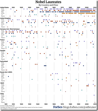
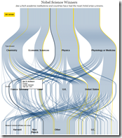
USA: Still A Nobel Country
In: Science
14 Oct 2011Nobel Prize winners by topic and country.
Here’s a weird version from the WSJ, and an interactive summary of the 2011 winners.
Washington DC Housing Prices
11 Oct 2011A nicely annotated analysis of changing house prices in the DC region. The main graphic shows how much you would need to earn to buy a “typical single family home”. There is also an interactive version which lets you compare information for different time periods and look at condo vs house sales. (related article)
What is Chart Porn?
An addictive collection of beautiful charts, graphs, maps, and interactive data visualization toys -- on topics from around the world.
Categories
- Bailout (118)
- Chartporn Related (3)
- Commentary (21)
- Culture (669)
- Emerging Markets (66)
- Employment (245)
- Environment/weather (133)
- Finance (298)
- Food (92)
- Global Economy (373)
- Graphic Design (bad) (26)
- Graphic Design (general) (183)
- Graphic Tools (23)
- History (158)
- Housing (162)
- Humor (204)
- Innovative (183)
- Interactive (545)
- Internet/tech (97)
- Maps (578)
- News Media (34)
- Politics (329)
- Reference (97)
- Science (331)
- Source: Economist (101)
- Source: FT (92)
- Source: NYT (147)
- Source: Ritholtz (76)
- Source: USA Today (27)
- Source: Washington Post (90)
- Source: WSJ (135)
- Sports (58)
- Stock Market (74)
- Uncategorized (2)
- Updated regularly (76)
- US Economy (553)
- Video (22)
- Aram Korevaar: This chart is now being used as a projection in which countries such as China see themselves as in a [...]
- David: Welcome back Chart Porn! [...]
- J S: Thanks for the great story. Miss reading this blog. Hope to see you more active again. [...]
- jake: I lived in a DC row house for 6 years, and I'm writing this comment from my tiny 1 bedroom apartment [...]
- ronny pettersen: Hilarious and unfortunately accurate... ;-) [...]


