Worst Times to Drive
In: Reference
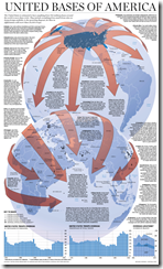
16 Nov 2011We could probably critique a few things here, but it’s so nice to see an infoposter where they actually put in a lot of useful data – in charts! – that I think we can let those slide.
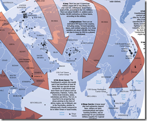
This is an interesting example because they really tried to have every part of the graphic convey information: color, size, and line type. (via The Big Picture)
If you look at the 2011 update of the report, you can see they have used a similar, but somewhat cleaner design. The labels are all clearer, and the use of a lighter background map and grey text improves the contrast considerably. Finally, I think using the color of the arrows instead of width for the value was a good call – as that’s easier for the eye to distinguish.
Unfortunately, I don’t know of any software that let’s you produce these quickly – you generally have to draw them by hand.
How (un)Popular is Congress?
16 Nov 2011Congress is less popular than the IRS, lawyers, banks, and Nixon – but just above Fidel Castro. Hahaha!.
Opinion polls are probably the mostly worthless statistics out there. However, they can sometimes be amusing: In the 1990s, Michael Moore’s television show “TV Nation” paid for a number of entertaining polls to be professionally conducted:
65% of all Americans believe that frozen pizza will never be any good and there’s nothing science can do about it.
15% of Americans wish Dennis Hopper would go back on drugs.
29% of Americans believe that Elvis was right to shoot TV sets.
60% of Americans say that if they could push a button that would make Larry King disappear, they would “keep pushing it and not stop.”
17% of college graduates would punch themselves really hard in the face for $50.
16% of all Americans believe that the world is out to get them. Of those, 46% are gun owners.
What Your Favorite Map Projection Says About You
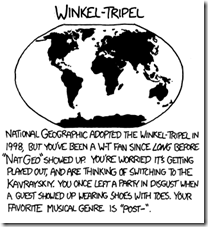
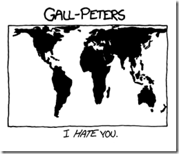
15 Nov 2011Personally, I like to stare at the Peters when I’m pondering global issues, but I use the Winkel-Tripel when I’m double checking a choropleth or cartogram and need to be sure which shape in the middle of eastern Europe really is Slovenia – I have large versions of both on my office walls.
Unemployment (1948-2011)
In: Employment Interactive Source: WSJ Updated regularly US Economy
14 Nov 2011I haven’t posted this version in a while, but the WSJ does keep it up to date with the latest data. I think it’s a lovely use of a heatmap.
Sexperience
13 Nov 2011Based on a survey of 1000 British adults, this interactive display lets you select questions and filter answers in a variety of interesting charts, where each dot represents a person in the survey. The live animations are really cool, though some of the presentations are more effective than others.
Atlas of Economic Complexity
8 Nov 2011Harvard has released an interesting new index of “economic complexity” which is the productive knowledge of the economy, based on analysis of its output composition.
… the Economic Complexity Index (ECI) is based on the number and the complexity of the products that a country exports with comparative advantage. Empirically, countries that do well in this index, given their income level, tend to achieve higher levels of economic growth. The ability to successfully export new products is a reflection of the fact that the country has acquired new productive knowledge that will then open up further opportunities for progress.
The index is then used to make detailed growth projections, and identify export opportunities on a country-by-country basis.
There are also interactive versions of most of these visualizations that you can explore and filter:
(via)
Dark Sky Weather Forecaster
8 Nov 2011Dark sky is an interesting short-term (<60 minutes) weather app. The creators interpolate weather radar information and present it based on your GPS location in the form of a smooth animation, along with a precipitation estimate. So instead of knowing that there’s a 50% chance of rain in your region that afternoon (typical weather forecast), you’d know if there was a very likely chance of rain falling on your head in the next 15 minutes. The app is currently in development, and there’s a Kickstarter campaign if you want to contribute to the cause. There’s also a blog post that explains in more detail how they are using the standard NOAA data.
Death and Taxes 2012
In: Politics US Economy
8 Nov 2011Jess Bachman has updated his beautiful visualization of the United States budget. He’s been doing this for several years, so the design is very solid and accurate.
European Twitter Languages
2 Nov 2011Eric Fischer analyzed twitter meta data for location and language and ended up with a pretty good approximation of the normal geopolitical borders. He chose grey for English, since they speak that everywhere – it would be interesting to see a map of just English. There’s also a world version. (via FlowingData)
United Bases of America
2 Nov 2011Evolution of Western Dance Music
In: Culture Interactive Maps
2 Nov 2011An interactive timeline showing (roughly) the origins and evolution of different genres of dance music. I wish you could filter to see the connections a little clearer.
Google Ripples
In: Internet/tech
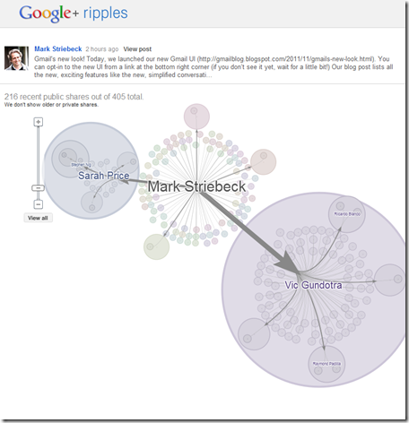
1 Nov 2011Ripples is a new visualization feature of Google+ which shows the propagation of posts across different users. Circles within circles indicate resharing. The easiest way to see this is to go into your Google+ stream, select “What’s Hot” from the list on the left, then click on the little arrow in the right hand corner of any post and select “view ripples”. You can click on a timeline at the bottom and watch the post spread, and also see some summary stats about influencers. (and yes, none of my friends are using Google+ much either, which is why this only looks good on public “what’s hot” posts)
Death and Gravestone Symbolism
1 Nov 2011This is a strange little compendium of symbols. Half of these symbols are completely obvious, and I was ready to dismiss the whole thing as link-bait, but then there are a number of little gems that I never would have guessed. Also, when was the last time you saw a mono-spaced courier font used? It sort of works here, though overall there are a few too many different fonts strewn around. I also have to give credit that the source links at the bottom do indeed lead to more interesting information on the subject.
Movie Monsters
In: Culture
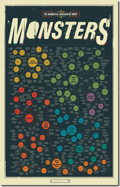
1 Nov 2011I have to say, this is a pretty thorough list – I’ve never heard of most of these. But, then, I’m not a big fan of scary movies. Available as a poster if you want one.
What is Chart Porn?
An addictive collection of beautiful charts, graphs, maps, and interactive data visualization toys -- on topics from around the world.
Categories
- Bailout (118)
- Chartporn Related (3)
- Commentary (21)
- Culture (669)
- Emerging Markets (66)
- Employment (245)
- Environment/weather (133)
- Finance (298)
- Food (92)
- Global Economy (373)
- Graphic Design (bad) (26)
- Graphic Design (general) (183)
- Graphic Tools (23)
- History (158)
- Housing (162)
- Humor (204)
- Innovative (183)
- Interactive (545)
- Internet/tech (97)
- Maps (578)
- News Media (34)
- Politics (329)
- Reference (97)
- Science (331)
- Source: Economist (101)
- Source: FT (92)
- Source: NYT (147)
- Source: Ritholtz (76)
- Source: USA Today (27)
- Source: Washington Post (90)
- Source: WSJ (135)
- Sports (58)
- Stock Market (74)
- Uncategorized (2)
- Updated regularly (76)
- US Economy (553)
- Video (22)
- Aram Korevaar: This chart is now being used as a projection in which countries such as China see themselves as in a [...]
- David: Welcome back Chart Porn! [...]
- J S: Thanks for the great story. Miss reading this blog. Hope to see you more active again. [...]
- jake: I lived in a DC row house for 6 years, and I'm writing this comment from my tiny 1 bedroom apartment [...]
- ronny pettersen: Hilarious and unfortunately accurate... ;-) [...]


