Corruption and Development
5 Dec 2011Antarctica’s Underground
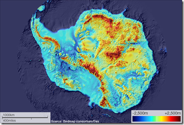
5 Dec 2011Using ice penetrating radar, scientists have mapped out the ground and mountains that lie beneath Antarctica’s ice sheets. The project is interesting because it draws on decades of work from many different teams and datasets, and will help create more accurate models of melt rates.
Designer’s Toolkit
2 Dec 2011Anyone But Romney
In: Politics
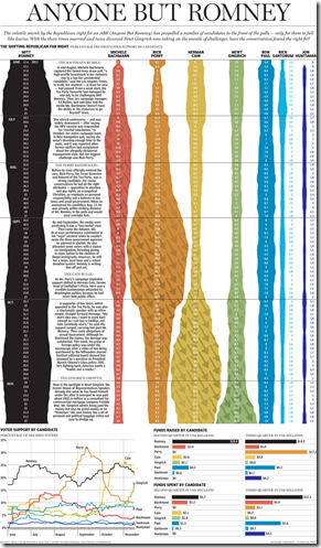
2 Dec 2011A nice illustration of the popularity swings among Republican presidential nominees. (via)
Resistance is Futile
In: Science
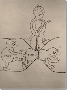
2 Dec 2011Twinkle twinkle little star, Voltage equals I times R. My physics classes would have sunk in quicker if there were more diagrams like this one.
Presidential Primary Calendar
1 Dec 2011An interesting comparison of state primary and caucus dates 2000-2012, both for the Democrats and Republicans. You can watch Iowa and New Hampshire keep moving back the opening day to stay before other states trying to steal the spotlight. The bad news: Super Tuesday isn’t until March 6th – so we have 3 more months to go of lame media coverage of the Republican field.
Road Casualties (2001-09)
In: History Interactive Maps
29 Nov 2011Education Pays
In: Employment US Economy
29 Nov 2011Greek Crisis Videographics
23 Nov 2011This jumps around a little too much for my taste – but it is a good example of using simple facts to put things in perspective.
Here’s a slightly more in depth, much more tongue-in-cheek version (from two years ago):
Finally, an even more tongue in cheek SNL skit about which god is in charge of Greek finance:
Economic Indicators Dashboard
In: Employment Finance Housing Interactive Stock Market US Economy
22 Nov 2011Updated for November: one of my favorite economic dashboards. It highlights major macro indicators, what direction they are trending, and what the typical ranges are. It also lets you drill down to explanations of why you should care, and historical values.
4.74 Degrees of Separation
In: Culture Internet/tech
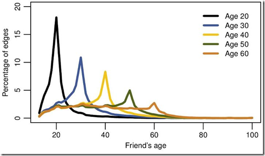
22 Nov 2011New research by Facebook based on user friends, reveals that there are not 6 degrees of separation between you and everyone else – but only 4.74. Other interesting tidbits: the distance is shrinking: in 2008 it was 5.28. If you just look at the United States, it’s only 4.
… 84% of all connections are between users in the same country. We also find that people tend to have a similar, albeit typically smaller, number of friends as their neighbors, and tend to be about the same age.
Money – All of it
21 Nov 2011XKCD pulls together a number of interesting statistics and presents them all as square blocks, varying the magnitude in each section. I’m not sure how much value this has as a graphic – the comparative value of the different groups isn’t very high in most cases. However, the statistics themselves are really interesting and worth browsing.
(note: the graphic’s viewer took a while to load – probably because of server load, which should quiet down later)
Eurozone Debt Crisis Dashboard
18 Nov 2011Some very well organized statistics on the Eurozone debt crisis, aggregated from the IMF, OECD, Eurostat, and the World Bank. It includes data on EFSF commitments, debt, SGP criteria, employment, trade, pensions, and mortgages. There are multiple dashboards, each with multiple tabs – so take the time to explore a bit. I particularly like the little sparklines – which I think do a great job of quickly illustrating trends, and don’t get used often enough.
US Economy: A Lost Decade?
18 Nov 2011A visually interesting video from the BBC. It does a good job of presenting basic facts, with a little annotation. The difficulty with these videographics, I find, is striking the right balance between being simple enough to understand easily, but complicated enough that they actually make a point. In the BBC’s favor, they appear to be using this as an introduction to issues, and link it back to their broader coverage of the global economy and crisis, including their video series “Make it Clear”, which answers basic questions like “How Can Countries Go Bust?” and “What is the IMF?”.
What is Chart Porn?
An addictive collection of beautiful charts, graphs, maps, and interactive data visualization toys -- on topics from around the world.
Categories
- Bailout (118)
- Chartporn Related (3)
- Commentary (21)
- Culture (669)
- Emerging Markets (66)
- Employment (245)
- Environment/weather (133)
- Finance (298)
- Food (92)
- Global Economy (373)
- Graphic Design (bad) (26)
- Graphic Design (general) (183)
- Graphic Tools (23)
- History (158)
- Housing (162)
- Humor (204)
- Innovative (183)
- Interactive (545)
- Internet/tech (97)
- Maps (578)
- News Media (34)
- Politics (329)
- Reference (97)
- Science (331)
- Source: Economist (101)
- Source: FT (92)
- Source: NYT (147)
- Source: Ritholtz (76)
- Source: USA Today (27)
- Source: Washington Post (90)
- Source: WSJ (135)
- Sports (58)
- Stock Market (74)
- Uncategorized (2)
- Updated regularly (76)
- US Economy (553)
- Video (22)
- Aram Korevaar: This chart is now being used as a projection in which countries such as China see themselves as in a [...]
- David: Welcome back Chart Porn! [...]
- J S: Thanks for the great story. Miss reading this blog. Hope to see you more active again. [...]
- jake: I lived in a DC row house for 6 years, and I'm writing this comment from my tiny 1 bedroom apartment [...]
- ronny pettersen: Hilarious and unfortunately accurate... ;-) [...]


