Ending the Infographic Plague
27 Dec 2011Megan McArdle critques the content of several info-posters in an article over at The Atlantic". It’s sort of shooting fish in a barrel, considering the infogrpaphics she chose – but I give her props for taking the time to double check the data.
NASA iPad Visualization Explorer
27 Dec 2011Who has some of the coolest data around? NASA, of course. While you can dig around their numerous websites looking for gems, they have pulled together many of their best work into a free iPad App. The quality of the visualizations is incredible, and most of them are well annotated/narrated. They add 8-10 new visualizations each month.
Here are stills from some of the videos:
Wind currents:
Ocean currents:
Snow cover:
Carbon absorption:
Lego Brick Costs (1973-2011)
In: Culture
20 Dec 2011I like it when someone take a silly anecdotal observation and then does the research to see if it’s actually true. In this case, Ruth Suehle was wondering whether Legos really used to be cheaper when we were kids. The statistical methodology choices and related discussions over at GeekMom are interesting (though wonderfully pointless).
Charting the Euro Zone Crisis
20 Dec 2011Interest Rates (1831-2011)
In: Finance History US Economy
19 Dec 2011Iraq and Afghanistan Casualties
In: Graphic Design (bad) Interactive Maps Politics Source: Washington Post Source: WSJ
19 Dec 2011There are a lot of these graphs out there. What I like about this presentation from the WSJ is that each dot in each bar can be clicked on for a short biography of the person who died – a nice combination of information and gravitas.
CNN’s tool maps out where they came from and where they died, and provides an area for others to leave memories for each fallen. While information rich, this one felt very sterile to me, and I couldn’t find anyone that had the “memories” section filled in.
The NYT’s went strangely artsy, with a digitized mosaic menu of the fallen’s faces:
The Washington Post’s Faces of the Fallen feature does a good job of presenting summary information, as well as photos of each soldier:
And the Huffington post comes up with the least interactive, self-identified as interactive (ALL CAPS IN THE TITLE!!!), series of charts I’ve even seen. Pretty sad.
Interstates and Routes as Subway Map
In: Maps
19 Dec 2011I’m not a big fan of these subway map mashups, but I know some of you enjoy them. Designer Cameron Booth clearly did a lot of research and work to produce these representations of the Interstate highway system, and the old Route system.
The Millennials
In: Culture
16 Dec 2011Using the faded “other” generation graphics really helps keep this one on focus (though the hands get a bit overused, perhaps).
Preventing Cancer
In: Science
15 Dec 2011The key is a bit complicated at first, but there’s lots of interesting information here.
For additional info, check out http://cancerhelp.cancerresearchuk.org/type/lung-cancer/
Economists’ Favorite Charts of 2011
14 Dec 2011These 11 charts appeared on BBC, so they are very Euro-centric, but there are still some gems. My favorite:
For a long time the perception was that the creation of the euro meant sovereign risk was effectively the same across all countries. That of course proved to be wrong. The Lehman’s crisis and financial meltdown that followed affected the deficits and debt levels of different countries in different ways. Interestingly it is much the same countries now with very high yields as it was pre-euro, suggesting little has changed fundamentally in a decade.
Marriage on the Decline
14 Dec 2011The Washington Post added family type to it’s interactive map of census data (the map also allows you to filter over time, race, density, etc). You can zoom in and see how your county compares to the rest of the country. Interesting observations: Married people with children only make up 7% of Washington DC?!? Utah is one of the few remaining regions with high “married w/children” percentages, compared to previous years when it was more common across the country.
Just 51 percent of all adults who are 18 and older are married, placing them on the brink of becoming a minority, according to a Pew Research Center analysis of census statistics to be released Wednesday. That represents a steep drop from 57 percent who were married in 2000… In 1960, for example, when most baby boomers were children, 72 percent of all adults were married. The median age for brides was barely 20, and the grooms were just a couple of years older. (related article)
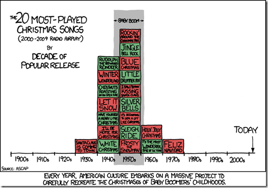
Christmas Carols
In: Culture
13 Dec 2011I’ve noticed this before – the same applies to “Christmas Movies” (with the exception of Bad Santa and South Park xmas shows, of course)
Correlation or Causation
12 Dec 2011Amusing examples of why you shouldn’t trust a lot of charts. Thanks to Sam F. for sending me the link!
Breeds: Dogs vs Cat
In: Humor
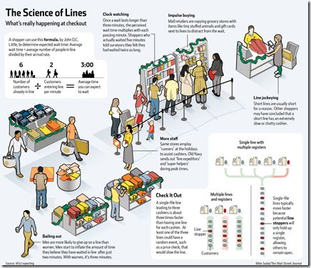
8 Dec 2011Which Checkout is Fastest?
8 Dec 2011The WSJ explains some of the science behind new checkout procedures you might be seeing this holiday season. I saw the one-to-many recently at a local Whole Foods and it reminded me a little too much of cows going to the slaughter house – but then, I hate lines of all kinds. Hat tip to Jennifer DuMars for sending it along. (related article)
What is Chart Porn?
An addictive collection of beautiful charts, graphs, maps, and interactive data visualization toys -- on topics from around the world.
Categories
- Bailout (118)
- Chartporn Related (3)
- Commentary (21)
- Culture (669)
- Emerging Markets (66)
- Employment (245)
- Environment/weather (133)
- Finance (298)
- Food (92)
- Global Economy (373)
- Graphic Design (bad) (26)
- Graphic Design (general) (183)
- Graphic Tools (23)
- History (158)
- Housing (162)
- Humor (204)
- Innovative (183)
- Interactive (545)
- Internet/tech (97)
- Maps (578)
- News Media (34)
- Politics (329)
- Reference (97)
- Science (331)
- Source: Economist (101)
- Source: FT (92)
- Source: NYT (147)
- Source: Ritholtz (76)
- Source: USA Today (27)
- Source: Washington Post (90)
- Source: WSJ (135)
- Sports (58)
- Stock Market (74)
- Uncategorized (2)
- Updated regularly (76)
- US Economy (553)
- Video (22)
- Aram Korevaar: This chart is now being used as a projection in which countries such as China see themselves as in a [...]
- David: Welcome back Chart Porn! [...]
- J S: Thanks for the great story. Miss reading this blog. Hope to see you more active again. [...]
- jake: I lived in a DC row house for 6 years, and I'm writing this comment from my tiny 1 bedroom apartment [...]
- ronny pettersen: Hilarious and unfortunately accurate... ;-) [...]


