Gold
12 Jan 2012Candidate Blind Date
11 Jan 2012Answer a series of 11 questions to see which presidential candidate’s views are most like your own. At the end, you can also roll over each candidates columns to see what their specific positions are. Personally, I thought some of the questions were slanted and missing answers that fit my beliefs – no shock, I suppose, considering they had to fit the answers to candidate platforms.
Press Freedom Map
9 Jan 2012I went to the Newseum this weekend (a great museum – recommend it to everyone) and saw the below wall sized map of freedom of the press. The online version of it isn’t much to look at, but the pop-up/drill down information for each country is very rich.
Online version (which was also available at the Museum at the kiosks you see above):
Indiemapper is Free
In: Graphic Tools Maps
5 Jan 2012Wow! The excellent online thematic map software Indiemapper is now free. Unfortunately, this decision appears to go hand in hand with one to reduce future development – which means we aren’t likely to see easy excel integration anytime soon (always a drawback in my mind). The features that are there, however, are beautifully integrated. The method for assigning classed and unclassed color ranges using an interactive histogram, for example, should be a model for other software; and the ease with which you can switch map projections is almost magical.
Single Malt Flavor Map
In: Food
5 Jan 2012I didn’t link this to the original over at Malts.com because they want you to enter some bullshit marketing form before you can enter the site – that, and they didn’t include my favorite Macallan’s 12 year on the map. The link below is to an explanatory blog post over at Strange Maps.
Top 21 Albums of 2011
In: Culture
5 Jan 2012I love music, but the only album on here that I think I’ve heard is the (incredibly overplayed) one by Adele.
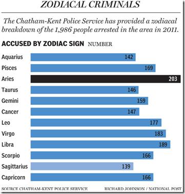
Aries Criminals
4 Jan 2012An analysis of people arrested in Southwestern Ontario in 2011 by astrological sign. Anyone have a larger dataset?
The Post is doing a great job visualizing the election so far, with a number of clear tools that they are keeping very up to date.
First up: Maps and interactive filtering of spending on ads, including videos of the ads themselves:
A Primary Tracker: mapping out candidate visits, “pre-game analysis”, results by county, and “post-game analysis” – for EACH state!
And a campaign finance explorer:
They also have something called the @MentionMachine that supposedly tracks candidates by twitter mentions and other media references that you can drill down through. Unfortunately, it isn’t working for me on either Firefox or IE.
Descriptive Photos
4 Jan 2012One year and 3888 photos of the same scenery in one picture:
Globe on a drop of water: (how it’s done)
Color combining the rainbow by spinning an umbrella:
David Imus created a new map of the United States by applying careful attention to details, design, and symbology. The figure below compares Imus’ version (on the right) to National Geographics (left). An article over at Slate highlights some of the design choices Imus made, as does a pamphlet from Imus’ website. Personally, I think it’s great that people are re-examining the “standard” way to map things, and love the way Imus squeezed in as much information as possible, without sacrificing clarity – on the other hand, it apparently took him two years and over 6,000 hours to complete. Yikes!
Humans Suck
In: Science
30 Dec 2011Luckily we have brains to figure out what’s really going on. (via)
Washington’s Revolving Door
In: Politics
29 Dec 2011Each pair of circles shows people who left government service to work/lobby for major corporate interests.
Flavor Networks
29 Dec 2011Interesting work on flavors and food pairings over at Nature.com.
Each node denotes an ingredient, the node color indicates food category, and node size reflects the ingredient prevalence in recipes. Two ingredients are connected if they share a significant number of flavor compounds, link thickness representing the number of shared compounds between the two ingredients.
(via FlowingData)
Spineless Classics
27 Dec 2011What is Chart Porn?
An addictive collection of beautiful charts, graphs, maps, and interactive data visualization toys -- on topics from around the world.
Categories
- Bailout (118)
- Chartporn Related (3)
- Commentary (21)
- Culture (669)
- Emerging Markets (66)
- Employment (245)
- Environment/weather (133)
- Finance (298)
- Food (92)
- Global Economy (373)
- Graphic Design (bad) (26)
- Graphic Design (general) (183)
- Graphic Tools (23)
- History (158)
- Housing (162)
- Humor (204)
- Innovative (183)
- Interactive (545)
- Internet/tech (97)
- Maps (578)
- News Media (34)
- Politics (329)
- Reference (97)
- Science (331)
- Source: Economist (101)
- Source: FT (92)
- Source: NYT (147)
- Source: Ritholtz (76)
- Source: USA Today (27)
- Source: Washington Post (90)
- Source: WSJ (135)
- Sports (58)
- Stock Market (74)
- Uncategorized (2)
- Updated regularly (76)
- US Economy (553)
- Video (22)
- Aram Korevaar: This chart is now being used as a projection in which countries such as China see themselves as in a [...]
- David: Welcome back Chart Porn! [...]
- J S: Thanks for the great story. Miss reading this blog. Hope to see you more active again. [...]
- jake: I lived in a DC row house for 6 years, and I'm writing this comment from my tiny 1 bedroom apartment [...]
- ronny pettersen: Hilarious and unfortunately accurate... ;-) [...]


