Magnificent Map of Rap Names
22 Feb 2012Pop Chart Lab has apparently updated their Grand Taxonomy of Rap Names (298 names) to a Magnificent Map of Rap Names (636 names)
Amazing Old (and Free) Visualization Books
22 Feb 2012There are lots of great new books out there about graphics and data visualization. But have you ever taken a look at some that were written back before computer software? It turns out that most of these chart and visualization methods have been around for decades – it’s just that they used to draw them by hand.
I highly recommend these books to anyone. Besides the impressive graphics and nostalgia values, the writing quality and content advice are excellent – regardless of what century you are in.
Graphic Methods for Presenting Facts, Willard Cope Brinton (1914). Brinton not only presents a variety of graph types, he goes into quite a bit of detail on the decisions that go into making a well designed chart. Note the author’s sarcastic review of the first chart below – Ha!
In 1939, Brinton released a greatly expanded version of his book, entitled Graphic Presentation, which covers an amazing breadth of graphic methods (520 pages with separate chapters for 59 different graph types!) — including these beauties:
Sections on chart elements and color choice:
Who knew they were drawing 3d curve charts in 1939?:
Next up, Calvin Schmid’s 1954 Handbook of Graphic Presentation. Schmid focused a lot on the proper use of design elements, including some draftsmanship tips. It’s amusing how many of the examples resemble charts from recent policy debates:
Others are a bit more dated:
Note: if you want to read these on your iPad (like I did), you should follow the directions at this link (the PDF files available directly from the Archive do not always display properly).
Global Wealth
21 Feb 2012There are a number of interesting and well designed charts in the 2011 Global Wealth Report from Credit Suisse. The private sector actually does a lot of good analysis and visualization work that just doesn’t get publicized much.
This one took me a minute to figure out – it’s showing distribution of wealth by decile:
There are a series of charts on wealth and age:
Thanks to Sean R for sending in the link!
Earth Photos
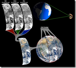
16 Feb 2012Interesting article on how they composite satellite photos of earth into those beautiful globe shots:
While we’re on the subject, below is NASA’s gateway for Astronaut photography of Earth, including some stunning videos:
2013 Federal Budget
In: Interactive Politics Source: NYT Source: Washington Post Source: WSJ
14 Feb 2012A number of news agencies took a crack at visualizing Obama’s 2013 budget proposal. (If you want to try it yourself, a shocking amount of detailed data is available in spreadsheet form at the OMB website).
Below is the Washington Post’s version. You can click on any box to see a column chart of historical values. It would have been nice to be able to drill down further, but this is a good start:
The NYT created a beautiful animated – ummm – I’m not sure what this is. A dorling diagram? Well, it looks pretty, and it’s slightly more detailed than the WashPost version, but I think the brain processes square area better than circles.
The WSJ posted five charts, but they’re nothing special:
14 Ways Economists Say I Love You (with Charts)
In: Humor
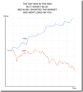
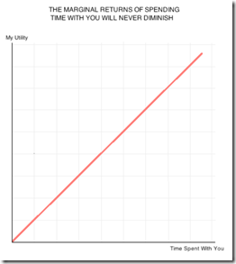
14 Feb 201214 charts – each one quite cute. Below are my favorites. Happy Valentine’s Day everyone!
Thanks to Sam F. for sending me the link!
Chinese Investment
13 Feb 2012While in NYC recently I noticed that most of the traffic seems to consist of Taxis. Tom McKeogh, Eliza Montgomery, and Juan F Saldarriag collected Manhattan taxi GPS data and created this beautiful map of Taxi trips over just 24 hours. Nice! (via FlowingData)
Why Does a Salad Cost More than a Big Mac?
In: Food Politics Source: NYT
11 Feb 2012Originally from PCRM, but I link to the NYT commentary below. Farm subsidies are a joke. Actually, almost all subsidies are a joke, now that I think about it.
European Debt
8 Feb 2012A billion here, a billion there – soon you’re talking about real money.
News reports often focus on debt to gdp ratios, but it’s powerful to actually show the magnitudes of each, and compare the amounts already committed to what remains to be financed, as is done here by Spiegel:
A rawer way of looking at the debt of all of the PIIGS, in piles of euros:
This version shows who loaned Greece the money:
Beyond the Hairball
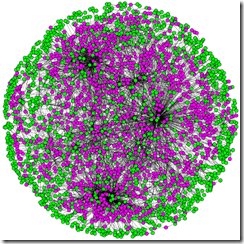
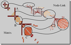
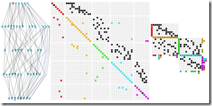
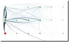
6 Feb 2012Robert Kosara examines alternatives to the classic (useless) node-link hairball network diagram.
Bad!
Better?
Ok, enough politics and economics this week. It’s Friday, so here’s a more appropriate graphic: The definitive guide to mixed drinks:
We Need a New Pie Chart
3 Feb 2012While poking around the World Economic Forum’s website I came across this talk by Adam Bly from 2011 about the important uses of data visualization to policy makers:
2012 Global Risk Map
In: Employment Environment/weather Finance Global Economy Interactive
3 Feb 2012The World Economic Forum always has some interesting visualizations and info-videos.
Global Risk Map:
Interactive Risk Explorer (be sure to play with the menu tabs on the right):
What is Chart Porn?
An addictive collection of beautiful charts, graphs, maps, and interactive data visualization toys -- on topics from around the world.
Categories
- Bailout (118)
- Chartporn Related (3)
- Commentary (21)
- Culture (669)
- Emerging Markets (66)
- Employment (245)
- Environment/weather (133)
- Finance (298)
- Food (92)
- Global Economy (373)
- Graphic Design (bad) (26)
- Graphic Design (general) (183)
- Graphic Tools (23)
- History (158)
- Housing (162)
- Humor (204)
- Innovative (183)
- Interactive (545)
- Internet/tech (97)
- Maps (578)
- News Media (34)
- Politics (329)
- Reference (97)
- Science (331)
- Source: Economist (101)
- Source: FT (92)
- Source: NYT (147)
- Source: Ritholtz (76)
- Source: USA Today (27)
- Source: Washington Post (90)
- Source: WSJ (135)
- Sports (58)
- Stock Market (74)
- Uncategorized (2)
- Updated regularly (76)
- US Economy (553)
- Video (22)
- Aram Korevaar: This chart is now being used as a projection in which countries such as China see themselves as in a [...]
- David: Welcome back Chart Porn! [...]
- J S: Thanks for the great story. Miss reading this blog. Hope to see you more active again. [...]
- jake: I lived in a DC row house for 6 years, and I'm writing this comment from my tiny 1 bedroom apartment [...]
- ronny pettersen: Hilarious and unfortunately accurate... ;-) [...]








![clip_image002[4] clip_image002[4]](http://chartporn.org/wp-content/uploads/2012/02/clip_image0024.jpg)
![clip_image002[6] clip_image002[6]](http://chartporn.org/wp-content/uploads/2012/02/clip_image0026.jpg)

