High Costs of US Medical Procedures
In: Science US Economy
6 Mar 2012A recent study compared the cost of procedures across different countries. It’s interesting to me that some people think our “free market” medical system is the best, without realizing that health care services here in no way resemble a market. The related article runs through a number of ways our system is dysfunctional.
2012 Economic Freedom Map
In: Finance Global Economy History Interactive Maps Politics Updated regularly
6 Mar 2012I’m not a fan of the Heritage Foundation, and the one time I dug into the data of their Economic Freedom Index I found that they occasionally compare apples and oranges to get around data scarcity – BUT: they do put a large research effort into the report each year. The below interactive map is well executed – but you should drill down to country level data to get a feel for what is really being measured (click on a country, then the “learn more about this country” link that pops up in the lower left. Why this requires two steps I have no idea).
Stephen Wildish
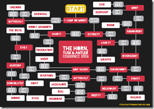
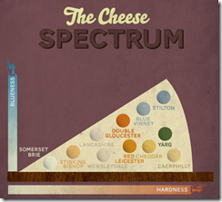
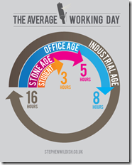
5 Mar 2012A number of cool diagram designs from this UK designer. File them in your inspiration rolodex under “properly balanced color combinations”. Thanks to Lisa Lisa for sending in the link!
A wonderful post over at The Big Picture that takes both liberals and conservatives to the wood shed over their abuse of economic indicators and charts that show correlation but not causation.
Note: The comments over there are worth a read as well.
Foreclosures 2005-2011
5 Mar 2012These charts make it pretty clear that the housing market still isn’t functioning anywhere near normal. (via The Big Picture)
The “discount” below is the foreclosure price vs a non-foreclosure sale.
Improving on Minard?!?
2 Mar 2012How dare they! Well, actually, it’s a fun exercise. Declared by Tufte to be one of the best statistical graphics ever drawn, Joseph Minard’s graph of Napoleon’s march on Russia is definitely a classic (a copy hangs in my bathroom).
John Boykin recently took a crack at redesigning the classic, and goes into quite a bit of detail on his website about the choices he made:
John links to a series of other re-creations and re-interpretations of Minard’s dataset, as collected by Michael Friendly:
3D:
I particularly like this googlemap version:
And then there’s the executive summary version. Bwahahahahaha!
(via JunkCharts)
100 Infographic Tools and Resources
In: Graphic Tools
2 Mar 2012Of course, the most remarkable thing about the list of datavis blogs, tools, and resources over at Daily*Tekk is that Chart Porn isn’t on it. Oh well. Can’t win them all.
As there were no actual charts at that blog, I will instead invite you to contemplate this sign:
Chinese Spending
1 Mar 2012A sankey diagram illustrating where one particular Shanghai office worker spends his money.
Old Maps Online
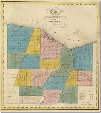
29 Feb 2012What’s cool about this repository of old maps is that you can just type in a city or zip code, select the period your are interested in, and it will you show you what maps cover that area. Below is my hometown in 1829. I think it’s great that they are preserving these online – I see the old surveyor books torn up for sale at flea markets all the time.(via Sean R and Flowing Data)
Genealogy of Car Companies
29 Feb 2012Another cool piece from HistoryShots – this one looking at the growth, consolidation, and death of automobile companies.
Graphic Decision Making
29 Feb 2012I thought this was a good example of how to use graphics to clearly differentiate a list of similar items – in this case making a choice between 25 different software apps.
Corporate Taxes Paid
In: Politics
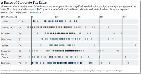
24 Feb 2012Nice chart from the NYT showing average S&P 500 company tax rates 2005-10: total taxes (fed,state,local,foreign) over pre-tax earnings, by sector. A weighted average dot would have been nice for each sector. (related article)
Presidential Wealth
In: Politics
24 Feb 2012I can’t see why anyone cares about this, but it’s been getting some press and visualization attention lately – so here ya go:
Here’s an out of focus chart from Time magazine (anyone know why their online graphics always suck? Cutbacks, probably.)
If you want more details, The Atlantic has a paragraph on each coupled with stately portraits:
An interactive version using Tableau:
And yes – it’s cold and rainy in DC today – and I’m a little grumpy. Or maybe it’s the thought of any kind of presidential analysis that is depressing me. Barf.
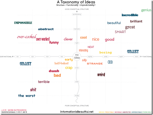
Taxonomy of Ideas
In: Culture
24 Feb 2012San Francisco Rain (1960-2012)
23 Feb 2012Stephen Von Worley created this beautiful visualization of 50 years of San Francisco rainfall. I’d love to see an interactive version of this for any city – as an addition to Weatherspark perhaps?
What is Chart Porn?
An addictive collection of beautiful charts, graphs, maps, and interactive data visualization toys -- on topics from around the world.
Categories
- Bailout (118)
- Chartporn Related (3)
- Commentary (21)
- Culture (669)
- Emerging Markets (66)
- Employment (245)
- Environment/weather (133)
- Finance (298)
- Food (92)
- Global Economy (373)
- Graphic Design (bad) (26)
- Graphic Design (general) (183)
- Graphic Tools (23)
- History (158)
- Housing (162)
- Humor (204)
- Innovative (183)
- Interactive (545)
- Internet/tech (97)
- Maps (578)
- News Media (34)
- Politics (329)
- Reference (97)
- Science (331)
- Source: Economist (101)
- Source: FT (92)
- Source: NYT (147)
- Source: Ritholtz (76)
- Source: USA Today (27)
- Source: Washington Post (90)
- Source: WSJ (135)
- Sports (58)
- Stock Market (74)
- Uncategorized (2)
- Updated regularly (76)
- US Economy (553)
- Video (22)
- Aram Korevaar: This chart is now being used as a projection in which countries such as China see themselves as in a [...]
- David: Welcome back Chart Porn! [...]
- J S: Thanks for the great story. Miss reading this blog. Hope to see you more active again. [...]
- jake: I lived in a DC row house for 6 years, and I'm writing this comment from my tiny 1 bedroom apartment [...]
- ronny pettersen: Hilarious and unfortunately accurate... ;-) [...]


