From the 2012 Military Balance report. (via)
There’s also a 2012 Chart of Conflict – but I couldn’t find a decent sized image on their site. I think they want you to buy it.
Ryan’s New Budget
21 Mar 2012There’s are a lot of nonsense charts and projections in Paul Ryan’s new House Republican budget, but rather than get into political arguments, I’ll just post the ones I thought were actually insightful:
Generational Income Gaps (kids are screwed)
21 Mar 2012The FT takes an insightful look at British household disposable income by generation – examining the long held belief that each generation is better off than the previous one. That notion has been true – until the most recent one. I think putting age on the x-axis was brilliant. Anyone want to generate this for the USA?
note: some FT features require a subscription to view.
World GDP (1-2050)
19 Mar 2012I’ve posted charts based on Maddison’s GDP dataset before, but here’s a new one that tacks on IMF projections. Obviously, the timeline scale isn’t linear and thus distorts things a bit, but the broad point is the same.
New Washington DC Metro Map
In: Maps
19 Mar 2012Not much difference from the old one. Some font and icon changes, and split coloring to indicate rush hour schedule changes.
All of History
19 Mar 2012Chronozoom provides an interactive timeline of the known history of the universe. Maybe think of it as a historical Prezi, where you can zoom in on information, images, and videos explaining what we know. The html5 animation was pretty shaky on my Firefox, but it ran nicely on Safari. The behind the scenes story about the team that created this is a good read.
CityMaps
In: Culture Food Interactive Maps
16 Mar 2012CityMaps is an interactive going out map service– something like a crowdsourced cross between google maps and yelp. Personally I found it to be a disturbing reminder of how surrounded we are by corporations and logos. For a fun game, see how many Starbucks logos you can fit in one screen – my record is eight, below. Currently available for NYC, San Francisco, and Austin.
Diagrammer
In: Graphic Tools
15 Mar 2012The design experts over at Duarte have released for sale a series of diagram elements, for use in creating presentations, reports, etc. The elements are well organized, letting you filter them by the type of relationship you are trying to visualize, number of nodes, and style. I have mixed feelings about these sorts of collections (Powerframeworks is another) as they are very similar to what is available for free in Powerpoint’s SmartArt graphics. And yet, whenever I browse through them, I always find something I haven’t seen before, or get inspired to mash a few designs together in a new way. If you have strong illustrator or photoshop skills, these probably won’t be of much interest to you. But if you don’t, and just need a quick diagram to drop into powerpoint with no fuss – these are a lifesaver.
TSA: Grope and Pillage
In: Politics
15 Mar 2012Some interesting facts and timelines about the Transportation Services Administration. I usually don’t post these types of info-posters anymore, but the timeline in particular caught my eye
Map of the US Melting Pot
In: Culture Interactive Maps
14 Mar 2012Bloomberg created this interactive map of heritages according to the 2010 census. You can select any two and see how they compare across the country. It struck me a bit odd that neither “native american” nor “african american” is included – it’s probably some strange dataset problem.
Basketball Courtvision
In: Sports
13 Mar 2012A beautiful visualization of where NBA players make their shots from. The author, Kirk Goldsberry, even breaks it down by different player positions, and uses it to analyze specific player tendencies. (original paper; via)
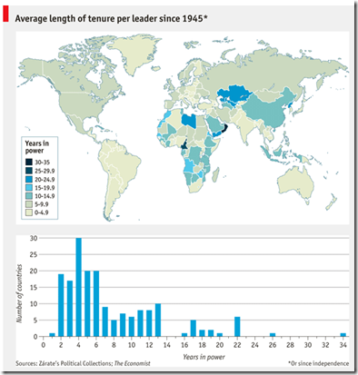
Country Tenure
7 Mar 2012Chart Art
7 Mar 2012Artist Gary Simpson created a series of frescos in 2006 based on global indicators from the CIA’s factbook. A bit stylized, to say the least, but I applaud the effort. Below are my favorites:
Visualizing a Book
In: Culture
7 Mar 2012The Book Genome Project calculates a series of analytical metrics for books, such as motion, pacing, dialogue, themes, and characters. The goal is to provide tools for writers to analyze their writings, and readers to find more books they like. The project is still in it’s formative years, but I think it has a lot of potential.
What is Chart Porn?
An addictive collection of beautiful charts, graphs, maps, and interactive data visualization toys -- on topics from around the world.
Categories
- Bailout (118)
- Chartporn Related (3)
- Commentary (21)
- Culture (669)
- Emerging Markets (66)
- Employment (245)
- Environment/weather (133)
- Finance (298)
- Food (92)
- Global Economy (373)
- Graphic Design (bad) (26)
- Graphic Design (general) (183)
- Graphic Tools (23)
- History (158)
- Housing (162)
- Humor (204)
- Innovative (183)
- Interactive (545)
- Internet/tech (97)
- Maps (578)
- News Media (34)
- Politics (329)
- Reference (97)
- Science (331)
- Source: Economist (101)
- Source: FT (92)
- Source: NYT (147)
- Source: Ritholtz (76)
- Source: USA Today (27)
- Source: Washington Post (90)
- Source: WSJ (135)
- Sports (58)
- Stock Market (74)
- Uncategorized (2)
- Updated regularly (76)
- US Economy (553)
- Video (22)
- Aram Korevaar: This chart is now being used as a projection in which countries such as China see themselves as in a [...]
- David: Welcome back Chart Porn! [...]
- J S: Thanks for the great story. Miss reading this blog. Hope to see you more active again. [...]
- jake: I lived in a DC row house for 6 years, and I'm writing this comment from my tiny 1 bedroom apartment [...]
- ronny pettersen: Hilarious and unfortunately accurate... ;-) [...]


