Augusta Then and Now
5 Apr 2012A nice look at how each hole has been modified over the years from Historyshots.
Debt Restructuring (1970-2012)
4 Apr 2012Two charts examining the size of debt restructuring by countries. The second chart is more useful since it aggregates the restructurings of countries that had several over different years (Brazil, Mexico, Argentina, etc).
Tornados (1950-2011)
4 Apr 2012Where are the Jobs?
3 Apr 2012A nice interactive from USA Today. Select your job sector and see where in the country the most growth has been, and is projected to happen in the next year. They update this monthly.
MEGA MILLIONS!
30 Mar 2012Seemed timely considering tonight’s $640million drawing: how many times numbers have been picked?
A heatmap of variations from the standard deviation:
Financial Times’ Graphic World
30 Mar 2012The Financial Times has created a giant videographic project in NYC’s Grand Central Station. Check out details about the installation and watch some of the videos (on business and the global economy) at http://ftgraphicworld.ft.com. Has anyone seen it yet in person?
Glub
29 Mar 2012Climate Central lets you zoom in on a map and visualize how much of our coast will be underwater if sea levels rise. You can adjust how much increase there is using the slider. Some experts say we should expect 2-7 feet higher by end of century. (via)
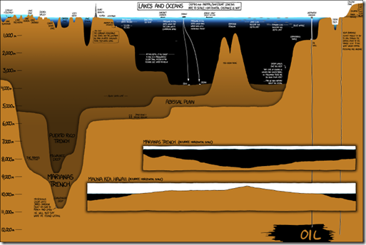
It’s interesting to see this all in one place, in such detail. Anyone want to bust out a ruler and see if he calculated the areas correctly?
DC Terrorist Nuke Attack
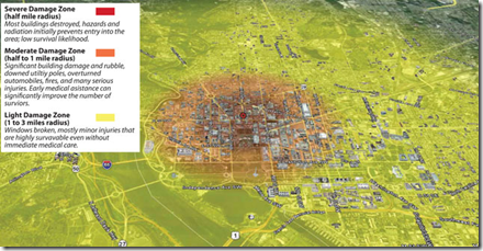
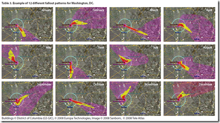
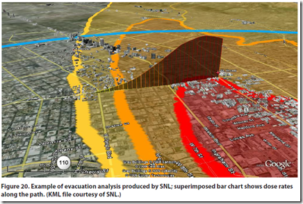
27 Mar 2012A government report analyzed the impact of a ground 10-kiloton explosion in Washington DC. Turns out it wouldn’t be quite as bad as you might think (well, compared to what it would have looked like during the cold war when the scenario was multiple megaton air bursts). The full report contains a number of nice map visualizations of the severe fallout threat. The bad news? I live and work within the “severe damage, lifesaving not likely” region. Oh well…
Geography of Government Benefits
26 Mar 2012Share of income that comes from government programs, broken down by type of benefit. (related article)
Post-Recession Jobs
In: Employment
26 Mar 2012Basically, what’s going on is, any dot above the diagonal line represents an industry where job growth is faster now than it was pre-recession. Any dot below the line indicates slower job growth.
Why Gas Prices Vary Across the USA
In: Maps US Economy
23 Mar 2012James Hamilton takes a crack at explaining why gasoline prices vary so much across the country. I think he’s right that taxes, regulations, and transportation explain most of it, but I suspect that refinery shenanigans also play a role. Brad Plumer over at WashPost has additional insights.

(the original version of this map over at Gasbuddy is fun to zoom around in)
Update: Economic Indicators Dashboard
23 Mar 2012One of my favorite economic dashboards. It highlights major macro indicators, what direction they are trending, what the typical ranges are, and lets you drill down to explanations of why you should care about these numbers.
Rise and Fall of Online Empires
23 Mar 2012I looked at this for several minutes before noticing that they never actually say what they’re measuring on the charts. <sigh> ALWAYS LABEL YOUR AXIS!!!
What is Chart Porn?
An addictive collection of beautiful charts, graphs, maps, and interactive data visualization toys -- on topics from around the world.
Categories
- Bailout (118)
- Chartporn Related (3)
- Commentary (21)
- Culture (669)
- Emerging Markets (66)
- Employment (245)
- Environment/weather (133)
- Finance (298)
- Food (92)
- Global Economy (373)
- Graphic Design (bad) (26)
- Graphic Design (general) (183)
- Graphic Tools (23)
- History (158)
- Housing (162)
- Humor (204)
- Innovative (183)
- Interactive (545)
- Internet/tech (97)
- Maps (578)
- News Media (34)
- Politics (329)
- Reference (97)
- Science (331)
- Source: Economist (101)
- Source: FT (92)
- Source: NYT (147)
- Source: Ritholtz (76)
- Source: USA Today (27)
- Source: Washington Post (90)
- Source: WSJ (135)
- Sports (58)
- Stock Market (74)
- Uncategorized (2)
- Updated regularly (76)
- US Economy (553)
- Video (22)
- Aram Korevaar: This chart is now being used as a projection in which countries such as China see themselves as in a [...]
- David: Welcome back Chart Porn! [...]
- J S: Thanks for the great story. Miss reading this blog. Hope to see you more active again. [...]
- jake: I lived in a DC row house for 6 years, and I'm writing this comment from my tiny 1 bedroom apartment [...]
- ronny pettersen: Hilarious and unfortunately accurate... ;-) [...]


