Charts via Fonts
In: Graphic Tools
15 Aug 2012FF Chartwell is an interesting tool for creating simple charts using font character sets. I’m not sure that this is really much easier than using excel or other charting software, but some people might find it more intuitive – but at $129 for the full set, it seem a bit pricey.
There’s a nice demo video at http://vimeo.com/41772735
Emotional Guidance Scale
In: Culture
14 Aug 2012Emotions are the result of how well reality meets up with your expectations. I go back and forth between liking this graphic and thinking the it’s a little too vague and disconnected.
Design wise, I suppose the colors don’t really add anything – so sure, make it black.
Everything You’ll Ever Need to Know About Napping
In: Science
14 Aug 2012Not the best infographic, but I love napping. I love it so much.
Here’s a related oldie but goodie:
Thanks to LisaLisa for the link!
4 New Typographic Maps
In: Maps
10 Aug 2012I can’t imagine the patience it takes to make these. I have one on my wall at home next to my door to explain to people how to get out of the city. Now available for London, Philadelphia, Seattle, Minneapolis, DC, Boston, NYC, SF, Madison (?), and Chicago.
Mining and Metals
In: Science
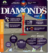
10 Aug 2012I don’t usually post these kinds of niche infographics, but the ones by Visual Capitalist are are pretty well done – both in terms of content and design. If you want a backgrounder on anything that comes out of the ground (copper, gold, lithium, gas, oil, diamonds, etc), check them out.
Awesome Discontinued Olympic Events
In: Sports
7 Aug 2012Tug of War? Club Swinging? Live Pigeon Shooting. What a fantastic list!
Here’s a version from the Telegraph describing “Single Stick”:
…involved two man standing still, facing one another, and attempting to draw blood from the other’s head with a stick"
Wow. How great is that? They should bring that back.
Energy Sankey
7 Aug 2012We’ve seen these systemically applied. In this case it’s to a multi-family home. Anyone have one for a single home?
The creator also has a blog post and demo of how he creates these diagrams: http://visualizegreen.posterous.com/pages/create-energy-diagram
Restaurant Density
6 Aug 2012How Much Have Olympians Improved?
In: Source: NYT Sports Video
6 Aug 2012NASA Logo
6 Aug 2012Summer Olympics (1896-2012)
In: History Interactive Maps Sports
30 Jul 2012I guess today is the day of map posts! Here is one from the Economist that shows which countries participated in each summer Olympics since 1896. You can see the stupid 1980/84 boycotts by east and west, for example.
Eastern Europe
30 Jul 2012“Eastern Europe” doesn’t really exist anymore. In fact, it never really did in the first place, according to this videographic.
Origins of America
30 Jul 2012Awesome animated gif of the growth of the US territories and states. The only improvement I can think of is if there was a timeline control – watching the dates change while keeping track of map changes is almost impossible.
I couldn’t find the original creator to link to. If you know where credit should be given, let me know.
What is Chart Porn?
An addictive collection of beautiful charts, graphs, maps, and interactive data visualization toys -- on topics from around the world.
Categories
- Bailout (118)
- Chartporn Related (3)
- Commentary (21)
- Culture (669)
- Emerging Markets (66)
- Employment (245)
- Environment/weather (133)
- Finance (298)
- Food (92)
- Global Economy (373)
- Graphic Design (bad) (26)
- Graphic Design (general) (183)
- Graphic Tools (23)
- History (158)
- Housing (162)
- Humor (204)
- Innovative (183)
- Interactive (545)
- Internet/tech (97)
- Maps (578)
- News Media (34)
- Politics (329)
- Reference (97)
- Science (331)
- Source: Economist (101)
- Source: FT (92)
- Source: NYT (147)
- Source: Ritholtz (76)
- Source: USA Today (27)
- Source: Washington Post (90)
- Source: WSJ (135)
- Sports (58)
- Stock Market (74)
- Uncategorized (2)
- Updated regularly (76)
- US Economy (553)
- Video (22)
- Aram Korevaar: This chart is now being used as a projection in which countries such as China see themselves as in a [...]
- David: Welcome back Chart Porn! [...]
- J S: Thanks for the great story. Miss reading this blog. Hope to see you more active again. [...]
- jake: I lived in a DC row house for 6 years, and I'm writing this comment from my tiny 1 bedroom apartment [...]
- ronny pettersen: Hilarious and unfortunately accurate... ;-) [...]


