Great Tree of Life
24 Sep 2012The angle threw me for a minute, and I wonder if the ending arc widths are proportionally representative or not – but overall, I like it!
The American Dream
In: Culture US Economy
24 Sep 2012Who Pays Income Tax?
18 Sep 2012I’m a little surprised by the increase in non-payers over the years.
Non payers by state. I’m not sure I agree with using ordinal coloring – especially when so many states fall into the 30-40% range.
Who Pays for Health Care (1960-2010)
In: Employment US Economy
18 Sep 2012Interactive graph of where the money comes from to pay medical bills (private insurance, medicare, out of pocket, etc). It’s interesting that private insurance still only covers a small amount of total expenses (~39%).
Dogs on a Farm
13 Sep 2012Either I’m not reading this correctly, or the person who created it has never actually seen a dog on a farm – they are some of the happiest creatures to ever walk the earth.
How Google Builds its Maps
11 Sep 2012Awesome article in The Atlantic about the science and process that goes into Google’s maps and directions.
The maps you see represent the combination of many different sources of information. For example, the map below includes street signs captured by Street View cars driving around.
If you didn’t know, you can add your own local knowledge to Google maps with their Map Maker:
Global Facebook Friendships
11 Sep 2012Ok, maybe I’m just in a bad mood because I’m back at work after a nice long vacation – but I think this visualization sucks. All it does is ordinally identify the top five linked countries for each country. There is no scale. What does the bubble size indicate? No matter what country you click on, the top five all grow to about the same size. Is the 4th relationship really almost as strong as the 2nd? Who knows? The methodology states “Rankings between countries are based on the number of Facebook friendships between countries and the total number of Facebook friendships within each country.” Ummm… how, exactly? Is it a ratio? Is the total number used as a weight? Thankfully they color coded it based on the continents – because everyone has trouble identifying those, right? Oh, and Seychelles will be happy to know it’s now in Asia. Totally useless.
Younger Africa
7 Sep 2012Where most regions are grappling with the strains of an aging population – Africa is having the opposite experience.
Mortality (1960-2010)
In: Science
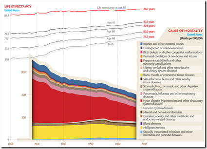
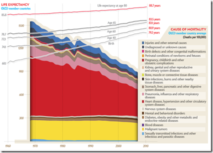
6 Sep 2012We covered a lot of this data back in June, but this is a nice presentation. The addition of the global data is useful, though trying to make comparisons by switching between the two isn’t easy – a static version would probably have worked better – so here are two screenshots to help you out.
Dynamic Online Pricing
In: Internet/tech
6 Sep 2012Online retailers adjust their prices throughout the day. (related WSJ article – requires subscription) Personally, I’ve always wondered whether retailers give different prices to customers who are signed in or not.
Here’s another example and a good free article/video:
Human Genome Browser
In: Science
6 Sep 2012Philographics
21 Aug 2012I can’t say I agree with a lot of these deconstructed icons, but it is a fun collection to look through.
Murder! (2000-2010)
In: Culture Source: WSJ
20 Aug 2012Explore the 165,068 murders in the US by where, when, how, and the circumstances. The subtotals next to the filter menu saves a lot of time.
(Except for Florida – who doesn’t use the FBI’s guidelines for reporting homicide details)
Income Distribution by Religion
In: Culture
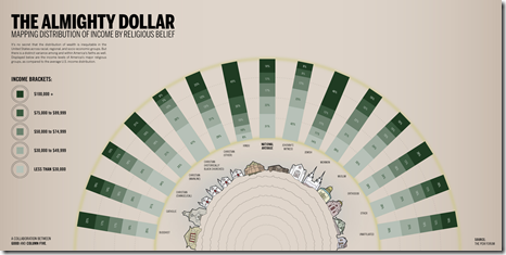
20 Aug 2012No point to the arc or the dotted lines, but the content is kind of interesting. Who knew the Hindus were rich?
Orbital Motion
In: Science
16 Aug 2012Sure, the planets orbit the sun, but it’s all moving – so it’s really moving more like this:
What is Chart Porn?
An addictive collection of beautiful charts, graphs, maps, and interactive data visualization toys -- on topics from around the world.
Categories
- Bailout (118)
- Chartporn Related (3)
- Commentary (21)
- Culture (669)
- Emerging Markets (66)
- Employment (245)
- Environment/weather (133)
- Finance (298)
- Food (92)
- Global Economy (373)
- Graphic Design (bad) (26)
- Graphic Design (general) (183)
- Graphic Tools (23)
- History (158)
- Housing (162)
- Humor (204)
- Innovative (183)
- Interactive (545)
- Internet/tech (97)
- Maps (578)
- News Media (34)
- Politics (329)
- Reference (97)
- Science (331)
- Source: Economist (101)
- Source: FT (92)
- Source: NYT (147)
- Source: Ritholtz (76)
- Source: USA Today (27)
- Source: Washington Post (90)
- Source: WSJ (135)
- Sports (58)
- Stock Market (74)
- Uncategorized (2)
- Updated regularly (76)
- US Economy (553)
- Video (22)
- Aram Korevaar: This chart is now being used as a projection in which countries such as China see themselves as in a [...]
- David: Welcome back Chart Porn! [...]
- J S: Thanks for the great story. Miss reading this blog. Hope to see you more active again. [...]
- jake: I lived in a DC row house for 6 years, and I'm writing this comment from my tiny 1 bedroom apartment [...]
- ronny pettersen: Hilarious and unfortunately accurate... ;-) [...]


