The Truth about Natural Cold Remedies
2 Nov 2012A great diagram about different options and their efficacy. The related article goes into more detail on each remedy.
Federal Debt (1790-2037)
In: Maps Politics US Economy
1 Nov 2012From the generally impartial Pew Center:
Increase in federal support to states during recession:

Where the federal grant money went as percent of state revenue:
Hurricanes, Earthquakes, and Fires
1 Nov 2012Getting Lost
31 Oct 2012Feels like a music video for a slogan, using meaningless animated infographics.
Mount Stupid
In: Humor
29 Oct 2012US Congress: Left and Right
29 Oct 2012Another beauty from xkcd. I’m a little dubious of the methodology behind the liberal/conservative distinctions, but they’re upfront and clear about what is being displayed.
A Day in Our Solar System
In: Interactive Science
24 Oct 2012Beautiful gif illustrating simultaneous orbits.
There’s also an interactive version which allows you to do cool things like pick the year, and view Tychonian (earth-centric) orbits or zodiac houses.
p.s: sorry for not posting in a while – I was in Asia for several weeks, and while they do have internet there, I was busy exploring instead of digging up infographics:
Cheetahs!
2 Oct 2012To be honest, I get submitted so many crap info-posters, I almost didn’t catch this one. Lots of interesting content, and the animation is a nice aesthetic innovation (though probably not really necessary, of course).
In related news, the Washington DC Zoo has had a steady crop of adorable cheetah cubs the past few years. Click the link for some awww-some pictures.
Election Projections
2 Oct 2012Some fantastically clear interactive maps from the Washington Post, identifying tossups in each race (Presidential, Senate, House, Governor).
Safest Seat on a Plane
In: Science
1 Oct 2012Based on a Popular Mechanics review of every commercial jet crash in the United States since 1971, that had both fatalities and survivors.
In 11 of the 20 crashes, rear passengers clearly fared better. Only five accidents favored those sitting forward. Three were tossups, with no particular pattern of survival. In one case, seat positions could not be determined.
Startup Salaries and Equity Shares
25 Sep 2012Dynamic bubble chart showing compensation ranges for startups across different job types. I’m kinda afraid to ask what a “Sales Engineer” is.
Top 20 Data Visualization Tools
In: Graphic Tools
25 Sep 2012A list compiled by Brian Suda over at netmagazine.com. It’s a little heavy on java libraries – but I suppose that’s the direction visualization is heading. Still, you think basic tools like Illustrator, or BI software like Tableau would have made it in there somewhere.
You’re Too Old to be King?
In: History
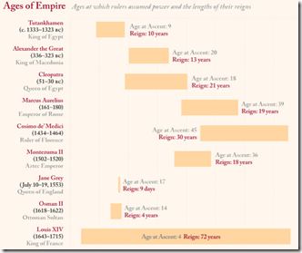
25 Sep 2012Ages and reigns of famous leaders throughout history. The coverage is a little odd. Mao but not Castro? No Khans?
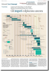
Here’s a similar chart of the empires themselves. I’m told this is an awesome graphic, but I can’t read Italian.
Update: Economic Indicators Dashboard
24 Sep 2012One of my favorite economic dashboards. It highlights major macro indicators, what direction they are trending, what the typical ranges are, and lets you drill down to explanations of why you should care. Looks like a lot of indicators are finally in the “typical” range.
What is Chart Porn?
An addictive collection of beautiful charts, graphs, maps, and interactive data visualization toys -- on topics from around the world.
Categories
- Bailout (118)
- Chartporn Related (3)
- Commentary (21)
- Culture (669)
- Emerging Markets (66)
- Employment (245)
- Environment/weather (133)
- Finance (298)
- Food (92)
- Global Economy (373)
- Graphic Design (bad) (26)
- Graphic Design (general) (183)
- Graphic Tools (23)
- History (158)
- Housing (162)
- Humor (204)
- Innovative (183)
- Interactive (545)
- Internet/tech (97)
- Maps (578)
- News Media (34)
- Politics (329)
- Reference (97)
- Science (331)
- Source: Economist (101)
- Source: FT (92)
- Source: NYT (147)
- Source: Ritholtz (76)
- Source: USA Today (27)
- Source: Washington Post (90)
- Source: WSJ (135)
- Sports (58)
- Stock Market (74)
- Uncategorized (2)
- Updated regularly (76)
- US Economy (553)
- Video (22)
- Aram Korevaar: This chart is now being used as a projection in which countries such as China see themselves as in a [...]
- David: Welcome back Chart Porn! [...]
- J S: Thanks for the great story. Miss reading this blog. Hope to see you more active again. [...]
- jake: I lived in a DC row house for 6 years, and I'm writing this comment from my tiny 1 bedroom apartment [...]
- ronny pettersen: Hilarious and unfortunately accurate... ;-) [...]


