What Career Should You Choose?
31 May 2013Interesting interactive scatter showing median salaries vs number of people employed – with the color of the dots indicating expected growth by 2020. You can filter by category of employment to cut down the dots a bit. It would have been nice if you could filter by expected growth rate as well.

US Corporations: Effective Tax Rates
31 May 2013A spiffy annotated interactive visualization by the NYT on what different industries actually pay in taxes. The differences in rates between industries illustrate who is getting tax breaks. The related article is worth a read.


31 Charts to Restore Your Faith in Humanity
31 May 2013A lot of these are misleading – but hey, so are most charts. For more entertaining interpretations of the same figures, check out The Washington Post’s “31 Charts to Destroy Your Faith in Humanity.”


 and so on.
United States Immigration
30 May 2013Immigration has always been a tough issue to deal with.

The chart reminds me of this John Stewart bit on immigration and “Traditional America”:
2000 years of Global Temperatures
15 May 2013Interesting scientific work, building on prior studies from across the world. Rather than get into the findings in detail I refer you to the NYT article and a very detail FAQ at the authors’ website)

Jobs in America (2001-2011)
15 May 2013A lot of tree maps are gibberish. This one drives home the structural changes in the job market quite clearly. It’s part of Catherine Mulbrandon’s awesome book “An Illustrated Guide to Income in the United States”. I highly recommend her book – whether it’s for the insightful content, or for the 130+ beautiful examples of clean design.

The Art of Data Visualization
15 May 2013A nice introductory video from PBS with Edward Tufte, Julie Steele, Josh Smith, and Jer Thorp. Every once in a while it’s good to remind yourself of basic principles.
Geography of Hate
In: Culture Internet/tech Maps
15 May 2013This has been making the rounds. Based on 150,000 geocoded tweets from June 2012 to April 2013, filtered 1st by use of word, and then manually whether it was used in a negative or derogatory fashion.
Obviously this suffers from selection bias as it only includes people who bother to tweet, and those who aren’t ashamed to do it publicly. There’s also the usual population density distortion (last map below), which would be compounded by cell phone coverage out west. So, basically, this is another pretty visualization of social media meta data that doesn’t really mean much of anything. To be honest I’m surprised they only found 150,000 hateful tweets in 11 months. (The author’s FAQ is an interest read)
Homophobia:

Racist:

Disability:


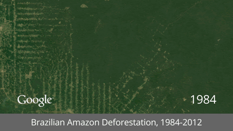
Satellite GIFs
15 May 2013It’s interesting how popular animated gifs have become again. I guess that even with high speed internet people are a little fed up with player load times and lags. Here GIFs are used to show time lapse satellite images of mankind’s impact on the earth. (google earth link)


Average Dissertation Length by Topic
In: Science
8 May 2013The R is my friend blog used some nifty coding to analyze 2,500+ dissertations (though only those since 2007). (via)
Most were between 100 and 200 pages. 
The below boxplot shows the length by topic. It could have used a legend to verify, but traditionally, the vertical line is the median, the colored areas are the 1st and third quartiles, the horizontal line is the range of extreme values (1.5x the inter quartile from the upper and lower quartile, and the dots are outliers (greater than 1.5 the inter-quartile range). Make sense? Of course, page length doesn’t actually indicate much of anything… so this whole exercise is pointless – just like most PhDs. 🙂

Corporate Logo Evolution
2 May 2013I love symbols and logos. It’s interesting how they change over time to reflect the times, marketing attempts, and mediums.


here are a few more:


Psychology of Color
2 May 2013I usually don’t post banner infographics anymore (most of them are linkbait), but I liked how this one summarizes the basic concepts of color theory and provides iconic examples. Of course, there is way too much room given to the chakra color nonsense.

![]()
The aesthetic aspects of color in design are demonstrated in my friend Mitch’s collage piece of vintage advertisements:

Is it Worth the Time to be More Efficient?
29 Apr 2013More awesomeness from xkcd. It needs a third axis to factor in how annoying the task is.

Geek Productivity
29 Apr 2013Pretty accurate. Some people just don’t understand that performing at a high level requires some rest periods in between the productivity. Or maybe we really are just lazy – I can’t say for sure.

Facebook Image Dimensions
29 Apr 2013I am always googling these, so it’s nice to have them all in one place. Of course, they will probably change in a week. Here’s an older one that includes sizes for additional services (google+, twitter, youtube, etc). Anyone know of a permanent repository?


What is Chart Porn?
An addictive collection of beautiful charts, graphs, maps, and interactive data visualization toys -- on topics from around the world.
Categories
- Bailout (118)
- Chartporn Related (3)
- Commentary (21)
- Culture (669)
- Emerging Markets (66)
- Employment (245)
- Environment/weather (133)
- Finance (298)
- Food (92)
- Global Economy (373)
- Graphic Design (bad) (26)
- Graphic Design (general) (183)
- Graphic Tools (23)
- History (158)
- Housing (162)
- Humor (204)
- Innovative (183)
- Interactive (545)
- Internet/tech (97)
- Maps (578)
- News Media (34)
- Politics (329)
- Reference (97)
- Science (331)
- Source: Economist (101)
- Source: FT (92)
- Source: NYT (147)
- Source: Ritholtz (76)
- Source: USA Today (27)
- Source: Washington Post (90)
- Source: WSJ (135)
- Sports (58)
- Stock Market (74)
- Uncategorized (2)
- Updated regularly (76)
- US Economy (553)
- Video (22)
- Aram Korevaar: This chart is now being used as a projection in which countries such as China see themselves as in a [...]
- David: Welcome back Chart Porn! [...]
- J S: Thanks for the great story. Miss reading this blog. Hope to see you more active again. [...]
- jake: I lived in a DC row house for 6 years, and I'm writing this comment from my tiny 1 bedroom apartment [...]
- ronny pettersen: Hilarious and unfortunately accurate... ;-) [...]