US Economy Archive:
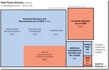
US Fiscal Stimulus
12 Aug 2010Includes the recent $26 billion state aid package. Related article.
Personal Finance Advice on Napkins
10 Aug 2010Napkins are not where you would expect to find good financial advice, but when they come from the New York Times they are worth reading (and each is linked to a related blog post).
State Budget Deficits
2 Aug 2010Yields on top-rated, tax exempt US municipal bonds have dropped to near-record lows, allowing many local borrowers to access cheap financing in spite of their recent fiscal troubles. Following concerns over public finances in Europe, the $2,800bn market for “munis” has come into the spotlight after several years of budget deficits. Related articles.
Update: AP Economic Stress Map
2 Aug 2010This map displays unemployment, foreclosures, bankruptcies, or a composite “stress index”, by county. Easy to miss: in the upper right you can change the scale of the mapping (rates, m-t-m, y-t-y). To look at data over time, click on the “monthly rates” option and a historical slider will appear at the bottom. Double click on a region to zoom in. Updated 8/2/10.
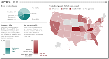
Update: NPR’s Toxic Real Estate Asset
24 Jul 2010Planet Money bought a toxic mortgage asset and has been tracking it’s death spiral. It’s now almost completely dead (non-performing). In a recent article they also tried to track down the people who originally took out the mortgages.
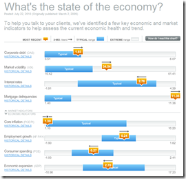
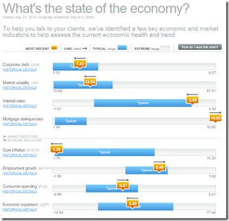
Update: Economic Indicators Dashboard (July ‘10)
23 Jul 2010A great monthly status board for market and economic indicators. Click on anything – the popup details are great.
$4 Trillion Housing Bubble Hangover
19 Jul 2010Why housing prices (and the economy) are not going to recover any time soon. (via The Big Picture; earlier post)
Double Dip Danger Signs
In: Bailout Finance Housing Source: WSJ Stock Market US Economy
1 Jul 2010The WSJ looks at indicators in seven areas to gauge whether we are sliding back into recession. Related article.
American Migrations: 2008
16 Jun 2010More than 10 million Americans moved from one county to another during 2008. The map below visualizes those moves. Click on any county to see comings and goings: black lines indicate net inward movement, red lines net outward movement.
Finviz Financial Visualizations
In: Finance Global Economy Interactive Reference Stock Market Updated regularly US Economy
7 Jun 2010Some really great financial analysis tools here.
Treemaps (for S&P, world, filter by sector, period, drill down as far as you want)

Same info as bubbles, with roll over graphs:
Bar, Spectrum, and other performance charts by industry, country, or capitalization:
Tables of insider trading:
Futures:
Foreign Exchange:
And a crazy filter system for stock tables:
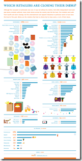
Retail Store Closings
In: Culture US Economy
3 Jun 2010EPI’s Economy Track
In: Employment Interactive Maps Updated regularly US Economy
3 Jun 2010The Economic Policy Institute has a collection of interactive charts covering employment, GDP, and capacity utilization. There are also filters to facilitate quick comparisons across recession periods.
Economic Indicators Dashboard (May ‘10 update)
25 May 2010One of my favorite summaries of economic indicators. Click on any of the “historical details” to see what each indicator means and why it’s important.
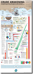
One Oil Graphic to Rule them All
18 May 2010This one is pretty comprehensive, to say the least. (via)
What is Chart Porn?
An addictive collection of beautiful charts, graphs, maps, and interactive data visualization toys -- on topics from around the world.
Categories
- Bailout (118)
- Chartporn Related (3)
- Commentary (21)
- Culture (669)
- Emerging Markets (66)
- Employment (245)
- Environment/weather (133)
- Finance (298)
- Food (92)
- Global Economy (373)
- Graphic Design (bad) (26)
- Graphic Design (general) (183)
- Graphic Tools (23)
- History (158)
- Housing (162)
- Humor (204)
- Innovative (183)
- Interactive (545)
- Internet/tech (97)
- Maps (578)
- News Media (34)
- Politics (329)
- Reference (97)
- Science (331)
- Source: Economist (101)
- Source: FT (92)
- Source: NYT (147)
- Source: Ritholtz (76)
- Source: USA Today (27)
- Source: Washington Post (90)
- Source: WSJ (135)
- Sports (58)
- Stock Market (74)
- Uncategorized (2)
- Updated regularly (76)
- US Economy (553)
- Video (22)
- Aram Korevaar: This chart is now being used as a projection in which countries such as China see themselves as in a [...]
- David: Welcome back Chart Porn! [...]
- J S: Thanks for the great story. Miss reading this blog. Hope to see you more active again. [...]
- jake: I lived in a DC row house for 6 years, and I'm writing this comment from my tiny 1 bedroom apartment [...]
- ronny pettersen: Hilarious and unfortunately accurate... ;-) [...]

