US Economy Archive:
Update: The State of the Economy
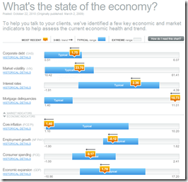
25 Oct 2010October’s update of the Economic Indicators Dashboard:
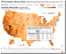
and while we’re at it, here is the AP’s Economic Stress Map, which shows unemployment, foreclosures, and bankruptcies from 2007-today, by county.
American Poverty
In: Employment Maps US Economy
22 Oct 2010And keep in mind that the “poverty rate” for a single person is less than $11,000. In other words, the majority of us should be skipping happily to work in the morning instead of popping prozac and lamenting our “tough” lives. Thanks to Kelly Brooks for the link.
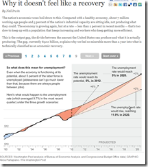
A nice animated/annotated series of charts explaining the output gap and its effects on unemployment.
Update: Wall Street Compensation
In: Employment Finance Interactive Source: WSJ Stock Market US Economy
12 Oct 2010Explore what percentage of revenue at Wall Street firms goes to compensation. Updated with 2010 data.
Rolling up TARP
4 Oct 2010A summary of the infamous Troubled Asset Relief Program. (via)
State Debt
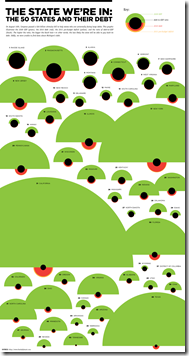
30 Sep 2010Interesting presentation of multiple debt related indicators. The alien invasion look is a bit strong, but they did refrain from including red circles and having them all look like ladybugs – just sayin.
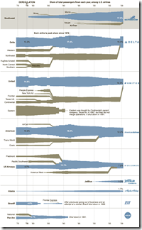
Fly Me! Airlines 1975-2010
30 Sep 2010A typically cool graphic from the NYT showing the births, deaths, assimilations, and growth of airlines since the 1970s.
Update: Economic Indicators Dashboard
In: Employment Finance Housing Interactive Updated regularly US Economy
24 Sep 2010One of my favorite summaries of economic indicators. Click on any of the “historical details” to see what each indicator means and why it’s important. Updated 9/22/10.
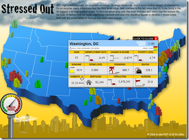
American Stress
23 Sep 2010Interactive map of stress based on unemployment, change in income, poverty, sunshine, ozone, crime, and cost of living.
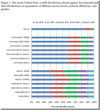
We’re All Stupid
23 Sep 2010Actual wealth distribution versus what people think it is. (via)
This reminded me of a survey the Washington Post did a while ago which compared the ethnic distribution of the USA to what different ethnic groups thought it was – everyone got that horribly wrong too. Quick test: what percent of the population is White, Black, and Asian? Highlight the next line for the answer:
White: 75% Black: 12% Asian: 3.6% (2000 Census)
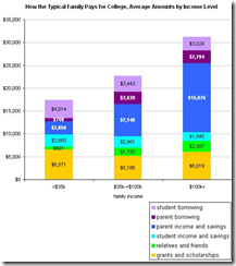
How Americans Pay for College
In: Employment US Economy
15 Sep 2010Interesting variations by income level. (via)
Bankruptcies Back on the Rise
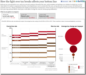
19 Aug 2010Bush’s Tax Cuts by the Numbers
18 Aug 2010A very well done interactive of how people will be affected by the expiration of the 2001/03 tax breaks, as well as a what Obama is proposing.
History of GDP (1-2008)
17 Aug 2010Data compiled by Angus Maddison, an economist who died earlier this year, suggest that China and India were the biggest economies in the world for almost all of the past 2000 years. Why they fell so far behind may be more of a mystery than why they are currently flourishing.
(ps – the comments at the Economist are worth the read)
The History of Social Security
16 Aug 2010Roll over the timeline to see how funding, eligibility, and benefits have changed over the last 75 years. However, I think AP got the beneficiaries numbers completely wrong – the 2009 total is more like 52 million (source).
Correct graph:
What is Chart Porn?
An addictive collection of beautiful charts, graphs, maps, and interactive data visualization toys -- on topics from around the world.
Categories
- Bailout (118)
- Chartporn Related (3)
- Commentary (21)
- Culture (669)
- Emerging Markets (66)
- Employment (245)
- Environment/weather (133)
- Finance (298)
- Food (92)
- Global Economy (373)
- Graphic Design (bad) (26)
- Graphic Design (general) (183)
- Graphic Tools (23)
- History (158)
- Housing (162)
- Humor (204)
- Innovative (183)
- Interactive (545)
- Internet/tech (97)
- Maps (578)
- News Media (34)
- Politics (329)
- Reference (97)
- Science (331)
- Source: Economist (101)
- Source: FT (92)
- Source: NYT (147)
- Source: Ritholtz (76)
- Source: USA Today (27)
- Source: Washington Post (90)
- Source: WSJ (135)
- Sports (58)
- Stock Market (74)
- Uncategorized (2)
- Updated regularly (76)
- US Economy (553)
- Video (22)
- Aram Korevaar: This chart is now being used as a projection in which countries such as China see themselves as in a [...]
- David: Welcome back Chart Porn! [...]
- J S: Thanks for the great story. Miss reading this blog. Hope to see you more active again. [...]
- jake: I lived in a DC row house for 6 years, and I'm writing this comment from my tiny 1 bedroom apartment [...]
- ronny pettersen: Hilarious and unfortunately accurate... ;-) [...]

